Business owners understand better than anyone that an investment is only as strong as the effort you put into protecting it. When you hire and train employees, you’re not just filling a position — you’re building capability, culture, and long‑term value. That’s why companies offer benefits, create supportive environments, and work hard to retain the people they’ve invested in.
Interestingly, the same principle applies to your buildings.
Just as you protect the investment you’ve made in your team, weatherproofing and painting your property protects the investment you’ve made in your buildings.
The Cost of Neglect: Employees and Buildings Both Suffer Without Care
When a business fails to retain employees, the consequences are immediate and expensive. You lose experience, productivity drops, and you’re forced to spend more time and money recruiting and retraining.
Buildings behave the same way.
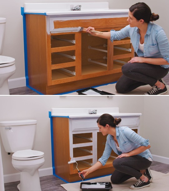
If you delay maintenance or skip repainting cycles, the structure begins to deteriorate. Moisture intrusion, UV damage, peeling coatings, and exposed surfaces all accelerate deterioration. What could have been a simple repaint becomes a costly repair — just like replacing a trained employee becomes far more expensive than retaining one.
Neglect always costs more than maintenance.
Retention Creates Stability — In Your Workforce and Your Property
A stable team strengthens a business. Employees who stay understand your systems, your customers, and your expectations. They work more efficiently, make fewer mistakes, and contribute to long‑term success.
A well‑maintained building offers the same kind of stability.
When you keep your property protected with quality coatings, you:
- Prevent premature aging
- Reduce repair costs
- Maintain curb appeal
- Preserve structural integrity
- Extend the life of your investment
Regular painting and weatherproofing build a stronger, more resilient property.
Proactive Care Pays Off
Smart business owners don’t wait for problems to appear before taking action. They invest in benefits, training, and workplace culture because they know proactive care is cheaper — and far more effective — than reacting to crises.
Your building deserves the same proactive approach.
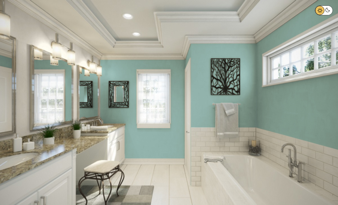
A fresh coat of paint, proper caulking, and high‑quality coatings act like the “benefits package” for your property. They keep the exterior protected from harsh weather, temperature swings, and daily wear. They prevent small issues from becoming major repairs. And they ensure your building continues to perform the way you need it to.
Proactive care always costs less than reactive repair.
Protecting What You’ve Built
Whether you’re managing a team or maintaining a building, the principle is the same:
When you invest in something valuable, you take steps to preserve it.
You wouldn’t train employees only to let them walk out the door. And you shouldn’t invest in a property only to let weather and time erode its value. Painting and weatherproofing are essential tools for protecting your building — just as benefits and retention strategies are essential tools for protecting your workforce.
Both are smart, strategic decisions that safeguard your long‑term investment.
Ready to Protect Your Property?
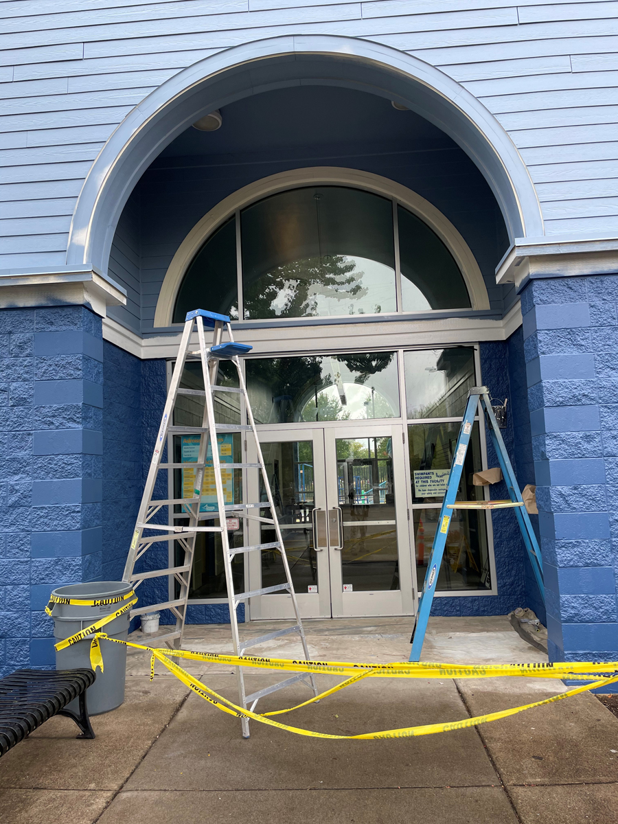
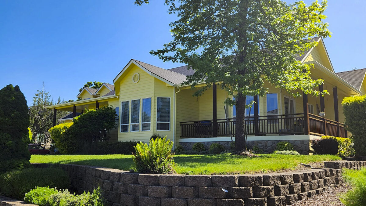
If it’s been a few years since your last repaint, or if you’re starting to see signs of wear, now is the perfect time to take action. A well‑maintained building not only looks better — it performs better, lasts longer, and saves you money in the long run.
Your employees are worth protecting. Your property is too.
Give us a call to get your property protection plan scheduled 541-497-3804