Meta Description: Looking for the perfect airy neutral? Discover why Sherwin-Williams Drift of Mist (SW 9166) was named February 2024 Color of the Month and how Paint Doctor’s Painting Service can bring it to life in your home!
If you’ve been searching for a wall color that feels bright and open without looking like a sterile hospital room, you’re not alone. Finding that sweet spot between clean white and oppressive gray can feel nearly impossible—until you meet Sherwin-Williams Drift of Mist (SW 9166).
Selected as the Sherwin-Williams Color of the Month for February 2024, Drift of Mist is one of the most versatile, inviting neutrals on the market. At Paint Doctor’s Painting Service, our professional team has applied this timeless shade across countless homes, and it continues to be a client favorite.
Here is everything you need to know about Drift of Mist and how to use it to elevate your space.
What Makes Drift of Mist (SW 9166) So Special?
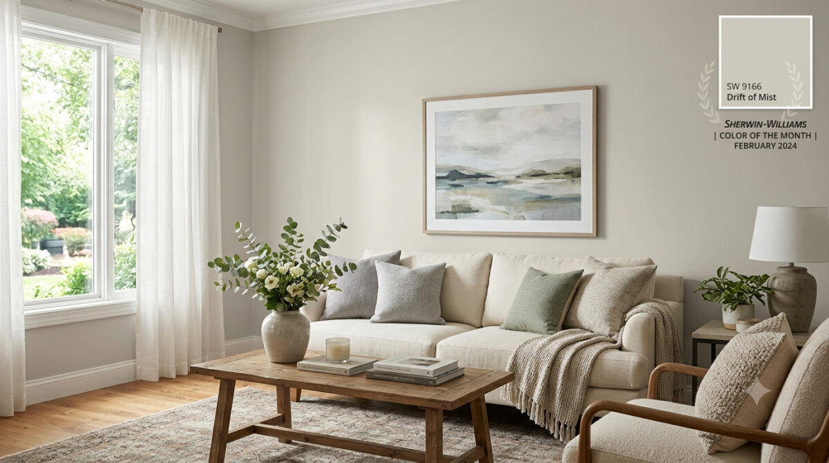
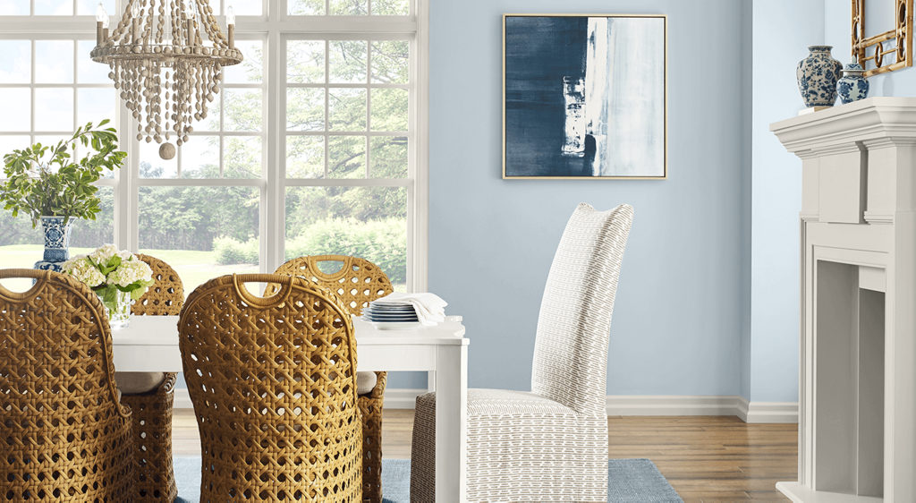
Drift of Mist is an off-white warm gray (often described as a light greige). It bridges the gap between modern cool tones and cozy warm tones, giving you maximum flexibility with your interior design.
Quick Color Specs
- Color Code: SW 9166
- Light Reflectance Value (LRV): 69 (Light and airy, bounces natural light without washing out completely)
- Undertones: Soft, muted green and gray with gentle warmth
- Vibe: Calm, serene, and sophisticated
How Light Affects Drift of Mist
Like any great neutral, Drift of Mist is a chameleon—it shifts subtly depending on the lighting in your room:
- South-Facing & West-Facing Light: Warm afternoon sunlight brings out its cozy greige undertones, making the space feel inviting and soft.
- North-Facing Light: Cooler, indirect light highlights its crisp gray side, giving it a sleek, modern finish.
- Warm Artificial Lighting (2700K–3000K): Enhances the soft, beige nuances, perfect for cozy evening relaxation.
Best Rooms for Drift of Mist
Because of its high LRV and quiet character, Drift of Mist works almost anywhere, but it truly shines in these areas:
1. Open-Concept Main Floors & Hallways
If you want a seamless flow from your entry to your living and kitchen areas, Drift of Mist provides a cohesive backdrop that unifies different spaces without overpowering them.
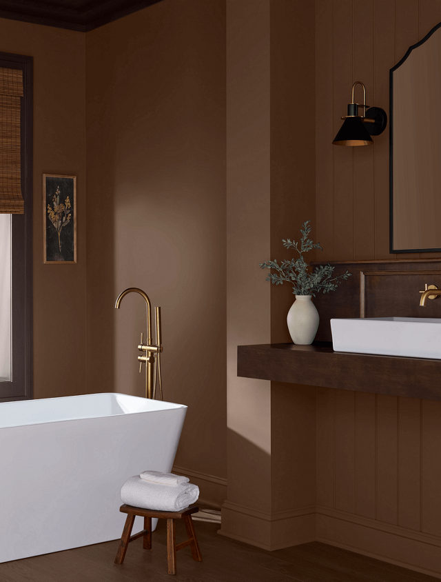
2. Bedrooms & Spa-Like Bathrooms
Pair Drift of Mist with crisp white linens, light wood vanities, and brushed metal fixtures to create a calming, hotel-inspired retreat.
3. Kitchen Walls & Custom Cabinetry
On walls, it lets white tile and dark stone countertops pop. On kitchen cabinets, it provides a soft, warm alternative to stark white, creating a custom, high-end feel.
Perfect Color Pairings
Pairing neutrals requires an eye for undertones, and Drift of Mist coordinates effortlessly with a variety of accent shades:
- Crisp Trim Whites: Pure White (SW 7005) or High Reflective White (SW 7757).
- Soft Earthy Accents: Sea Salt (SW 6204) or Evergreen Fog (SW 9130) for a natural, coastal-inspired palette.
- Bold Contrast: Iron Ore (SW 7069) or Naval (SW 6244) for built-ins, kitchen islands, or interior doors.
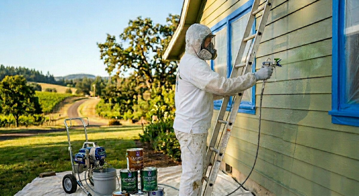
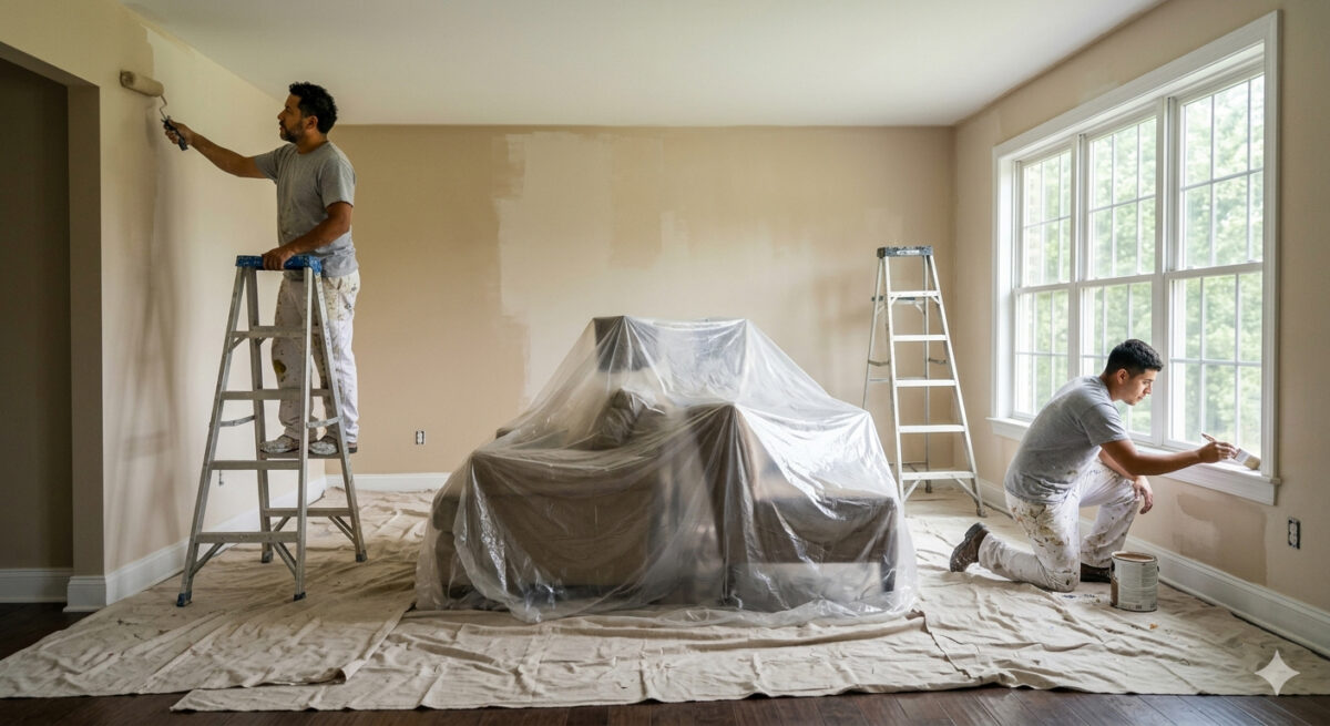
Bring Your Dream Palette to Life with Paint Doctor’s Painting Service
While Drift of Mist is an exceptionally easy color to love, getting a flawless, smooth coat requires professional skill—especially with subtle off-white tones where prep work and finish consistency are key.
Whether you want to refresh a single room, repaint your kitchen cabinets, or update your entire home’s exterior, Paint Doctor’s Painting Service is here to handle every step of the process.
- Flawless Wall & Trim Prep
- Clean, Precision Edges
- Premium Sherwin-Williams Paints
- Free Consultation & Quotes
Ready to Refresh Your Home?
Don’t guess with paint samples—let our experts deliver the flawless finish your home deserves!
📞 Call Paint Doctor’s Painting Service today to schedule your consultation, 541-4973804