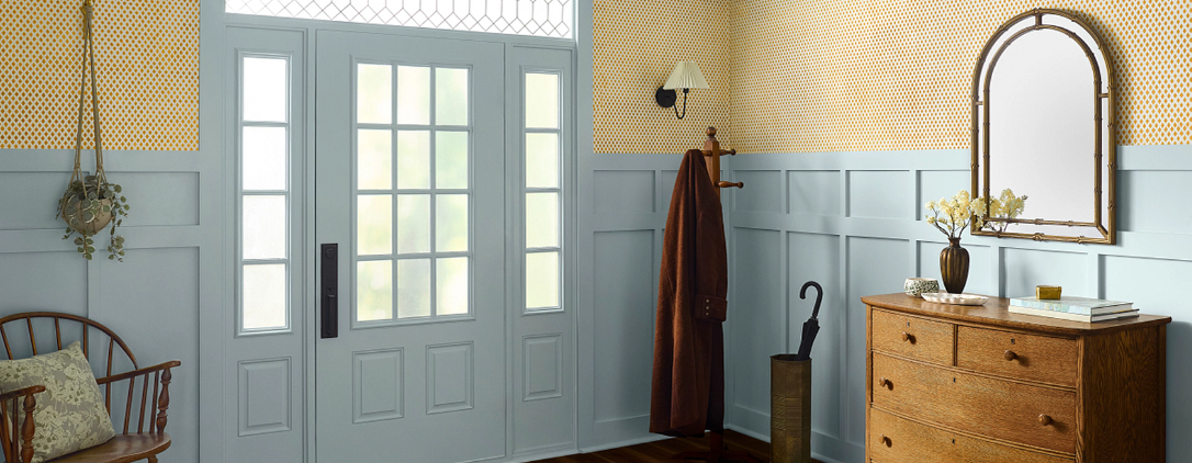
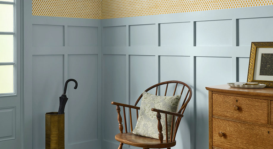
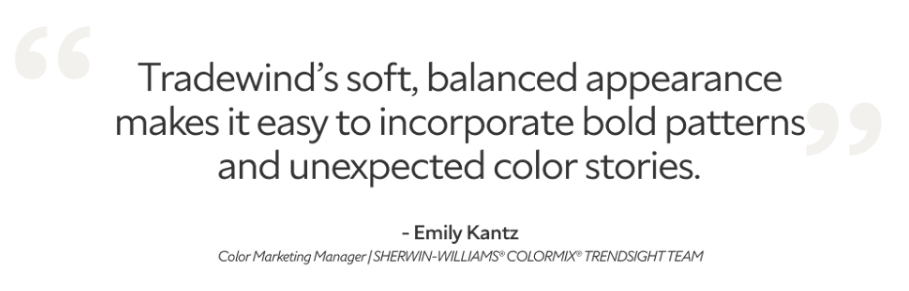
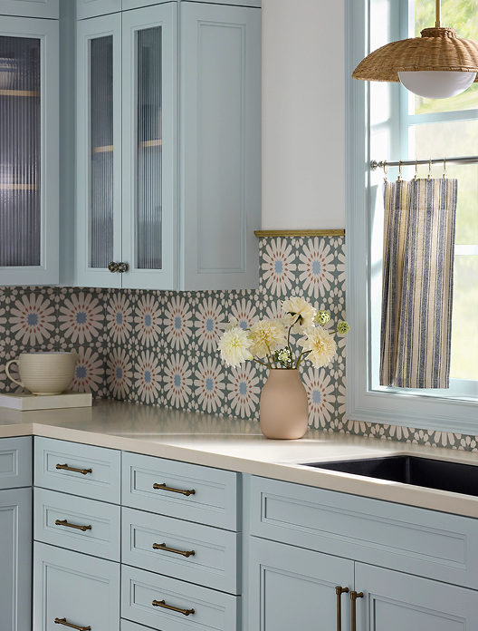
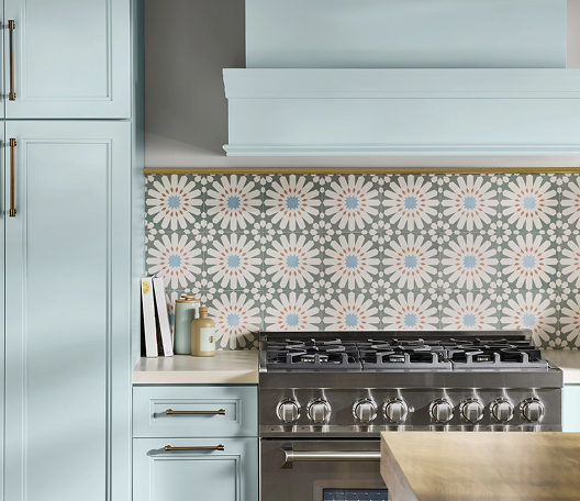
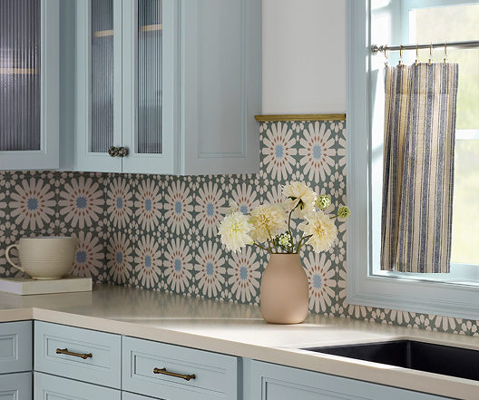
Sherwin-Williams says, “Gentle and oceanic, Tradewind is a versatile hue that can find a home in coastal or southern-inspired spaces. Subtle green undertones turn high traffic areas like kitchens and hallways into calming spaces to quickly recharge throughout the day. From balancing the wood tones in your space or giving your home a vintage charm, this tranquil blue creates harmony for timeless and trendy spaces alike.”
Let us know if we can help transform your favorite spaces with Tradewind, 541-497-3804.
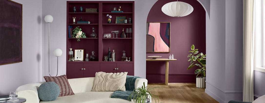
When most people think of purple tones, they picture bright floral patterns or a child’s bedroom. But in the world of high-end interior design and professional painting, those hues have grown up.
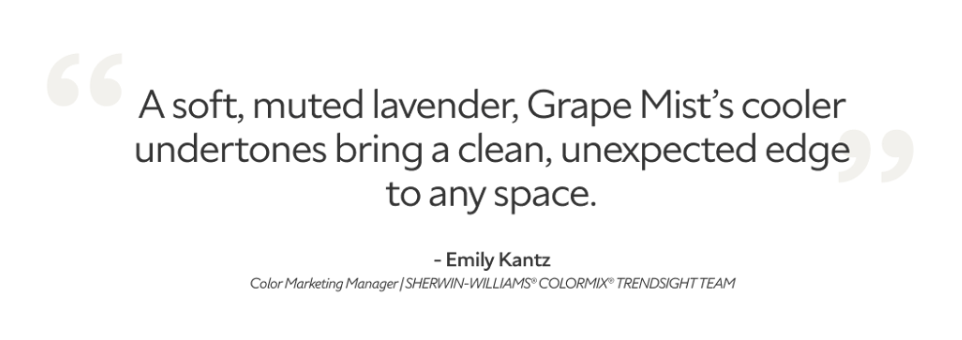
This month, we are highlighting Grape Mist—a hue so refined it acts as a “near-neutral.” Think of it as a gray with a secret; it provides the calm of a cool neutral that keeps a room from feeling clinical.
According to Sherwin-Williams, “From eclectic, open-concept homes to a child’s playroom, Grape Mist is perfectly suited for large or small applications. Thanks to its cool undertone, this soft lavender has an ethereal, dream-like quality that’s perfect for unplugging from the digital world. Whether you use it in a bedroom, powder room or beyond, this soft, playful hue will surely elevate your spaces to approachable luxury.”
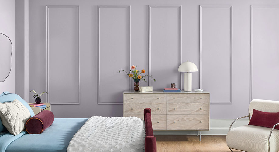
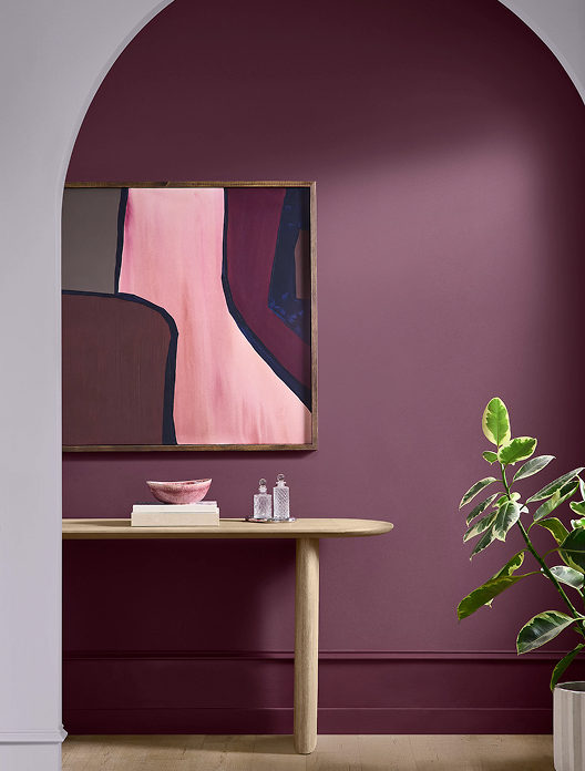
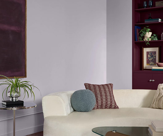
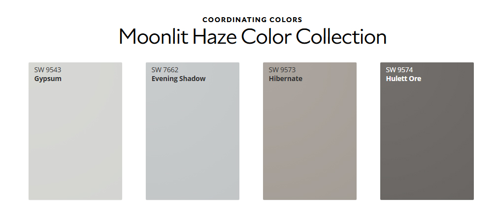
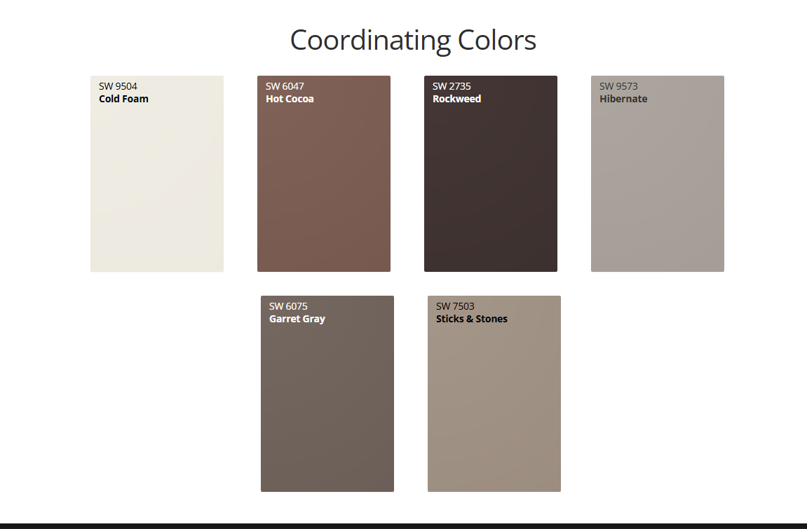
Grape Mist is a soft lavender which works well in this bedroom.Paired with deeper purple and art with bold colors, Grape Mist can move you out of your beige mood.Coordinating colors that go with the subtle lavender called Grape Mist.
If you’re looking to bring a sense of calm and modern elegance to your next project, Grape Mist might be the perfect fit. Give us a call for a color consultation, and let’s see how this shade looks on your walls, 541-497-3804
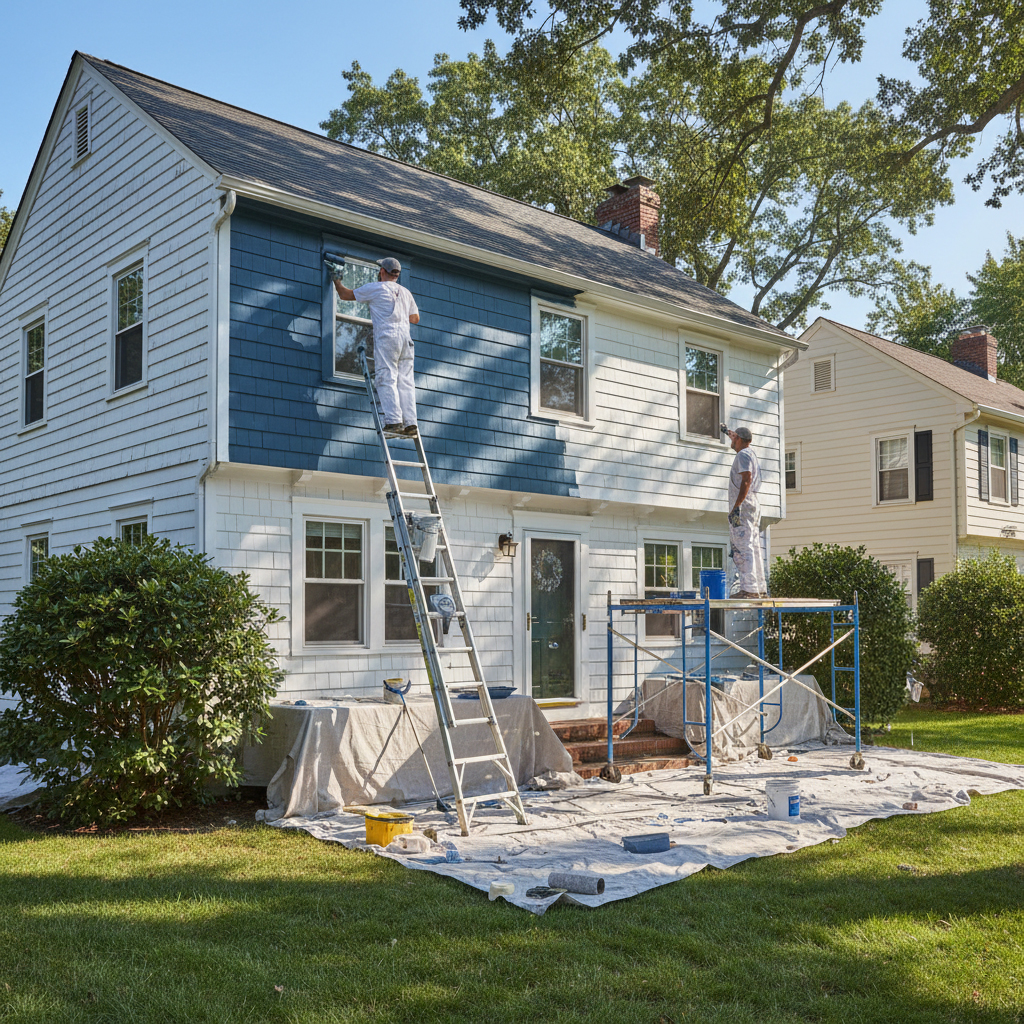
Waiting until visible damage appears is a costly strategy. At Paint Doctor’s Painting, we recommend a program of proactive maintenance, ensuring your property stays resilient and valuable over time.
The Hidden Threats
External factors like moisture, fluctuating temperatures, and UV exposure constantly attack your building’s surfaces. What begins as a minor crack or fade can lead to severe structural issues, requiring costly repairs down the line.
The “Benefits Package” for Your Building
Think of professional painting as a comprehensive benefits package for your property. It provides durable weatherproofing, sealing vulnerable areas and protecting from environmental stressors. This proactive approach not only maintains your building’s appearance but actively prevents costly damage, ensuring the long-term value and integrity of your investment. It’s a shield against time.
Speaking of time, let’s schedule some to get your maintenance up to date. 541-497-3804
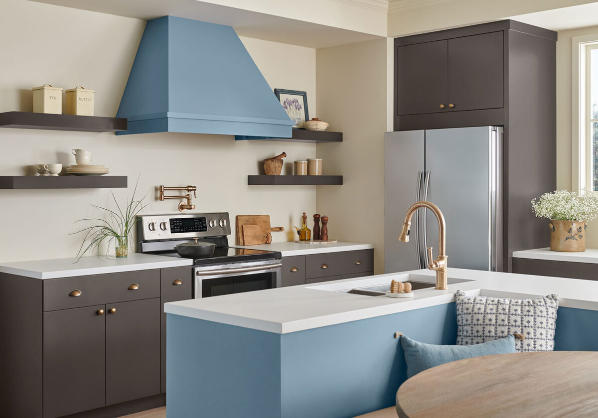
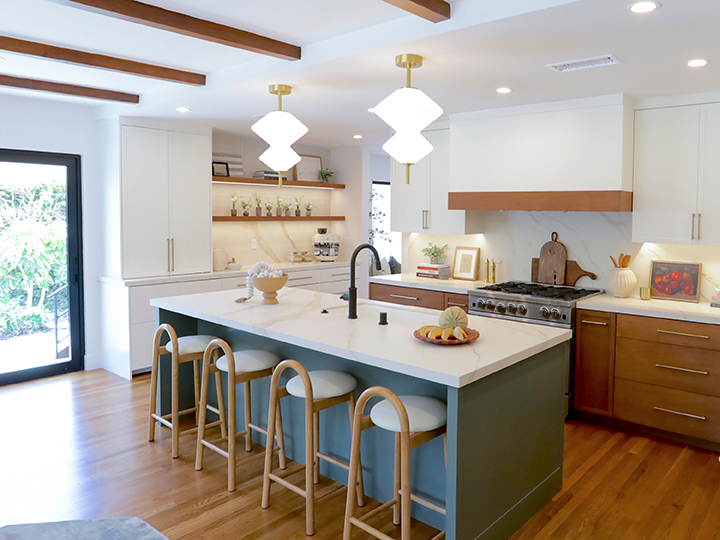
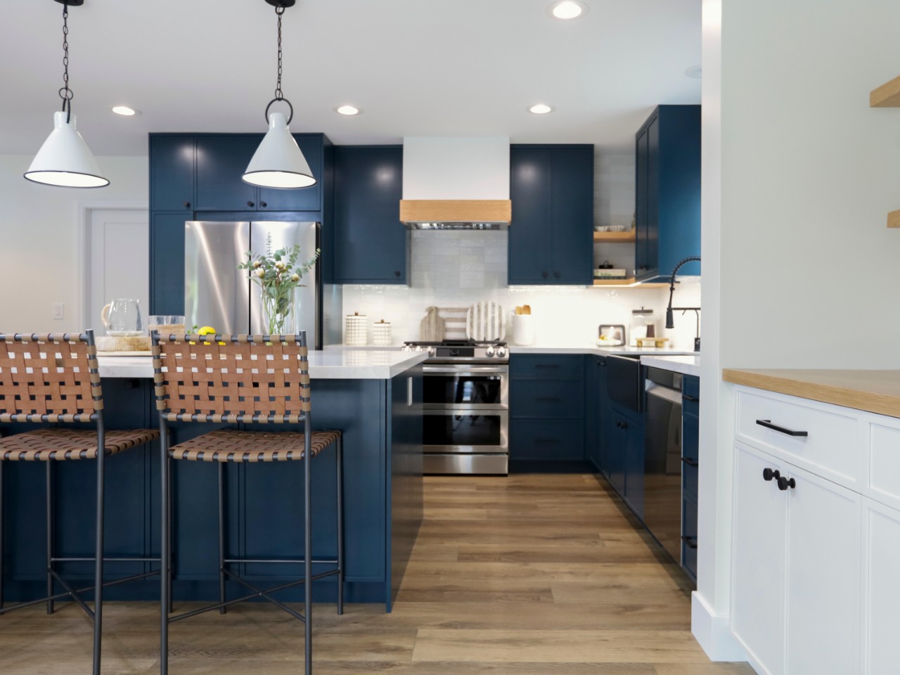
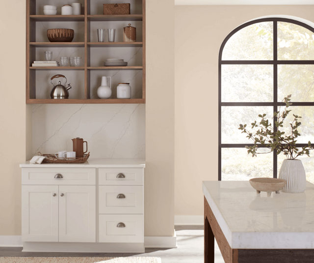
When choosing kitchen colors, prioritize the room’s size, lighting, and desired mood, using light shades (white, beige) to expand small spaces and dark, bold tones (navy, green) to add drama to larger ones. Consider existing elements like countertops, flooring, and hardware, and select a palette that reflects your personal style while balancing, warm, or neutral tones.
Key Considerations for Kitchen Colors:
Size and Layout: Small kitchens benefit from lighter colors to feel more open and bright. Larger, well-lit spaces can handle darker, more dramatic colors.
Natural and Artificial Lighting: North-facing kitchens often have cooler, blue-toned light, requiring warmer colors, while south-facing kitchens handle brighter, warmer colors well.
Kitchen Style and Vibe:
Cozy/Rustic: Earthy tones, such as olive green or terracotta.
Modern/Sophisticated: Dark, moody colors like charcoal or deep blue.
Classic/Timeless: White, cream, gray, or neutral palettes.
Existing Elements: Choose colors that complement or contrast with fixed, hard-to-change items like countertops, cabinets, and backsplashes.
Psychological Impact: Warm colors (red, yellow) can create a high-energy, social space or stimulate appetite, whereas cool tones (blue, green) create a calming, relaxed, and fresh atmosphere.
Durability and Trends: Neutral colors generally offer better long-term, timeless appeal, while bold colors should be chosen based on personal preference rather than passing trends.
Color Application Ideas:
Cabinets: Use bold, deep colors on islands or base cabinets to create focal points.
Walls: Light, neutral shades can make the overall kitchen feel larger and more cohesive.
Two-Toned: Combine light upper cabinets with darker lower cabinets for a balanced, modern look.
Here at the Paint Doctor’s Painting Service we use only quality paint because we take pride in our work, we stand behind our work and because we are watching out for the good of our customers.
There are many reasons to choose quality paint when working on your own.
Pigments: Quality paints use higher concentrations of prime pigments, such as titanium dioxide, which provide rich, vibrant color and better hiding power. Cheap paints use fewer prime pigments and more low-quality fillers (like clay or calcium carbonate) that do not enhance color or coverage.
Binders: Binders are the resins that help the paint adhere to the surface and form a durable film. Premium paints use superior high-quality resins (like 100% acrylic for water-based paints) that create a stronger, more flexible bond, resisting cracking, peeling, and blistering. Cheap paints use lower-grade binders that result in weaker adhesion and faster deterioration.
Liquids/Solvents: Solvents are the liquid carriers that help apply the paint and then evaporate as it dries. Cheap paints are often diluted with a higher water or solvent content, making them thinner and runnier, which negatively impacts coverage. Quality paints have a higher ratio of solids (pigments and binders) to liquids, resulting in a thicker consistency and better coverage.
Additives: Quality paints often include specialized additives for enhanced performance, such as mildew resistance, UV protection, and stain blocking. Many cheap paints lack these beneficial additives
Performance and Value Comparison
While cheap paint has a lower upfront cost, quality paint provides better long-term value due to its superior performance characteristics:
Feature
Cheap House Paint
Quality House Paint
Coverage
Requires more coats (3-4+) for full, even coverage.
Achieves full coverage in 1-2 coats.
Durability
Prone to chipping, cracking, peeling, and scuffing.
Highly durable, resisting damage and wear and tear.
Longevity
Short lifespan, often needing repainting every 2-4 years indoors and 1-3 years outdoors.
Long lifespan, typically lasting 8-12 years indoors and 7-10 years outdoors.
Color Retention
Fades quickly when exposed to sunlight and the elements.
Retains color and vibrancy for years due to better pigments.
Application
Thinner consistency, can be streaky, patchy, and more difficult to apply evenly.
Thicker, smoother, and easier to apply, resulting in a professional finish.
Washability/Maintenance
Difficult to clean; scrubbing can damage the finish.
Easy to clean and highly scrub-resistant without damage.
Long-Term Cost
Lower initial cost, but higher long-term cost due to frequent repainting and more labor.
Higher initial cost, but lower long-term cost as it lasts longer and requires less maintenance.
For most projects, especially high-traffic areas or exteriors where durability is essential, investing in quality paint saves time, effort, and money in the long run.
If all of this self-help talk is making you feel tired, give us a call and we can take care of your project with long-lasting, quality products, 541-497-3804.
Color is more than just a design choice—it’s a reflection of personality, mood, and lifestyle. Let’s explore what different colors might be saying as you enter a room.
🔵 Blue: Calm, Trustworthy, and Thoughtful
Blue is a favorite for bedrooms and bathrooms because it evokes serenity and stability. Soft blues or navy tones bring a sense of peace, order, and introspection. It’s also a color that builds trust—no wonder it’s popular in professional settings too.
🔴 Red: Bold, Passionate, and Energetic
Red walls make a statement. Whether it’s a deep burgundy in the dining room or a cherry accent wall, red signals confidence and vitality. It’s often chosen by those who love entertaining and aren’t afraid to stand out.
🟢 Green: Balanced, Natural, and Restorative
Green connects us to nature and renewal. Homeowners who choose green often seek harmony and wellness in their environment. It’s a great choice for living rooms or home offices where focus and calm are key.
Choosing interior paint colors can be fun when you think about transforming the mood of a room in your house. Give us a call when you are ready to update your mood! 541-497-3804
This year, Sherwin-Williams is leaning into warmth, depth, and nature-inspired hues that bring comfort and character to every space. Whether you’re building a house, planning a full remodel or just a weekend refresh, these trending colors offer endless possibilities.
🌿 Interior Color Trends
1. Urbane Bronze SW 7048
A rich, earthy brown-gray that adds depth and sophistication.
Perfect for accent walls, cabinetry, or cozy reading nooks.
2. Evergreen Fog SW 9130
A calming green-meets-gray tone that’s ideal for bedrooms and living rooms.
Pairs beautifully with natural wood and soft textiles.
3. Redend Point SW 9081(2023 Color of the Year, still trending)
A warm blush-beige that brings subtle warmth to any space.
Use it in entryways or bathrooms for a welcoming vibe.
4. Naval SW 6244
A classic navy that’s bold yet timeless.
Great for kitchen islands, built-ins, or dramatic accent walls.
5. Pure White SW 7005
A versatile, clean white with just enough warmth.
Ideal for trim, ceilings, and pairing with bold colors.
🏡 Exterior Color Trends
1. Iron Ore SW 7069
A deep charcoal that’s sleek and modern.
Use it for siding, shutters, or front doors to make a statement.
2. Alabaster SW 7008
A soft, creamy white that’s perfect for exteriors.
Works well with stone, brick, and wood accents.
3. Dried Thyme SW 6186
A muted green that blends beautifully with natural landscapes.
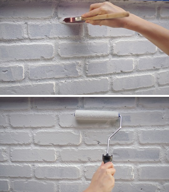
When you think about painting, the first tool that comes to mind might be the trusty brush, but let’s take a moment to appreciate the real workhorse of the painting world—the paint roller. If you’re tackling a large surface, nothing beats the efficiency, coverage, and smooth finish that a well-chosen roller can provide.
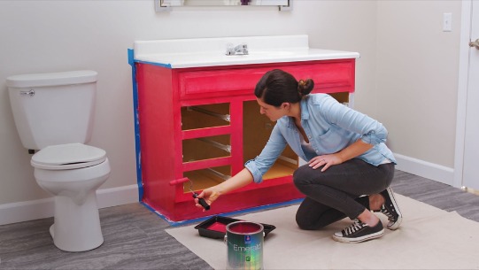
Some DIY projects require brushes and rollers.
Why Paint Rollers Matter
Paint rollers are designed to hold and distribute paint evenly, making them the perfect tool for painting walls, ceilings, and other broad surfaces. They reduce streaks, help you work faster, and can even add texture when used creatively.
Choosing the Right Roller
Not all rollers are created equal. Here’s a quick guide to help you pick the perfect one:
Foam Rollers – Ideal for ultra-smooth surfaces and glossy finishes.
Nap Rollers – Available in different thicknesses (or “nap” sizes). A thicker nap (like ¾”) is great for textured walls, while a thinner nap (like ¼”) works best on smooth surfaces.
Microfiber Rollers – Perfect for minimal splatter and maximum coverage, making them a favorite for DIY painters.
Pro Tips for Using a Paint Roller
Load Properly – Roll it in the tray and make sure it’s evenly coated but not dripping.
Use the “W” Technique – Start by rolling in a “W” shape to distribute the paint, then fill in the gaps.
Avoid Over-Rolling – Too many strokes over the same spot can leave unwanted texture or uneven coverage.
Keep It Clean – Rinse your roller after use and store it properly for future projects.
Elevate Your Painting Game
A great roller can make all the difference in your painting experience. Whether you’re revamping a room or tackling a big project, choosing the right roller ensures a smooth, professional-looking finish with minimal effort.
So next time you’re gearing up for a paint job, don’t underestimate this unsung hero—your walls will thank you!
Of course, you can avoid all of the hassles of rollers, brushes and sprayers by giving us a call, 541-497-3804
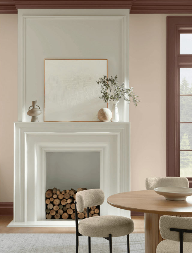
According to Sue Wadden, Director of Color Marketing at Sherwin-Williams, “Like a blanket of understated elegance, Sand Dollar inspires us to sit back, relax and indulge in cozy quietude.”
Find calm in the chaos with soothing Sand Dollar.Pair the inviting neutral with deep earthen browns and soft creamy whites.The comforting hue goes seamlessly with various wood tones and accent colors, bringing out natural grains and a sense of continuity.
Ready to transform your interior with Sand Dollar? Call Mike 541-497-3804
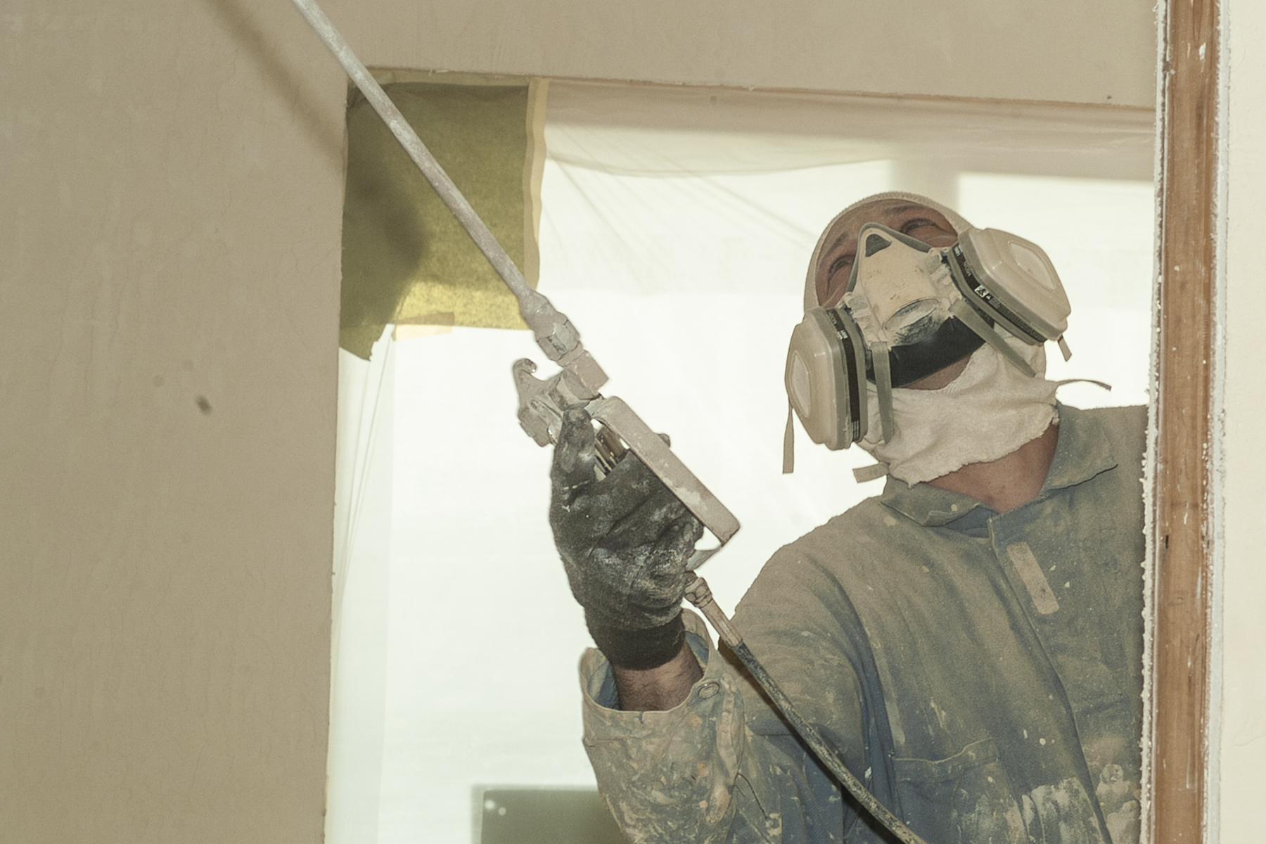
I recently had a friend get very sick with pneumonitis caused by spraying penetrating oil on a neighbors deck without using the proper safety equipment.
In previous blog posts we have mentioned the dangers of falling from ladders and roof tops when attempting to paint your own structures. Exposure to painting products can pose just as serious a risk. Here at Paint Doctor’s Painting, our combined training and experience makes us experts at safely handling a large variety of painting products.
Many of the products we use are atomized and airborne during application (that is, sprayed). Once applied, they form very resilient protective coatings, which are perfectly safe for our customers and their pets. However, when in spray form, they can penetrate respiratory tissues, eyes and skin and do some serious damage if not handled with proper safety equipment.
Safety first. Leave it to the experts at Paint Doctor’s Painting, 541-497-3804.