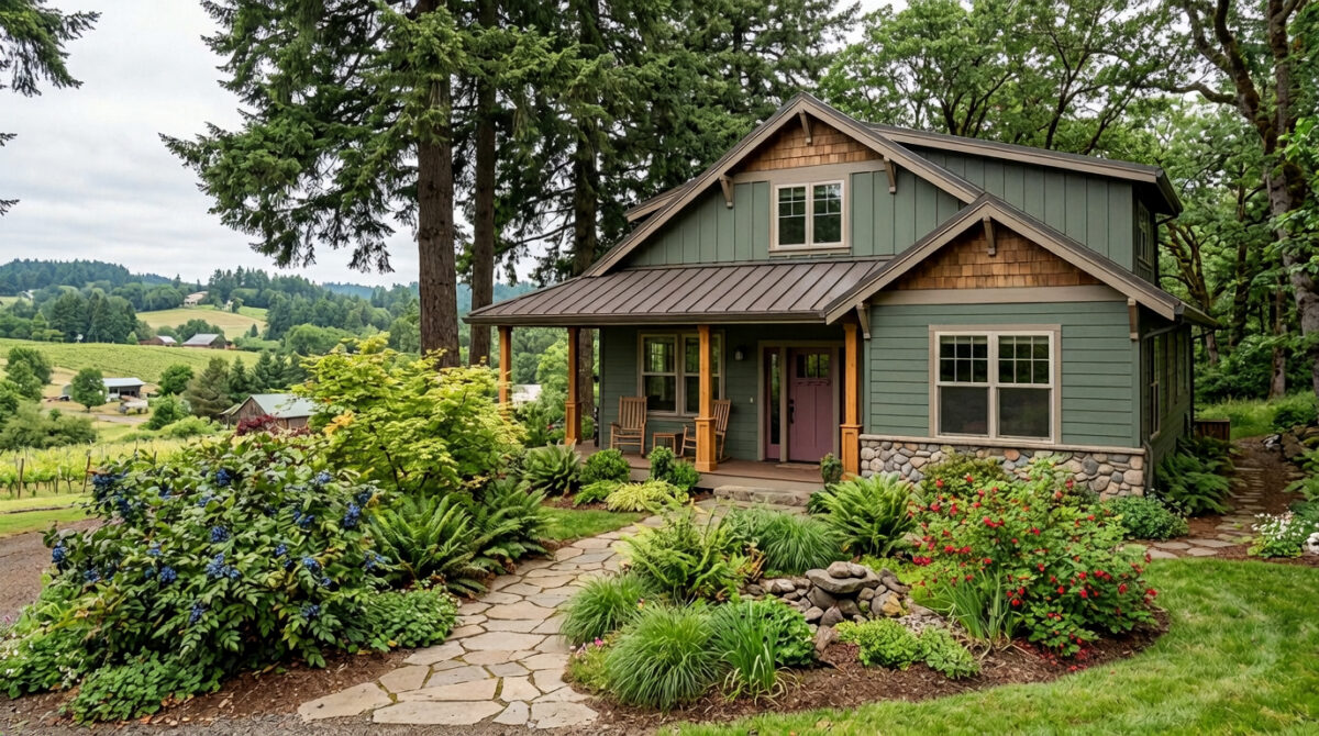
Rooted in the Valley: How to Choose Exterior Paint Colors That Complement Native Willamette Valley Landscaping

There’s something truly special about owning a rural property in the Willamette Valley. Whether your home nestles into the forested foothills near Corvallis, rests among the rolling vineyard hills outside South Salem, or sits surrounded by the oak savannas of Benton and Polk counties, your landscape is already doing the heavy lifting.

Towering Douglas firs, golden Garry oaks, lush sword ferns, and rich Oregon grape bushes give our region its iconic, timeless aesthetic. But when it comes time to paint your exterior, a common dilemma arises: How do you protect and elevate your home without making it clash against the natural environment?

For many Willamette Valley homeowners, the goal isn’t to make a house stand out like a bright beacon. It’s to make it feel like an organic extension of the land itself.

Here is our guide on selecting exterior paint palettes that blend seamlessly into native Pacific Northwest landscaping, while standing up to our unique climate.

1. Look to the Canopy: Deep Greens and Mossy Earth Tones

If your home is tucked into a grove of evergreens or surrounded by native forest, standard shades of bright green will often feel synthetic or stark. Instead, draw inspiration from the muted, complex tones found in the PNW forest floor.

  • Sages and Olive Undertones: Soft, earthy greens with grey or brown bases—such as Sherwin-Williams Dried Thyme —reflect the undersides of fern fronds and olive-hued lichen.
  • Deep Forest Darks: For modern farmhouses or rustic cedar siding, deep charcoal-greens (like Black Forest Green or Iron Ore) absorb light and allow the bright green foliage around the base of the home to pop naturally.

Local Pro Tip: Overcast Oregon skies tend to amplify blue and cool undertones in paint. Always test green shades on-site during a typical grey afternoon to ensure they don’t shift toward an unintended blue tint.

2. Harmonize with Oak Savannas: Warm Greiges and Bark Taupes

Properties across the valley floor and foothills often feature Garry oak stands, native grasses, and hazelnut or filbert orchards. During late summer and autumn, these landscapes shift to warm, golden hues.

To complement these warmer surrounding textures:

  • Rich Taupes and Warm Greiges: Colors that bridge brown and grey harmonize with oak bark and dry summer prairie grasses. Look for shades like Accessible Beige, Mega Greige, or Pashmina.
  • Earthy Trim Contrast: Pair warm neutral body paint with rich, creamy trim (rather than stark white) or dark bronze window frames to ground the architecture.

3. Accentuate Native Florals with Grounded Accent Shades

Blending into the environment doesn’t mean your home has to be plain or invisible. Your front doors, shutters, and porch accents are perfect places to pay homage to local flora:

  • Pacific Dogwood & Vine Maple: Soft off-white or muted terracotta doors capture the warmth of blooming spring dogwoods and autumn vine maple leaves.
  • Oregon Grape & Red Flowering Currant: Muted plum, deep berry, or dusty indigo accents offer a sophisticated head-nod to native berries and seasonal blooms without looking overly vibrant.

4. Don’t Forget the Oregon Weather Factor

A paint job in the Willamette Valley has to do more than look gorgeous—it has to endure our wet winters, damp shade, and hot summer sun.

  • Moisture & Mildew Resistance: Properties nestled under dense tree canopy experience prolonged moisture retention. Using premium 100% acrylic paints with built-in antimicrobial agents is essential for preventing moss, algae, and mildew growth on siding.
  • Low-Lustre Finishes: Flat, velvet, or low-sheen satin finishes absorb light rather than reflecting it, helping exterior walls blend softly into surrounding foliage. High-gloss finishes can reflect harsh glare under cloudy skies, making a home look unnatural.

Ready to Transform Your Rural Willamette Valley Home?

Whether you live in Philomath, Sublimity, Turner, Kings Valley, or anywhere between Salem and Corvallis, painting a rural acreage home requires an eye for detail and an understanding of the local landscape.

At Paint Doctor’s Painting Service, we specialize in helping homeowners choose long-lasting, weather-resistant paint systems that honor the natural beauty of the Pacific Northwest.

Thinking about updating your home’s exterior this season? Contact us today for a complimentary color consultation and detailed project estimate. Let’s make your home look like it truly belongs in the Valley. 541-497-3804
Current Trends in Exterior House Paint Colors

Current exterior house paint color trends are shifting decisively away from the stark whites and cool, blue-toned grays that dominated the previous decade. Instead, the focus is heavily centered on warm, comforting, nature-grounded palettes that blend seamlessly into the surrounding landscape.

If your painter client is looking to pitch the latest on-trend exterior schemes to homeowners, the defining color families and combinations include:

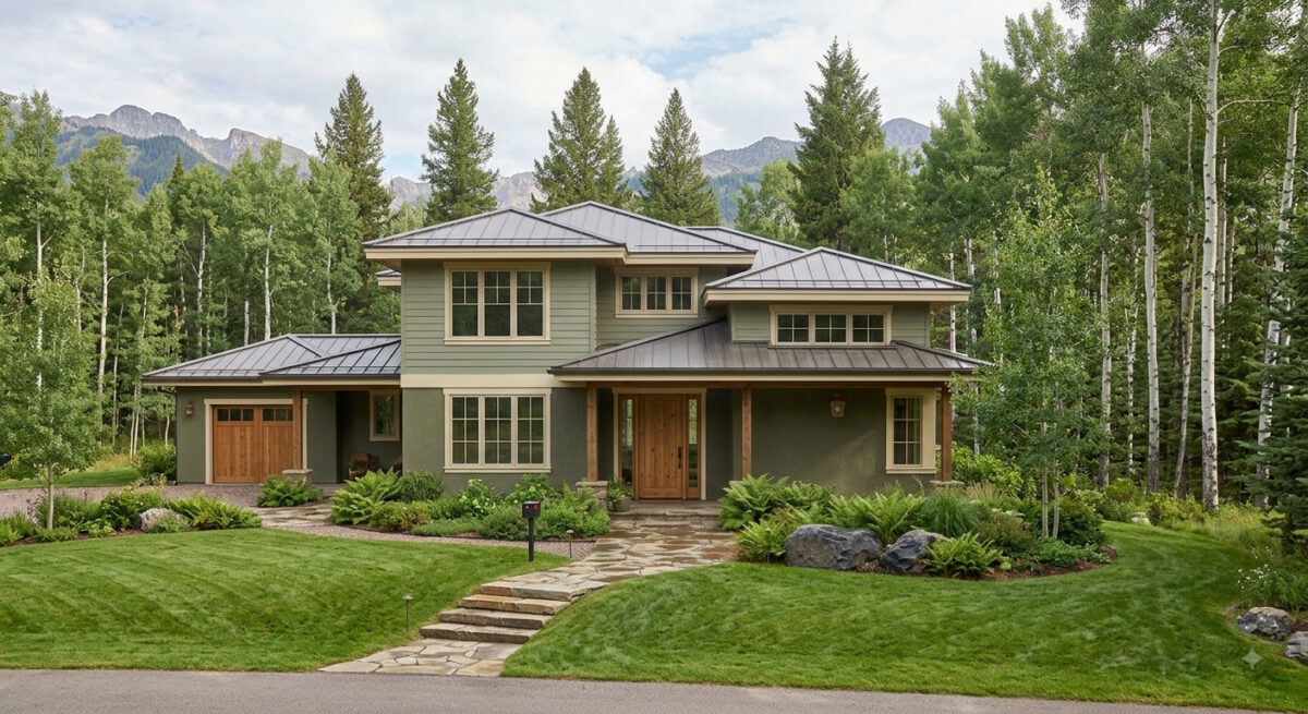
1. Earthy Sages and Olive Greens

Organic, nature-inspired greens have emerged as a breakout trend. Homeowners are choosing these colors because they feel sophisticated, calming, and deeply connected to the environment.

  • The Scheme: Sages and deep olives are typically used for the body of the house, paired with soft cream or warm white trim, and accented by natural wood elements (like a cedar front door).
  • Top Pick: Sherwin-Williams Evergreen Fog

2. Creamy, Warm Neutrals (The New Minimalist Look)

While the high-contrast modern look is still incredibly popular, stark, sterile whites are being replaced by softer, richer variants like cream, greige, and warm khaki.

  • The Scheme: A warm white or greige body paired with sharp, contrasting dark charcoal or bronze trim. This preserves the clean aesthetic of the modern farmhouse or contemporary home while feeling much more inviting.
  • Top Picks: Sherwin-Williams Alabaster, Sherwin-Williams Universal Khaki

3. Warm Charcoals and Espresso Browns

For homeowners wanting a dramatic, dark exterior, cool slate grays have taken a backseat to deeply saturated dark hues with brown or warm undertones.

  • The Scheme: Using a rich charcoal or “near-black” as the primary body color. These are heavily accented with warm wood siding segments, brass house hardware, or soft, warm white trim to keep the look from feeling too surgical.
  • Top Pick: Sherwin-Williams Urbane Bronze

4. Clay, Terracotta, and Desert Tones

Particularly strong in warmer regions or on stucco, Mediterranean, and Southwest-style homes, earthy desert tones are making a noticeable comeback.

  • The Scheme: A muted terracotta or warm ochre clay body paired with dark black or bronze trim and iron hardware to ground the warmth.
  • Top Picks: Sherwin-Williams Cavern Clay or Rookwood Terra Cotta.

5. Classic Coastal Blues

A perennial favorite that remains highly requested across traditional and colonial architecture.

  • The Scheme: Saturated navy on the main siding. The current trend pairs navy with soft ivory or cream trim rather than standard bright white, which gives the exterior a more high-end, classic feel.
  • Top Pick: Sherwin-Williams Naval.

Call us at 541-497-3804

Transform Your Space with Sherwin-Williams August 2026 Color of the Month: Pennywise (SW 6349)

Bring warmth, personality, and grounding energy into your home this late summer with Sherwin-Williams’ August 2026 Color of the Month: Pennywise (SW 6349). At Paint Doctor’s Painting Service, we love helping homeowners transform their spaces with color choices that feel both modern and timeless.

Why We Love Pennywise (SW 6349)

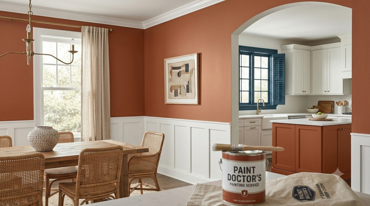
Pennywise is a rich, sun-baked terracotta neutral featuring soft clay undertones. It bridges the gap between vibrant warmth and earthy subtlety, making it an ideal choice for creating inviting, cozy interiors.

  • Versatile Tone: Works beautifully as an accent wall or across entire living rooms, dining spaces, and kitchen islands.
  • Organic Aesthetic: Aligns seamlessly with modern handcrafted design, natural woods, and woven textures.
  • Comforting Aura: Delivers a sophisticated, lived-in feel without overpowering the room.

Winning Color Palettes & Pairings

To highlight the warmth of Pennywise, contrast it with cool tones or crisp whites for a balanced aesthetic:

  • Pure White (SW 7005): Creates a clean, uplifting contrast on surrounding walls, trim, or ceilings to keep the space feeling bright and modern.
  • Bunglehouse Blue (SW 0048): Adds deep, dramatic sophistication. Use it on window trim, cabinetry, or exterior shutters to offset Pennywise’s earthy warmth.
  • Natural Elements: Pair with warm wood finishes, aged brass hardware, and greenery to accentuate its organic terracotta undertones.

Best Places to Use Pennywise in Your Home

  • Kitchen Island Accent: Paint your island base with Pennywise while keeping cabinets light for an instant, high-end focal point.
  • Dining Room Walls: Wrap your dining room in this inviting shade to create a intimate space for gatherings.
  • Front Door & Exterior Accents: Give your home’s entryway a memorable curb appeal boost with a terracotta touch that welcomes guests.

Let Paint Doctor’s Painting Service Bring Your Vision to Life

Achieving a smooth, flawless finish with rich terracotta tones requires proper surface preparation and professional application. Whether you want a single accent wall or a full interior overhaul, Paint Doctor’s Painting Service is here to deliver exceptional results. Contact us today to schedule your consultation and bring the warmth of Pennywise into your home! 541-497-3804
April 2026 Color of the Month: Grape Mist

When most people think of purple tones, they picture bright floral patterns or a child’s bedroom. But in the world of high-end interior design and professional painting, those hues have grown up.

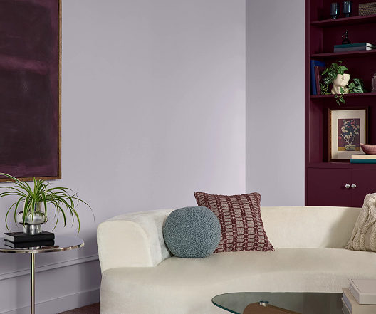
This month, we are highlighting Grape Mist—a hue so refined it acts as a “near-neutral.” Think of it as a gray with a secret; it provides the calm of a cool neutral that keeps a room from feeling clinical.

According to Sherwin-Williams, “From eclectic, open-concept homes to a child’s playroom, Grape Mist is perfectly suited for large or small applications. Thanks to its cool undertone, this soft lavender has an ethereal, dream-like quality that’s perfect for unplugging from the digital world. Whether you use it in a bedroom, powder room or beyond, this soft, playful hue will surely elevate your spaces to approachable luxury.”

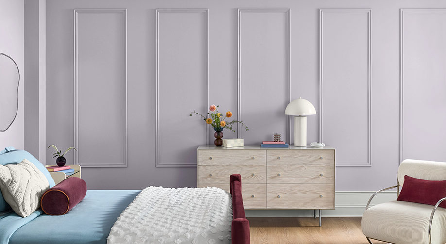
Grape Mist is a soft lavender which works well in this bedroom.
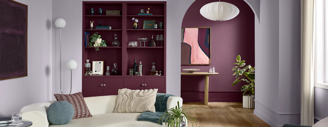
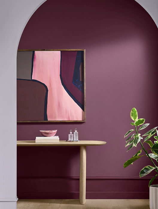
Paired with deeper purple and art with bold colors, Grape Mist can move you out of your beige mood.
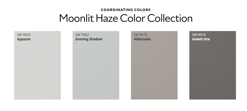
Coordinating colors that go with the subtle lavender called Grape Mist.

If you’re looking to bring a sense of calm and modern elegance to your next project, Grape Mist might be the perfect fit. Give us a call for a color consultation, and let’s see how this shade looks on your walls, 541-497-3804
March 2026 Color of the Month

Halcyon Green

Create spaces that prioritize purpose with this soothing, misty green.

This green is a great accent color for this kitchen island back and the mud room cubby.

“Reminiscent of serene, misty mornings, Halcyon Green is a response to our need for restorative retreats. This paint color’s cool, subtle blue-gray undertone breathes whispers of quiet elegance, turning any space into a functional sanctuary. From the bedroom to the mudroom and every room in between, this understated color grounds homes with natural elements, welcoming you to a world of creature comforts and lived-in luxe,” according to Sherwin-Williams.


modern kitchen island with bar stools and aqua green back panel
mud room cubby in seafoam green
Colors that go well with Halcyon Green.

Your color choices are coming together, now it’s time to schedule the Paint Doctor to get the job done right! 541-497-3804
Coral Island: February 2026 Color of the Month

“Capture the essence of sun-kissed style with a shade that’s equal parts soft and serene.”

Kitchen cabinets in Coral Island.

Call us about painting your space in whatever color you choose, 541-497-3804
Northern Exposure

Here in the Willamette Valley mildew can form on the north side of houses due to the lack of direct sunlight, which keeps the surface cooler and moister. Less sunlight means slower evaporation, which helps the surface stay damp longer promoting mildew growth. Mildew mitigation is an important step when preparing to paint the exterior of your home. One solution? Wash with a solution of TSP.

stiff brush with long handle in TSP solution Paint Doctor's Painting instruction on mitigating mildew
Brushing TSP solution on north facing siding
Using garden hose to clean siding in preparation for paint.

TSP Safety

  • Protective gear: It’s a good idea to wear eye protection, chemical-resistant gloves, and long sleeves and pants.
  • Ventilation: Ensure the area is well-ventilated, especially when working indoors.
  • Protect surfaces: TSP can damage some surfaces, including metal fixtures and glass. Use plastic sheeting to protect areas you do not want to clean.
  • Mixing: Add TSP powder to warm water, not the other way around, to prevent splashing. Typical dilutions range from 1/4 to 1/2 cup of TSP per gallon of warm water, depending on the job.
  • Rinse thoroughly: After cleaning, rinse the surface multiple times with clean water to remove all TSP residue. If not completely rinsed, it can leave a white film.
  • Protect landscaping: If using TSP outdoors, take care to protect plants from runoff by hosing them down with fresh water both before and after applying the solution. 

Quietude

Within a palette of hushed tones, the HGTV 2025 Color of the Year, Quietude, finds its power in its transcendent tranquility. A soft sage with a whisper of blue influence, Quietude is an emerging color for enduring design and soothes any space inside or out.

Subtle seafoam green applied to bathroom vanity.

Check out how designers used this color in a variety of settings.

wainscot, raided panels and double doors
great cabinet color
seafoam green chest of drawers
entry door in seafoam green

Let us know if Quietude is your color! Mike 541-497-3804.

The Curb Appeal of Fresh Paint

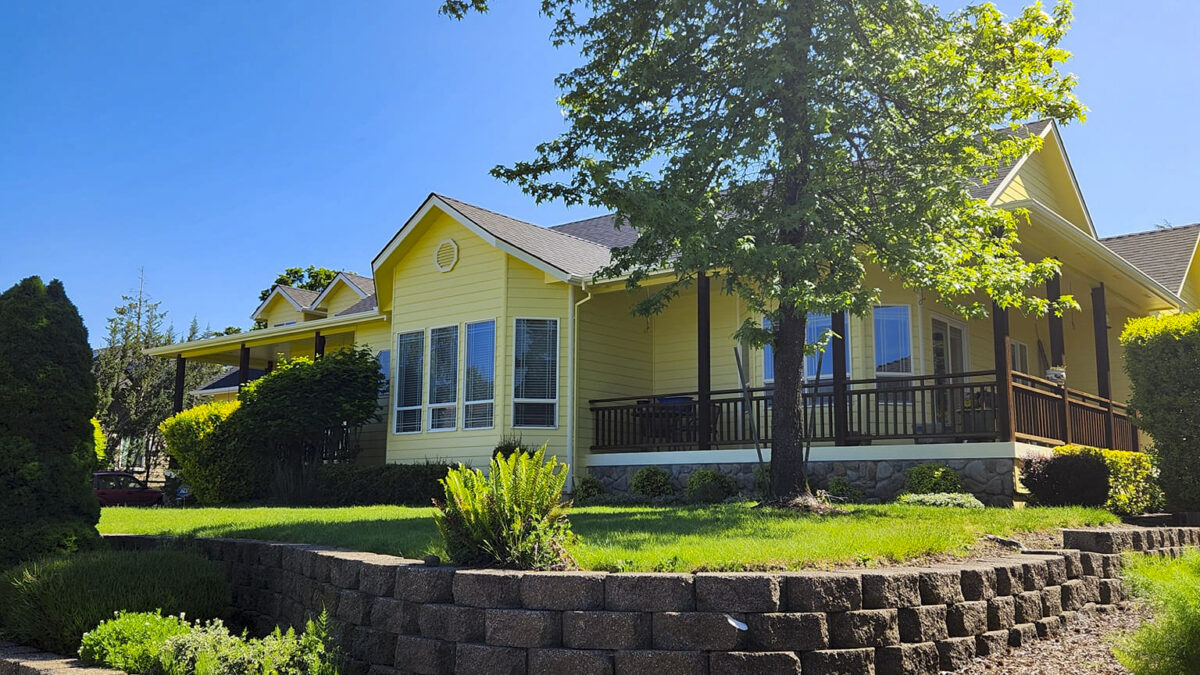
First impressions matter—especially when it comes to your home’s curb appeal. Whether you’re looking to increase property value, attract potential buyers, or simply take pride in your residence, a fresh exterior paint job can completely transform the way your home is perceived.

The Power of a Fresh Coat

Over time, exposure to the elements can make exterior paint fade, crack, or peel. A new paint job instantly revitalizes your home, giving it a clean, polished look that makes it stand out in the neighborhood.

Benefits of a Well-Painted Exterior:

  • Boosts Property Value – Homes with updated exteriors tend to sell faster and at higher prices.
  • Enhances Visual Appeal – A fresh color scheme can modernize your home and complement its architecture.
  • Protects Against the Elements – High-quality paint acts as a barrier against moisture, UV rays, and other environmental factors that can cause damage.

Choosing the Right Color

Selecting the perfect exterior color is key to maximizing curb appeal. Neutral tones like greys, beiges, and whites provide timeless elegance, while deeper hues like navy or forest green add sophistication. Want a pop of personality? A bold front door can make a memorable statement.

A Small Investment with Big Results

Refreshing your home’s exterior paint is one of the most cost-effective ways to enhance curb appeal. It’s a project that makes an immediate impact while protecting your home for years to come.

If your home’s exterior is looking tired, a fresh coat of paint could be the perfect solution. Ready to transform your curb appeal?

Sheen

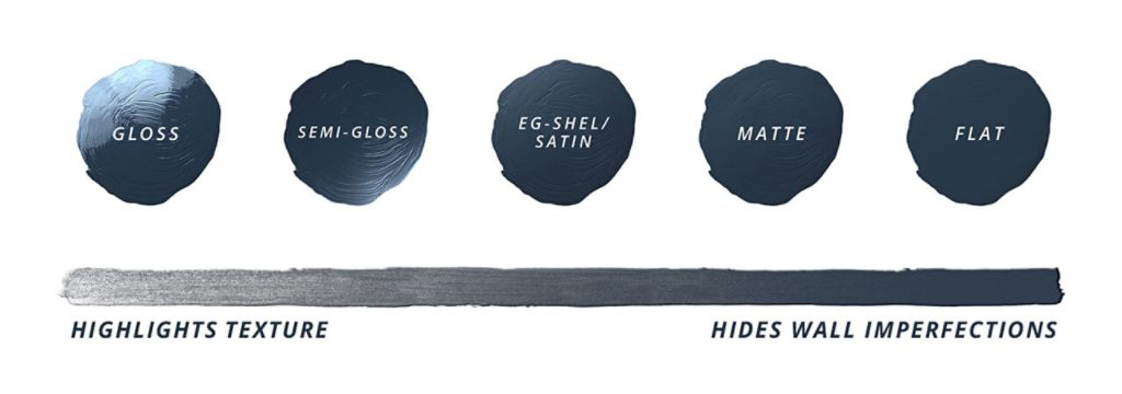
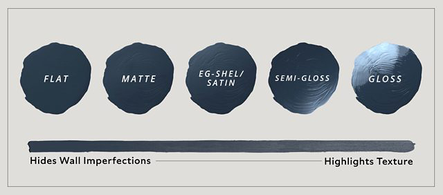
You’ve finally narrowed down your paint colors, and now you must make another decision – it’s time to choose a sheen.


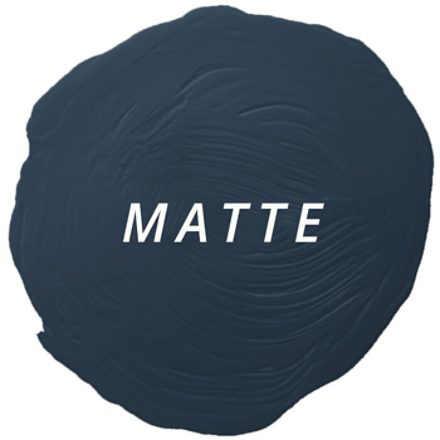
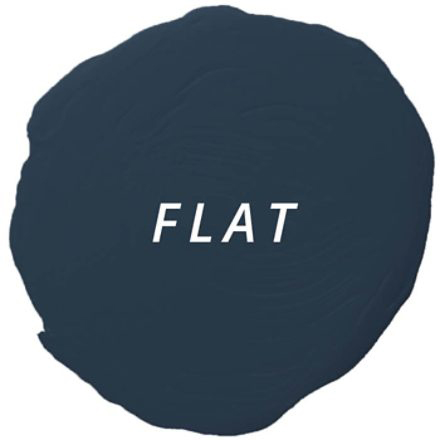
A non-reflective sheen that helps hide surface imperfections, making walls appear smooth. Visually this finish smooths walls that are dented or rough. However, it can be harder to clean. Best for:

Adult bedrooms
Formal Living Rooms
Ceilings
Uneven or textured walls
This flat finish is great for hiding surface imperfections, while its angular shine helps make walls smooth and washable. Use this sheen for:

Living rooms
Dining rooms
Exterior siding
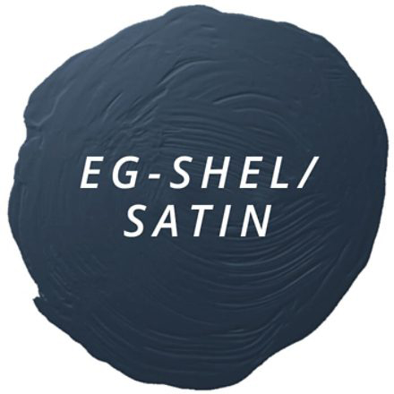
With a slight shine, Satin and Eg-Shel finishes offer a richer look. Washability makes these sheens ideal for high-traffic areas most likely to attract nicks and scuff marks such as:

Hallways
Woodwork
Children’s bedrooms
Family rooms
Exterior surfaces
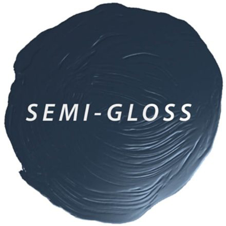
This moderately reflective, durable finish is perfect for areas that get cleaned frequently, such as:

Kitchens
Bathrooms
Utility area
Closet doors
Trim
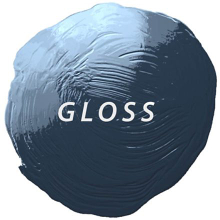
Gloss sheens have higher light-reflective characteristics. This shiny, durable finish works great for any element of a room you would like to highlight such as:
Wood trim
Cabinets
Doors
Furniture

If you have questions about choosing the sheen of paint to use for interior or exterior finishes, give us a call at 541-497-3804.