
If you’re looking to refresh your home’s interior with a color that feels both modern and timeless, it’s time to take a look at Sashay Sand (SW 6051). Celebrated as a standout Sherwin-Williams Color of the Month, this stunning shade is redefining how we think about neutrals.
As professional painters, we see a lot of paint colors. For years, cool grays and crisp whites dominated the scene. But lately, homeowners are craving warmth, comfort, and personality. Sashay Sand delivers exactly that.
Here is why this blushing neutral is capturing everyone’s attention—and how you can use it to transform your space.

What Makes Sashay Sand So Special?
Sashay Sand isn’t just another beige, and it isn’t a loud, bright pink. It sits perfectly in the middle: a sophisticated, blushing taupe-pink with a Light Reflectance Value (LRV) of 49.
In plain English? It’s right in the sweet spot. It is deep enough to contrast beautifully against white trim, but light enough to bounce natural sunlight around a room, making spaces feel open, airy, and incredibly welcoming. It brings a “dreamy nostalgia” to a home, blending vintage charm with clean, modern minimalism.
The Best Spaces for Sashay Sand
While this color is incredibly versatile, our crew has seen it absolutely shine in a few specific areas of the home:
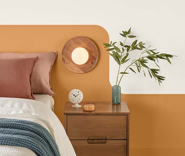
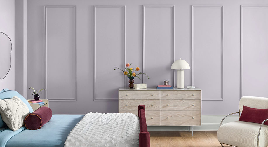
- The Owner’s Suite: Bedrooms should be a sanctuary. Sashay Sand creates a calming, spa-like atmosphere that feels cozy at night and bright in the morning.
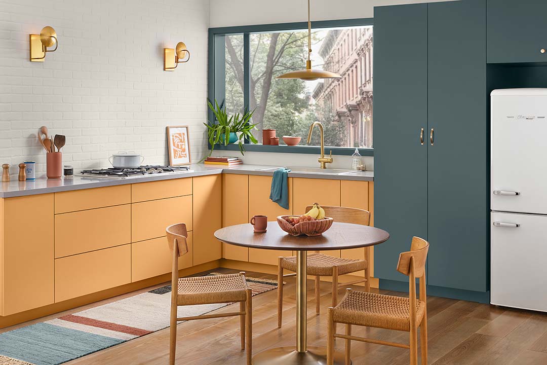
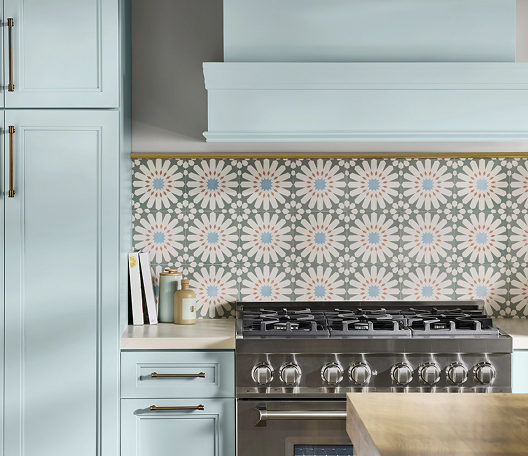
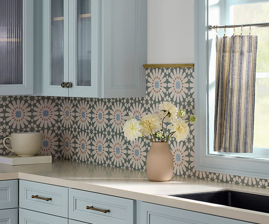
- The Kitchen & Dining Area: Want a kitchen that feels warm and conversational? Pairing Sashay Sand walls with crisp white or deep earthy cabinetry creates a high-end, designer look.
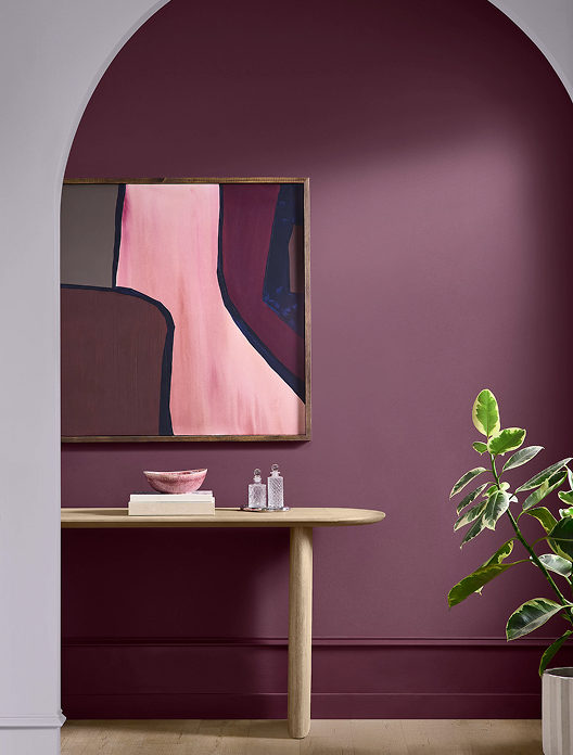
- Powder Rooms & Accent Walls: If you’re hesitant to commit an entire large room to a blush tone, a powder room or a feature wall is the perfect place to inject this sophisticated pop of color.

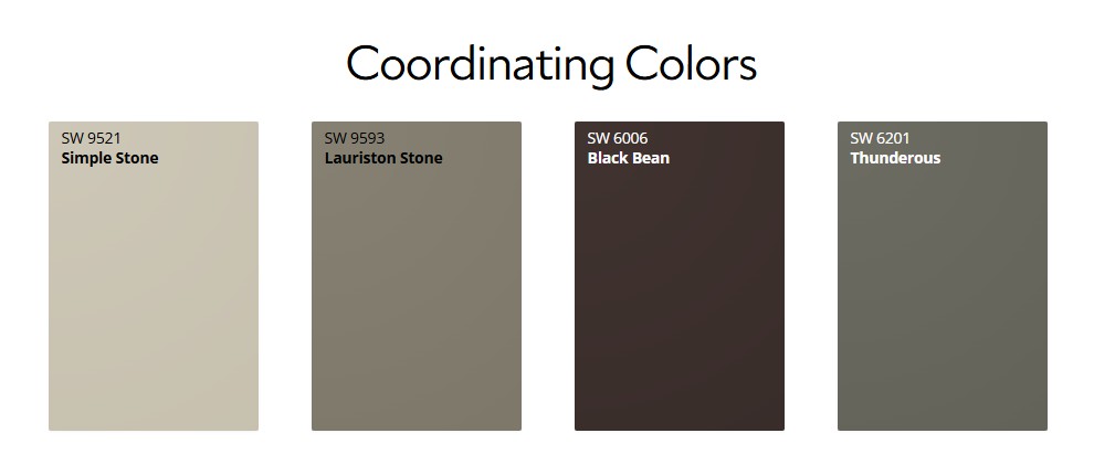
Designer-Approved Color Pairings
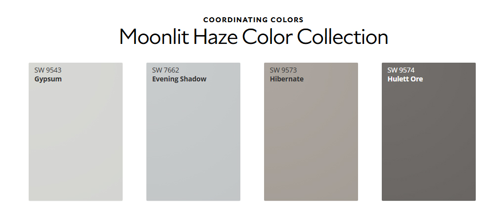
One of the reasons we love working with Sashay Sand is how beautifully it plays with other shades. If we were designing a palette for your home, we’d recommend pairing it with these Sherwin-Williams classics:
- For a Clean, Classic Look: Pair it with White Snow (SW 9541) on the trim and ceilings to make the blush undertones pop.
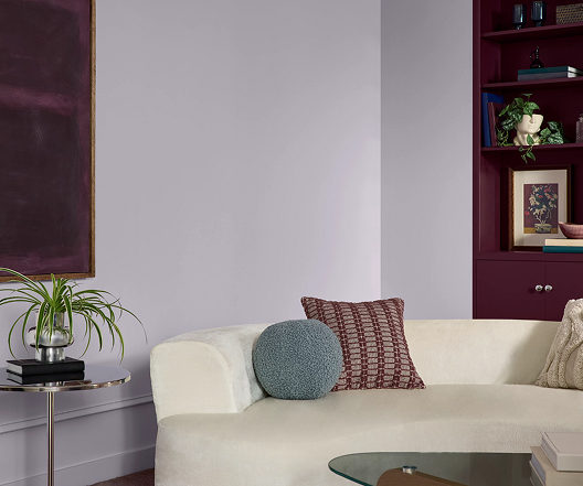
- For Modern Contrast: Combine it with Silver Gray (SW 0049) or Twilight Gray (SW 0054) for a stunning, balanced contrast between warm and cool tones.
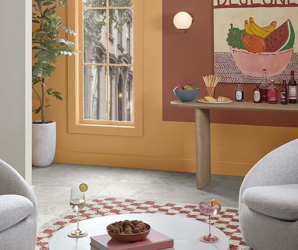
- For a Bold, Earthy Vibe: Bring in Cascade Green (SW 0066) on an accent piece or an adjacent room to ground the space in a nature-inspired aesthetic.
Why Professional Application Matters for Shades Like This
Colors with subtle pink, taupe, or beige undertones can be notoriously tricky. Depending on your room’s lighting—whether you have cool northern light or warm afternoon sun—Sashay Sand can shift characters throughout the day.
Furthermore, achieving a flawless finish with soft, elegant neutrals requires meticulous wall preparation, the right primer, and clean, sharp cut-ins along the trim. That’s where we come in. Our experienced team doesn’t just apply paint; we ensure the substrate is perfect so the color looks exactly as the designers intended.
Ready to Refresh Your Space?
Whether you’re completely sold on Sashay Sand or want to see how a physical swatch looks on your walls, we are here to help. Let’s bring a touch of warm, modern sophistication to your home.