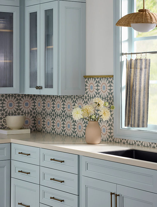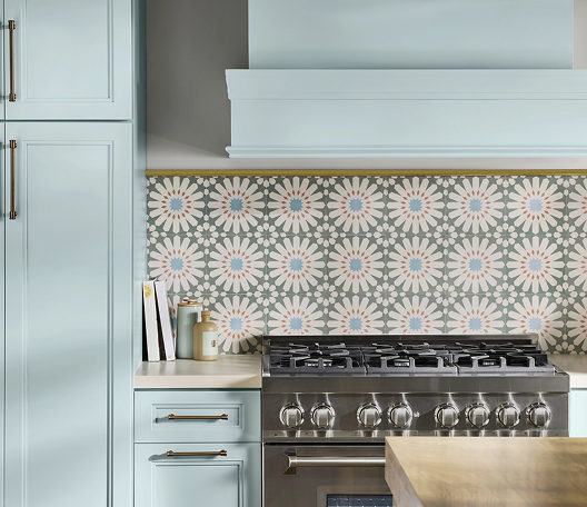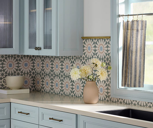
Color Spotlight: Why Sherwin-Williams Drift of Mist (SW 9166) is the Ultimate Light Neutral

Meta Description: Looking for the perfect airy neutral? Discover why Sherwin-Williams Drift of Mist (SW 9166) was named February 2024 Color of the Month and how Paint Doctor’s Painting Service can bring it to life in your home!

If you’ve been searching for a wall color that feels bright and open without looking like a sterile hospital room, you’re not alone. Finding that sweet spot between clean white and oppressive gray can feel nearly impossible—until you meet Sherwin-Williams Drift of Mist (SW 9166).

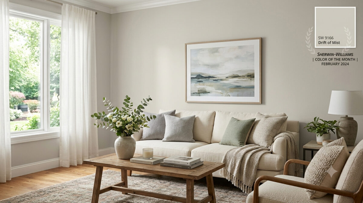
Selected as the Sherwin-Williams Color of the Month for February 2024, Drift of Mist is one of the most versatile, inviting neutrals on the market. At Paint Doctor’s Painting Service, our professional team has applied this timeless shade across countless homes, and it continues to be a client favorite.

Here is everything you need to know about Drift of Mist and how to use it to elevate your space.

What Makes Drift of Mist (SW 9166) So Special?

Drift of Mist is an off-white warm gray (often described as a light greige). It bridges the gap between modern cool tones and cozy warm tones, giving you maximum flexibility with your interior design.

Quick Color Specs

  • Color Code: SW 9166
  • Light Reflectance Value (LRV): 69 (Light and airy, bounces natural light without washing out completely)
  • Undertones: Soft, muted green and gray with gentle warmth
  • Vibe: Calm, serene, and sophisticated

How Light Affects Drift of Mist

Like any great neutral, Drift of Mist is a chameleon—it shifts subtly depending on the lighting in your room:

  • South-Facing & West-Facing Light: Warm afternoon sunlight brings out its cozy greige undertones, making the space feel inviting and soft.
  • North-Facing Light: Cooler, indirect light highlights its crisp gray side, giving it a sleek, modern finish.
  • Warm Artificial Lighting (2700K–3000K): Enhances the soft, beige nuances, perfect for cozy evening relaxation.

Best Rooms for Drift of Mist

Because of its high LRV and quiet character, Drift of Mist works almost anywhere, but it truly shines in these areas:

1. Open-Concept Main Floors & Hallways

If you want a seamless flow from your entry to your living and kitchen areas, Drift of Mist provides a cohesive backdrop that unifies different spaces without overpowering them.

2. Bedrooms & Spa-Like Bathrooms

Pair Drift of Mist with crisp white linens, light wood vanities, and brushed metal fixtures to create a calming, hotel-inspired retreat.

3. Kitchen Walls & Custom Cabinetry

On walls, it lets white tile and dark stone countertops pop. On kitchen cabinets, it provides a soft, warm alternative to stark white, creating a custom, high-end feel.

Perfect Color Pairings

Pairing neutrals requires an eye for undertones, and Drift of Mist coordinates effortlessly with a variety of accent shades:

  • Crisp Trim Whites: Pure White (SW 7005) or High Reflective White (SW 7757).
  • Soft Earthy Accents: Sea Salt (SW 6204) or Evergreen Fog (SW 9130) for a natural, coastal-inspired palette.
  • Bold Contrast: Iron Ore (SW 7069) or Naval (SW 6244) for built-ins, kitchen islands, or interior doors.

Bring Your Dream Palette to Life with Paint Doctor’s Painting Service

While Drift of Mist is an exceptionally easy color to love, getting a flawless, smooth coat requires professional skill—especially with subtle off-white tones where prep work and finish consistency are key.

Whether you want to refresh a single room, repaint your kitchen cabinets, or update your entire home’s exterior, Paint Doctor’s Painting Service is here to handle every step of the process.

  • Flawless Wall & Trim Prep
  • Clean, Precision Edges
  • Premium Sherwin-Williams Paints
  • Free Consultation & Quotes

Ready to Refresh Your Home?

Don’t guess with paint samples—let our experts deliver the flawless finish your home deserves!

📞 Call Paint Doctor’s Painting Service today to schedule your consultation, 541-4973804

Why Our Painting Crews Love Working in Brownsville, Oregon

Last Updated: July 17, 2026

In Short (TL;DR): Painting in historic Brownsville, Oregon is uniquely rewarding because of its beautifully preserved Victorian and Craftsman architecture, its rich local film history (like the setting of Stand by Me), and the welcoming, preservation-minded community that takes deep pride in maintaining their homes.

What Makes Brownsville, Oregon’s Historic Architecture Unique?

Brownsville boasts some of the best-preserved late 19th and early 20th-century architecture in the Willamette Valley, featuring ornate Queen Anne Victorians and earthy Craftsman bungalows. For painting contractors, these homes offer a masterclass in restorative craftsmanship, requiring precise wood preparation, historical color palette matchmaking, and heavy-duty weatherproofing to withstand wet Pacific Northwest winters.

How Does Film History Influence Brownsville’s Charm?

Brownsville is famous for portraying the fictional town of Castle Rock in the iconic 1986 film Stand by Me. This cinematic history has fostered a deep community pride in local preservation, as seen in the beautifully maintained Main Street storefronts and the famous, preserved hand-painted Coca-Cola mural downtown. Painting here means helping to keep a slice of American film history vibrant and alive.

Victorian vs. Craftsman: How We Approach Painting Historic Homes

Because historic homes require tailored techniques, our crews treat each architectural style with its own set of rules:

Architectural StyleKey Focus AreasHistoric Color Palette
Victorian (Queen Anne)Ornate gingerbread trim, fish-scale shingles, corbels.High-contrast 3-to-5 color schemes (sage, cream, rich burgundy accents).
Craftsman BungalowExposed rafter tails, heavy tapered porch columns, cedar siding.Low-contrast earthy tones (mossy greens, deep warm grays, rust accent doors).

Let’s be honest: Oregon weather can be brutal on exterior wood siding. Between our relentlessly damp winters and our hot, dry valley summers, wood expands, contracts, and fights off moisture constantly.

Working in Brownsville means we get to help homeowners protect their biggest investments. We love applying high-quality elastomeric caulks and specialized, moisture-resistant paints formulated specifically to withstand the unique climate of the Willamette Valley. There is nothing more satisfying than knowing the barrier we’ve applied will keep a beautiful historic property safe from rot and wear for a decade or more.

Give us a call, 541-497-3804

Trend Alert: Elevate Your Home with Sherwin-Williams’ Sashay Sand

If you’re looking to refresh your home’s interior with a color that feels both modern and timeless, it’s time to take a look at Sashay Sand (SW 6051). Celebrated as a standout Sherwin-Williams Color of the Month, this stunning shade is redefining how we think about neutrals.

As professional painters, we see a lot of paint colors. For years, cool grays and crisp whites dominated the scene. But lately, homeowners are craving warmth, comfort, and personality. Sashay Sand delivers exactly that.

Here is why this blushing neutral is capturing everyone’s attention—and how you can use it to transform your space.

What Makes Sashay Sand So Special?

Sashay Sand isn’t just another beige, and it isn’t a loud, bright pink. It sits perfectly in the middle: a sophisticated, blushing taupe-pink with a Light Reflectance Value (LRV) of 49.

In plain English? It’s right in the sweet spot. It is deep enough to contrast beautifully against white trim, but light enough to bounce natural sunlight around a room, making spaces feel open, airy, and incredibly welcoming. It brings a “dreamy nostalgia” to a home, blending vintage charm with clean, modern minimalism.

The Best Spaces for Sashay Sand

While this color is incredibly versatile, our crew has seen it absolutely shine in a few specific areas of the home:

  • The Owner’s Suite: Bedrooms should be a sanctuary. Sashay Sand creates a calming, spa-like atmosphere that feels cozy at night and bright in the morning.
  • The Kitchen & Dining Area: Want a kitchen that feels warm and conversational? Pairing Sashay Sand walls with crisp white or deep earthy cabinetry creates a high-end, designer look.
  • Powder Rooms & Accent Walls: If you’re hesitant to commit an entire large room to a blush tone, a powder room or a feature wall is the perfect place to inject this sophisticated pop of color.

Designer-Approved Color Pairings

One of the reasons we love working with Sashay Sand is how beautifully it plays with other shades. If we were designing a palette for your home, we’d recommend pairing it with these Sherwin-Williams classics:

  • For a Clean, Classic Look: Pair it with White Snow (SW 9541) on the trim and ceilings to make the blush undertones pop.
  • For Modern Contrast: Combine it with Silver Gray (SW 0049) or Twilight Gray (SW 0054) for a stunning, balanced contrast between warm and cool tones.
  • For a Bold, Earthy Vibe: Bring in Cascade Green (SW 0066) on an accent piece or an adjacent room to ground the space in a nature-inspired aesthetic.

Why Professional Application Matters for Shades Like This

Colors with subtle pink, taupe, or beige undertones can be notoriously tricky. Depending on your room’s lighting—whether you have cool northern light or warm afternoon sun—Sashay Sand can shift characters throughout the day.

Furthermore, achieving a flawless finish with soft, elegant neutrals requires meticulous wall preparation, the right primer, and clean, sharp cut-ins along the trim. That’s where we come in. Our experienced team doesn’t just apply paint; we ensure the substrate is perfect so the color looks exactly as the designers intended.

Ready to Refresh Your Space?

Whether you’re completely sold on Sashay Sand or want to see how a physical swatch looks on your walls, we are here to help. Let’s bring a touch of warm, modern sophistication to your home.

Getting Grounded

About Grounded

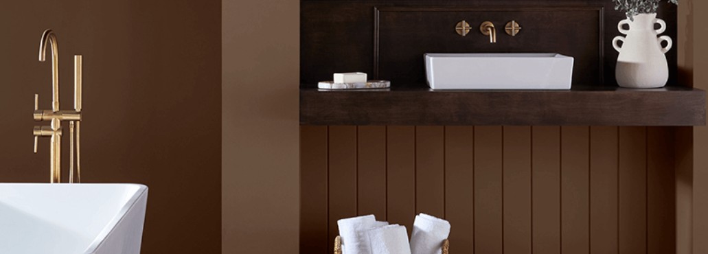
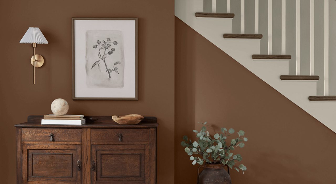
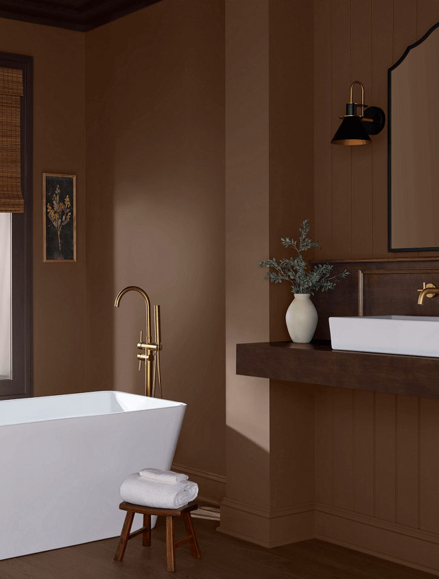
Grounded is a well-rounded hue that brings sought-after warmth to a family of versatile neutrals. In addition to its practicality, it also pairs effortlessly with a wide range of complementary shades and wood tones, making it an ideal candidate for creating cohesion and balance.

Warm chocolate brown is a good description of this versatile color.
It compliments brass and dark natural wooks

Give us a call if you are digging this chocolate color for your space, 541-497-3804

Bakelite Gold

Beaver Believers welcome original oranges to their favorite spaces.

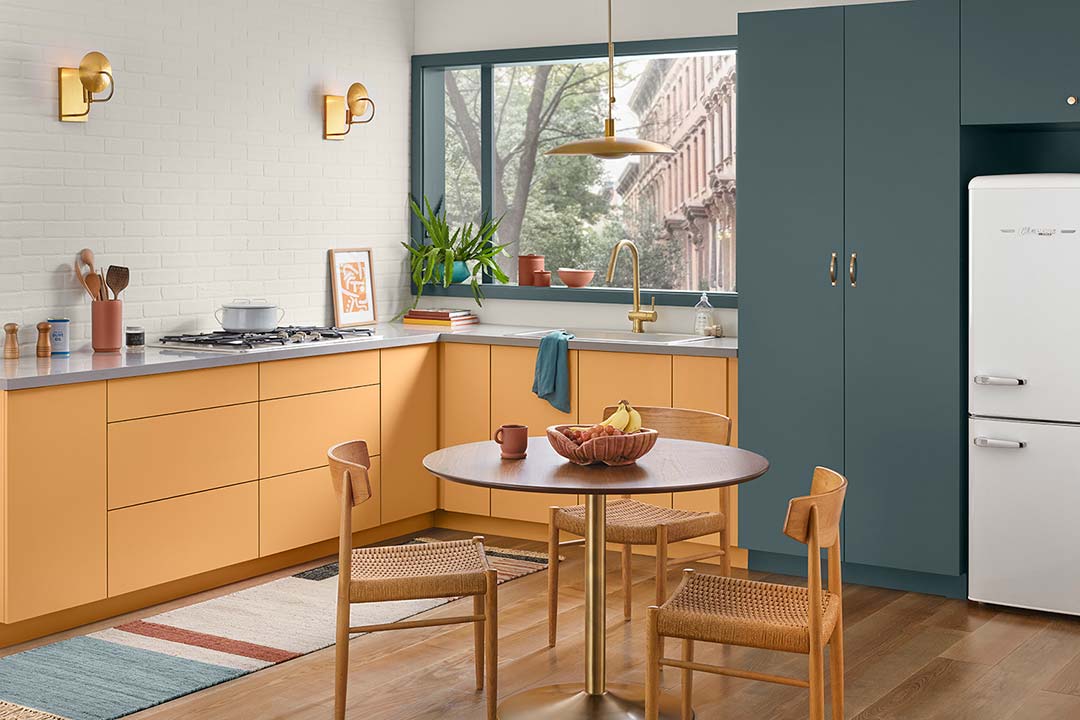
According to Sherwin-Williams, “Bakelite Gold is perfect for bringing character and warmth to a kitchen style that blends mid-century modern design with a timeless sensibility. Against a textured backdrop of aged, Alabaster brick, this happy hue grounds the modern-feeling aesthetic in a bright but earthy energy. A luxurious blue like Still Water pairs beautifully, creating a rich and intriguing contrast that pops in such a clean and simple space. The addition of bright brassy fixtures amplifies Bakelite’s shiny and positive attitude.”

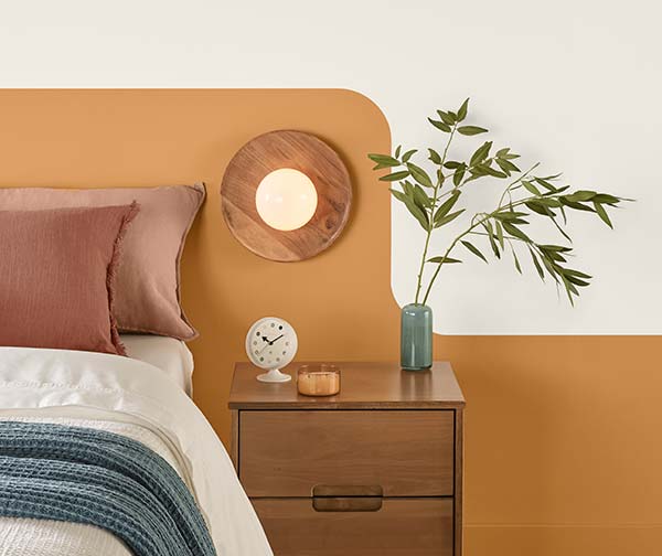
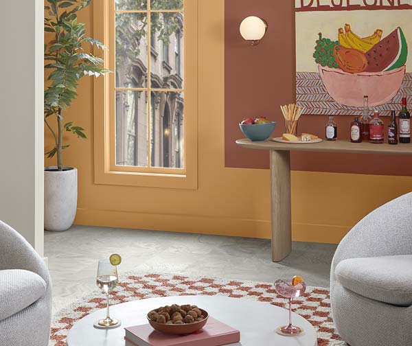
Bakelite Gold offers a great element in Environmental Graphic Design.
An accent wall can bring game days in everyday.

Give us a call for some fresh upgrades for the next phase in your life, 541-497-3804.

Tradewind

May 2026 Color of the Month

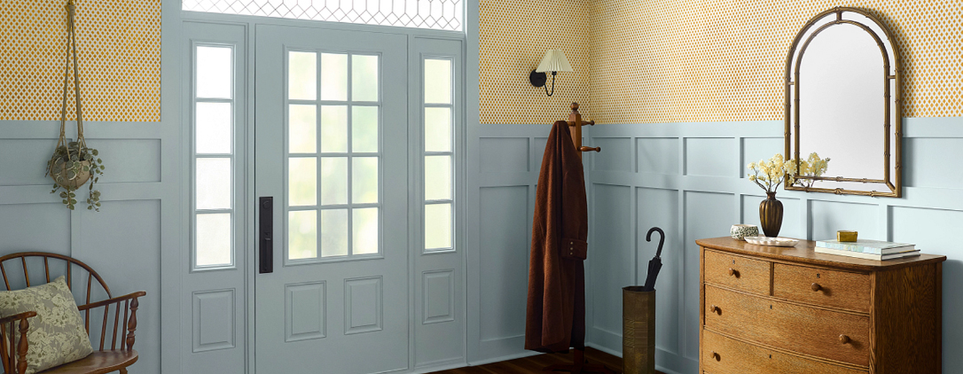
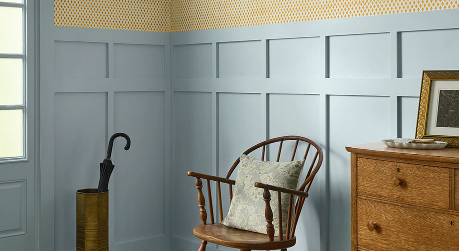
Sherwin-Williams says, “Gentle and oceanic, Tradewind is a versatile hue that can find a home in coastal or southern-inspired spaces. Subtle green undertones turn high traffic areas like kitchens and hallways into calming spaces to quickly recharge throughout the day. From balancing the wood tones in your space or giving your home a vintage charm, this tranquil blue creates harmony for timeless and trendy spaces alike.”

Let us know if we can help transform your favorite spaces with Tradewind, 541-497-3804.

Whatever Happened to Weekends?

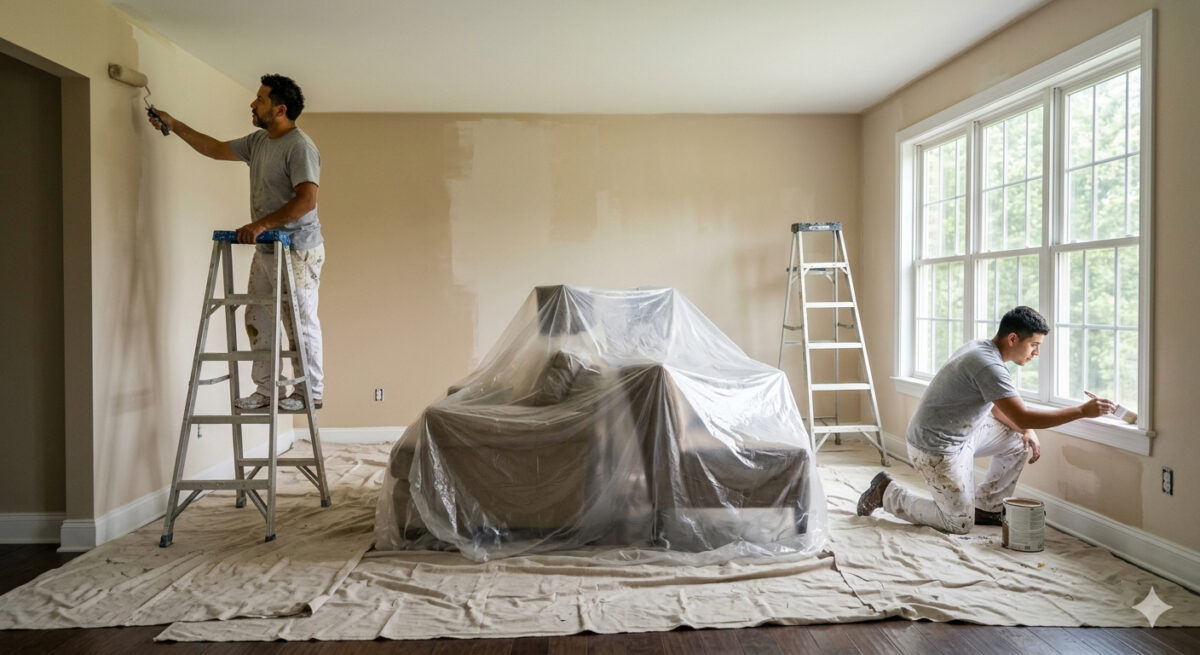
We’ve all seen the “weekend warrior” ads—the ones that make a full-house repaint look like a fun Saturday afternoon project. But as anyone who has actually tried to DIY a living room knows, the reality often involves three trips to the hardware store, paint in your hair, and a project that stretches into next month.

When you hire a professional painting contractor, you aren’t just paying for the color on the walls; you are buying efficiency.

Zero Downtime for Your Life

Your home is your sanctuary, not a construction zone. A DIY project can leave a room unusable for weeks.

The Pro Advantage: What takes a homeowner four weekends to finish, our crew can typically complete in two to three days. We get in, we move the furniture, we execute the work, and we leave your home spotless—allowing you to return to your routine immediately.

Ready to reclaim your weekend? Let us handle the logistics, the ladders, and the clean-up. Contact us today for a quote and see how efficient your next home transformation can be, 541-497-3804

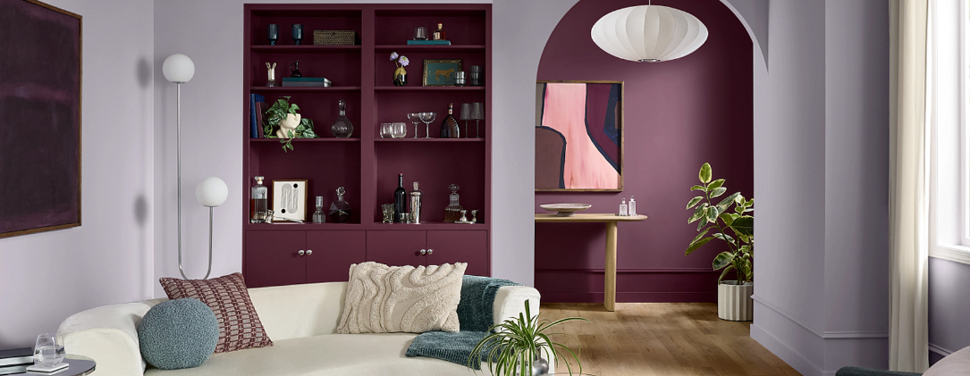
April 2026 Color of the Month: Grape Mist

When most people think of purple tones, they picture bright floral patterns or a child’s bedroom. But in the world of high-end interior design and professional painting, those hues have grown up.

This month, we are highlighting Grape Mist—a hue so refined it acts as a “near-neutral.” Think of it as a gray with a secret; it provides the calm of a cool neutral that keeps a room from feeling clinical.

According to Sherwin-Williams, “From eclectic, open-concept homes to a child’s playroom, Grape Mist is perfectly suited for large or small applications. Thanks to its cool undertone, this soft lavender has an ethereal, dream-like quality that’s perfect for unplugging from the digital world. Whether you use it in a bedroom, powder room or beyond, this soft, playful hue will surely elevate your spaces to approachable luxury.”

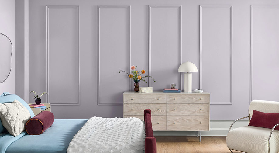
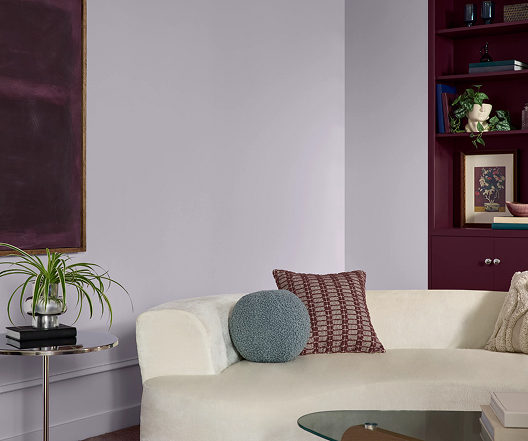
Grape Mist is a soft lavender which works well in this bedroom.
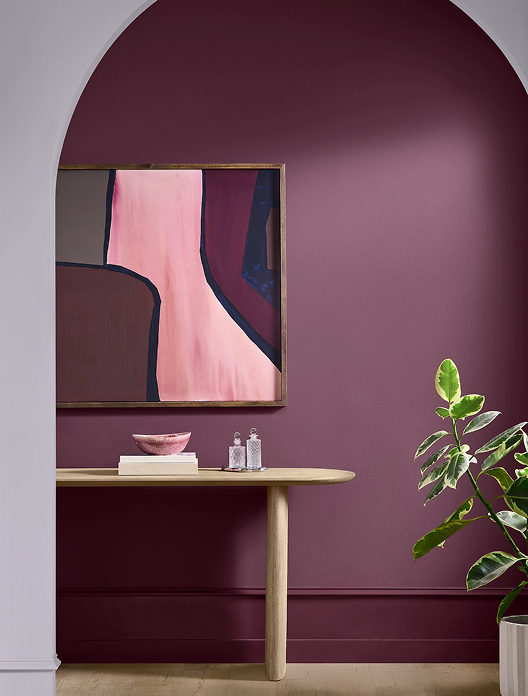
Paired with deeper purple and art with bold colors, Grape Mist can move you out of your beige mood.
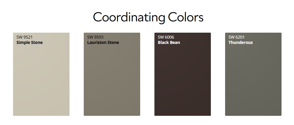
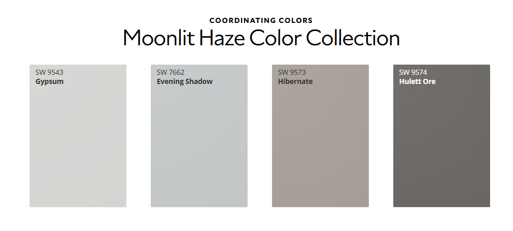
Coordinating colors that go with the subtle lavender called Grape Mist.

If you’re looking to bring a sense of calm and modern elegance to your next project, Grape Mist might be the perfect fit. Give us a call for a color consultation, and let’s see how this shade looks on your walls, 541-497-3804

Proactive Approach to Property Maintenance

Waiting until visible damage appears is a costly strategy. At Paint Doctor’s Painting, we recommend a program of proactive maintenance, ensuring your property stays resilient and valuable over time.

The Hidden Threats

External factors like moisture, fluctuating temperatures, and UV exposure constantly attack your building’s surfaces. What begins as a minor crack or fade can lead to severe structural issues, requiring costly repairs down the line.

The “Benefits Package” for Your Building

Think of professional painting as a comprehensive benefits package for your property. It provides durable weatherproofing, sealing vulnerable areas and protecting from environmental stressors. This proactive approach not only maintains your building’s appearance but actively prevents costly damage, ensuring the long-term value and integrity of your investment. It’s a shield against time.

Speaking of time, let’s schedule some to get your maintenance up to date. 541-497-3804

Weatherproofing in the Willamette Valley: A Necessity, Not a Luxury

The unique weather patterns of the Willamette Valley present distinct challenges for property owners. Persistent rainfall, frequent fog, and prolonged lack of sunlight create a constant moisture exposure environment. Then there are our winters, which really present some weather challenges.

The Silent Threats: Moss and Mildew

This persistent moisture is the perfect breeding ground for moss and mildew, especially in shaded areas. Moss can trap even more moisture against your siding and roofing, leading to premature deterioration, wood rot, and potentially structural damage.

The Solution: Specialized Weatherproofing

When it comes to the exterior of your home, a professional paint job is the best defense for your siding and trim. We use specialized coatings and meticulous preparation techniques designed for the region, creating a seal that resists moisture and inhibits moss and mildew growth. This is crucial for preserving your home’s integrity, aesthetic value and beauty.

Let’s get that exterior paint job scheduled! 541-497-3804