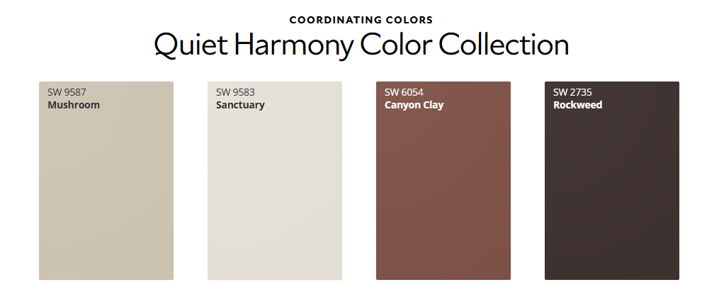
Sanderling, Color of the Month November 2026

As the crisp autumn air settles in and we begin spending more time indoors, our focus turns toward creating warm, grounded spaces for the holiday season. Sherwin-Williams’ featured Color of the Month for November 2026 is Sanderling (SW 7513)—a refined, complex taupe-beige that strikes the ideal balance between cozy warmth and modern simplicity.

If you are looking to update your home before hosting family and friends this winter, here is a professional painter’s guide on why Sanderling works so well, where to use it, and how to style it.
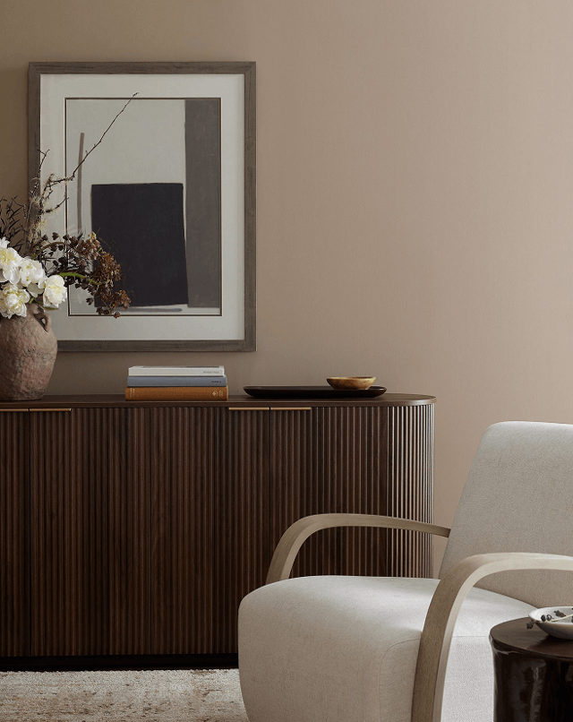
Living room wall painted in Sherwin Williams Sanderling SW 7513 warm taupe behind a fluted wooden credenza and cream accent chair
Sherwin Williams Sanderling (SW 7513) creates a rich, warm taupe backdrop paired with dark wood furniture and neutral upholstery.

What Color Is Sanderling (SW 7513)?

Sanderling is a rich greige-taupe with subtle creamy undertones. Unlike cold, sterile grays or overly yellow traditional beiges, Sanderling sits comfortably in the middle. It offers:

  • Adaptable Warmth: Adds depth without making a room feel dark or enclosed.
  • A Soft Foundation: Acts as a canvas that supports both minimalist contemporary decor and rustic, traditional woodwork.
  • Lighting Flexibility: Holds its character under morning natural light and evening warm artificial bulbs without turning muddy.
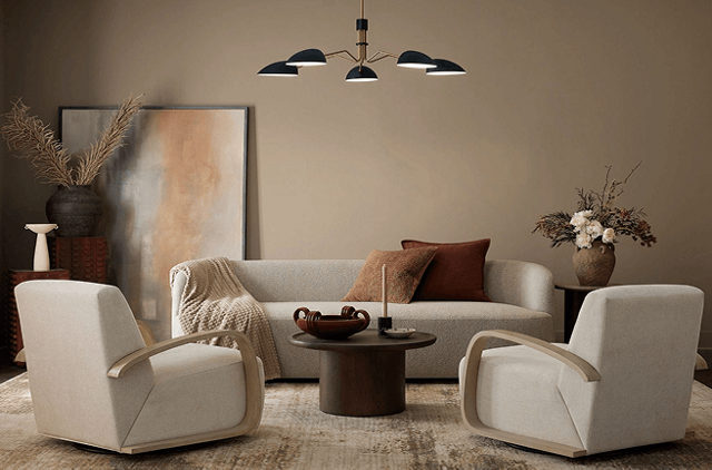
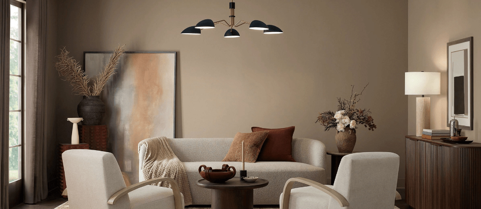
Living room interior painted in Sherwin Williams Sanderling SW 7513 featuring a light gray couch, two white accent chairs, and a modern chandelier
Warm taupe walls in Sherwin-Williams Sanderling (SW 7513) create an inviting living space paired with curved armchairs and warm earthy accents.

Best Places to Use Sanderling in Your Home

Living Rooms & Open Floor Plans
└─► Creates an inviting, cohesive backdrop that ties high-traffic family areas together.

Bedrooms & Primary Suites
└─► Delivers a calming, spa-like atmosphere perfect for unwinding during cold months.

Kitchen Cabinets & Millwork
└─► A sophisticated alternative to stark white cabinets when paired with warm brass or matte black hardware.

Home Offices & Libraries
└─► Brings a sense of quiet focus and subtle luxury to workspace walls.
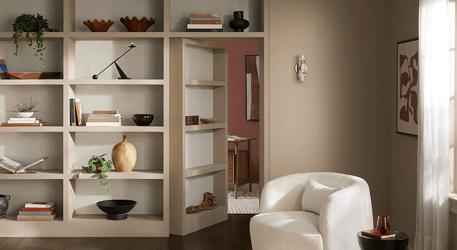
Living room wall and built-in shelving painted in Sherwin Williams Sanderling SW 7513 featuring a secret bookshelf door opening to an adjacent room
Sherwin-Williams Sanderling (SW 7513) painted across built-in shelving and walls, featuring a hidden doorway opening into an adjacent terra cotta room.

Professional Color Pairings

As painting contractors, we recommend pairing Sanderling with high-contrast or harmonious accent shades to elevate your interior:

Color RoleRecommended Sherwin-Williams ShadeWhy It Works
Clean Trim & CeilingsAlabaster (SW 7008) or Pure White (SW 7005)Soft off-whites provide crisp framing without harsh contrast.
Moody Accent WallPeppercorn (SW 7674) or Rock Bottom (SW 7062)Deep charcoal and dark olive tones create rich drama.
Earthy ComplementUniversal Khaki (SW 6150)Coordinates seamlessly with lighter tan and stone textures.

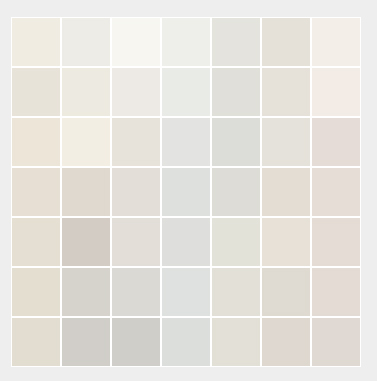
The Great Illusion: Why “White” Is Never Just White Paint

Walk into any paint store, ask for “white paint,” and watch the color specialist pull out a swatch deck with over 150 options. Beyond the marketing names like Alabaster, Chantilly Lace, or Swiss Coffee lies a critical truth every homeowner quickly discovers during a renovation: there is no such thing as a pure, neutral white on your walls.

What looks like a crisp, bright white on a small paper chip can turn dingy yellow, sterile blue, or muddy gray once applied to a full room. As professional painting contractors, understanding how undertones and room lighting interact is the single biggest factor in choosing a color that feels right.

1. Under the Hood: Undertones Control Everything

Every white paint is created by mixing tiny amounts of color pigment into a white base. These hidden pigments create undertones that fall into three primary categories:

  • Warm Whites (Yellow, Red, or Gold Undertones): These paints feel cozy, inviting, and soft. They soften hard edges and make spaces feel lived-in.
    • Best for: North-facing rooms, traditional architecture, spaces with warm wood floors or rustic accents.
  • Cool Whites (Blue, Green, or Violet Undertones): Crisp, clean, and modern. Cool whites make spaces feel larger and more open, but can feel clinical if misapplied.
    • Best for: South-facing rooms with abundant natural light, minimalist designs, bathrooms, and modern kitchens.
  • True/Neutral Whites (Minimal Pigment): Balanced between warm and cool, giving a clean look without heavy color cast.
    • Best for: Ceilings, interior trim, art galleries, or spaces where you want bold wall art to stand out.

2. Natural Light Changes Color Throughout the Day

Paint does not have a fixed color; it reflects the light that hits it. The directional orientation of your windows completely alters how white paint renders:

North-Facing Windows (Cool, grayish light)
└─► Needs: Warm White (e.g., Alabaster, Simply White) to counteract blue shadows.

South-Facing Windows (Warm, golden light all day)
└─► Needs: Cool or Balanced White (e.g., Chantilly Lace, Decorator’s White) to prevent overly yellow walls.

East-Facing Windows (Warm morning light, cool afternoon shade)
└─► Needs: Balanced White that transitions smoothly as natural light shifts.

West-Facing Windows (Cool morning light, intense warm late-afternoon sun)
└─► Needs: Neutral to slightly cool white to tame heavy late-day orange tones.

3. The Surrounding Environment (Reflection Matters)

White paint acts as a mirror for everything around it. Your walls don’t exist in a vacuum:

  • Flooring & Cabinetry: Dark hardwood or warm oak floors will bounce yellow and orange tones up onto white walls.
  • Exterior Foliage: Large green trees outside a window will cast a noticeable green hue onto bright white interior walls.
  • Artificial Lighting: The Color Rendering Index (CRI) and Kelvin temperature of your lightbulbs matter. A warm 2700K LED bulb will turn a cool white wall creamy, while a 5000K daylight bulb will make a soft warm white look harsh.

4. Sheen Alters Color Perception

The same paint formula will look visually different depending on the finish you choose:

FinishLight ReflectionColor EffectBest Use
Flat / MatteAbsorbs lightSoftens undertones, hides wall imperfectionsCeilings, low-traffic bedrooms
Eggshell / SatinSubtle sheenBalance of light reflection and durabilityLiving rooms, hallways, walls
Semi-Gloss / GlossHigh reflectionMakes whites look brighter and crisperTrim, doors, baseboards, cabinets

How to Test White Paint Like a Pro

  1. Skip the wall swatches: Never paint sample patches directly onto an existing colored wall—the old background color will distort your perception of the new white.
  2. Use sample boards: Paint two coats of sample paint onto 12″x12″ drywall pieces or poster boards.
  3. Move them around: Hold the sample board against different walls, near trim, next to flooring, and observe it at morning, noon, and night under artificial light.