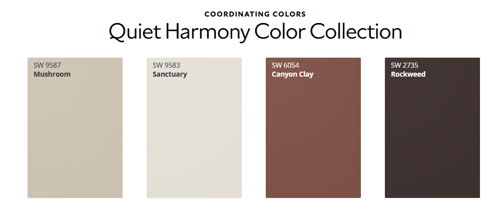
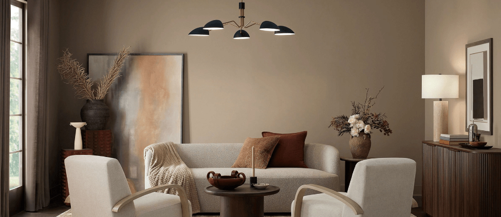
As the crisp autumn air settles in and we begin spending more time indoors, our focus turns toward creating warm, grounded spaces for the holiday season. Sherwin-Williams’ featured Color of the Month for November 2026 is Sanderling (SW 7513)—a refined, complex taupe-beige that strikes the ideal balance between cozy warmth and modern simplicity.
If you are looking to update your home before hosting family and friends this winter, here is a professional painter’s guide on why Sanderling works so well, where to use it, and how to style it.
What Color Is Sanderling (SW 7513)?
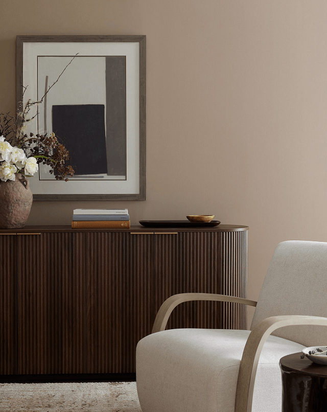
Sanderling is a rich greige-taupe with subtle creamy undertones. Unlike cold, sterile grays or overly yellow traditional beiges, Sanderling sits comfortably in the middle. It offers:
- Adaptable Warmth: Adds depth without making a room feel dark or enclosed.
- A Soft Foundation: Acts as a canvas that supports both minimalist contemporary decor and rustic, traditional woodwork.
- Lighting Flexibility: Holds its character under morning natural light and evening warm artificial bulbs without turning muddy.
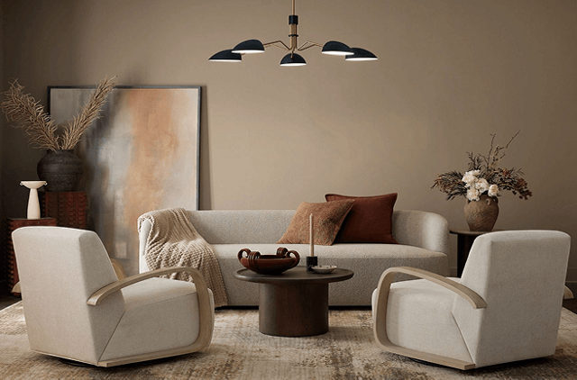
Best Places to Use Sanderling in Your Home
Living Rooms & Open Floor Plans
└─► Creates an inviting, cohesive backdrop that ties high-traffic family areas together.

Bedrooms & Primary Suites
└─► Delivers a calming, spa-like atmosphere perfect for unwinding during cold months.

Kitchen Cabinets & Millwork
└─► A sophisticated alternative to stark white cabinets when paired with warm brass or matte black hardware.

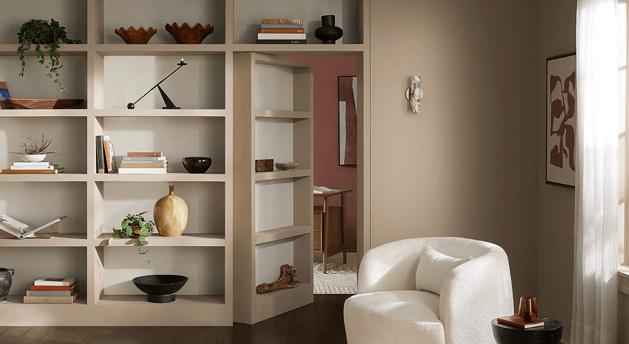
Home Offices & Libraries
└─► Brings a sense of quiet focus and subtle luxury to workspace walls.
Professional Color Pairings
As painting contractors, we recommend pairing Sanderling with high-contrast or harmonious accent shades to elevate your interior:
| Color Role | Recommended Sherwin-Williams Shade | Why It Works |
| Clean Trim & Ceilings | Alabaster (SW 7008) or Pure White (SW 7005) | Soft off-whites provide crisp framing without harsh contrast. |
| Moody Accent Wall | Peppercorn (SW 7674) or Rock Bottom (SW 7062) | Deep charcoal and dark olive tones create rich drama. |
| Earthy Complement | Universal Khaki (SW 6150) | Coordinates seamlessly with lighter tan and stone textures. |