Sanderling, Color of the Month November 2026

As the crisp autumn air settles in and we begin spending more time indoors, our focus turns toward creating warm, grounded spaces for the holiday season. Sherwin-Williams’ featured Color of the Month for November 2026 is Sanderling (SW 7513)—a refined, complex taupe-beige that strikes the ideal balance between cozy warmth and modern simplicity.

If you are looking to update your home before hosting family and friends this winter, here is a professional painter’s guide on why Sanderling works so well, where to use it, and how to style it.
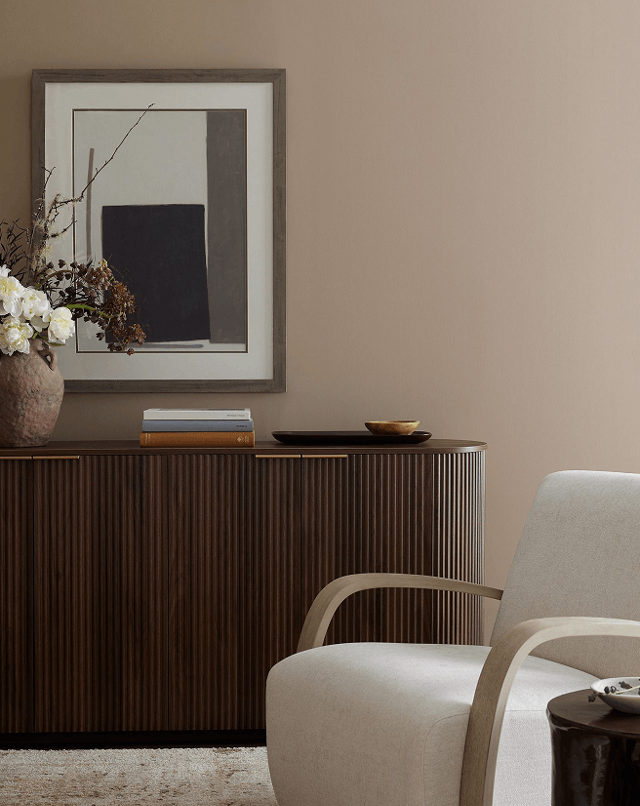
Living room wall painted in Sherwin Williams Sanderling SW 7513 warm taupe behind a fluted wooden credenza and cream accent chair
Sherwin Williams Sanderling (SW 7513) creates a rich, warm taupe backdrop paired with dark wood furniture and neutral upholstery.

What Color Is Sanderling (SW 7513)?

Sanderling is a rich greige-taupe with subtle creamy undertones. Unlike cold, sterile grays or overly yellow traditional beiges, Sanderling sits comfortably in the middle. It offers:

  • Adaptable Warmth: Adds depth without making a room feel dark or enclosed.
  • A Soft Foundation: Acts as a canvas that supports both minimalist contemporary decor and rustic, traditional woodwork.
  • Lighting Flexibility: Holds its character under morning natural light and evening warm artificial bulbs without turning muddy.
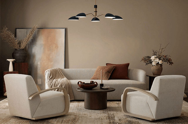
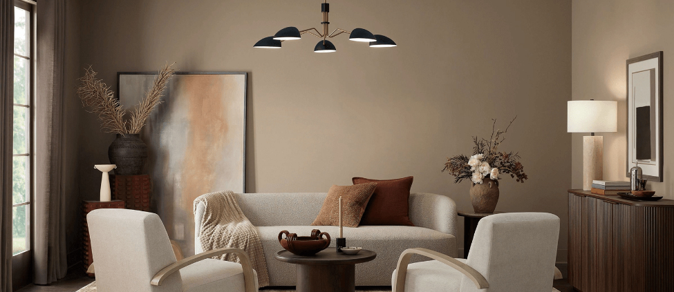
Living room interior painted in Sherwin Williams Sanderling SW 7513 featuring a light gray couch, two white accent chairs, and a modern chandelier
Warm taupe walls in Sherwin-Williams Sanderling (SW 7513) create an inviting living space paired with curved armchairs and warm earthy accents.

Best Places to Use Sanderling in Your Home

Living Rooms & Open Floor Plans
└─► Creates an inviting, cohesive backdrop that ties high-traffic family areas together.

Bedrooms & Primary Suites
└─► Delivers a calming, spa-like atmosphere perfect for unwinding during cold months.

Kitchen Cabinets & Millwork
└─► A sophisticated alternative to stark white cabinets when paired with warm brass or matte black hardware.

Home Offices & Libraries
└─► Brings a sense of quiet focus and subtle luxury to workspace walls.
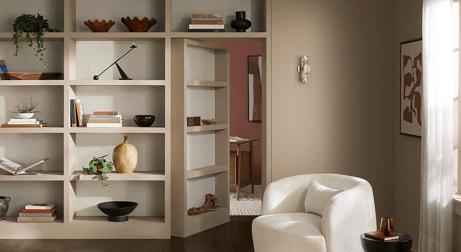
Living room wall and built-in shelving painted in Sherwin Williams Sanderling SW 7513 featuring a secret bookshelf door opening to an adjacent room
Sherwin-Williams Sanderling (SW 7513) painted across built-in shelving and walls, featuring a hidden doorway opening into an adjacent terra cotta room.

Professional Color Pairings

As painting contractors, we recommend pairing Sanderling with high-contrast or harmonious accent shades to elevate your interior:

Color RoleRecommended Sherwin-Williams ShadeWhy It Works
Clean Trim & CeilingsAlabaster (SW 7008) or Pure White (SW 7005)Soft off-whites provide crisp framing without harsh contrast.
Moody Accent WallPeppercorn (SW 7674) or Rock Bottom (SW 7062)Deep charcoal and dark olive tones create rich drama.
Earthy ComplementUniversal Khaki (SW 6150)Coordinates seamlessly with lighter tan and stone textures.

Transforming Your Home with Sherwin-Williams’ Color of the Month: September 2026


Prioritize depth and complexity in your kitchen or den with Rock Bottom. This deep, moody green-gray is the perfect foundational backdrop for timeless heirlooms and bold decor to create sophisticated spaces that are sure to be a topic of conversation. Subtle charcoal undertones add versatility, proving that neutral shades can be more than traditional grays, browns or beiges.

As summer fades and autumn sets in, many homeowners begin looking for fresh ways to bring warmth, comfort, and style into their living spaces. Choosing the right paint color can completely change how a room feels, and featured seasonal shades offer the perfect inspiration to update your home before the holiday season arrives.

Here are a few creative ways to bring this month’s featured color into your home—along with professional tips to help you get stunning, long-lasting results.

Modern living room corner featuring a dark textured charcoal accent wall behind a vibrant coral tufted armchair and a dark gray dresser
Contrast Rock Bottom walls with warm, vibrant accents like a coral armchair to create a striking seasonal look.

Beautiful Ways to Use Rich Autumn Tones in Your Home

1. Create a Cozy Accent Wall

If you want to introduce a stylish, deeper color without committing an entire room to a dark shade, an accent wall is the perfect solution. A rich accent color behind a bed headboard, around a fireplace, or along a dining room wall adds instant depth and character without overwhelming the space.

2. Give Kitchen Cabinets a Modern Facelift

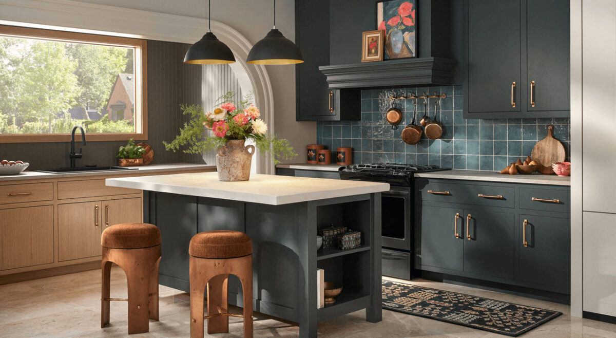
Darker, sophisticated hues are one of the most popular choices for kitchen islands and lower cabinets. Pairing a bold island base with lighter countertops or classic white perimeter cabinets creates high-end visual contrast that instantly elevates your entire kitchen.

3. Make a Lasting First Impression Outdoors

Your front door is the focal point of your home’s exterior. Applying a rich, welcoming shade to your front door or exterior shutters is an easy, high-impact project that dramatically boosts your home’s curb appeal.

Choosing the Right Sheen for Every Room

The color you choose is only half the equation—selecting the right finish ensures your paint looks great and holds up to daily life:

  • Flat/Matte: Best for low-traffic areas like guest bedrooms or ceilings. It absorbs light, hiding minor wall imperfections while creating a soft, velvety finish.
  • Eggshell & Satin: The ideal middle ground for living rooms, hallways, and family spaces. These finishes offer a gentle sheen that is easy to wipe clean without looking glossy.
  • Semi-Gloss: Highly durable and moisture-resistant, making it the top choice for trim, baseboards, doors, and bathroom walls.

Why Professional Application Makes All the Difference

Deep, rich paint colors require precision to look their best. Achieving smooth coverage without visible roller lines or uneven patches takes proper surface preparation, tinting the primer correctly, and using professional-grade application techniques.

Whether you’re planning a quick room update or a complete home makeover, taking advantage of current color trends is a fantastic way to refresh your living space.

Give us a call for a free estimate, 541-497-3804