Transforming Your Home with Sherwin-Williams’ Color of the Month: September 2026


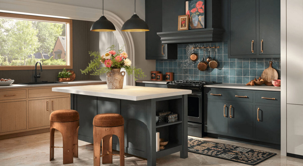
Prioritize depth and complexity in your kitchen or den with Rock Bottom. This deep, moody green-gray is the perfect foundational backdrop for timeless heirlooms and bold decor to create sophisticated spaces that are sure to be a topic of conversation. Subtle charcoal undertones add versatility, proving that neutral shades can be more than traditional grays, browns or beiges.

As summer fades and autumn sets in, many homeowners begin looking for fresh ways to bring warmth, comfort, and style into their living spaces. Choosing the right paint color can completely change how a room feels, and featured seasonal shades offer the perfect inspiration to update your home before the holiday season arrives.

Here are a few creative ways to bring this month’s featured color into your home—along with professional tips to help you get stunning, long-lasting results.

Modern living room corner featuring a dark textured charcoal accent wall behind a vibrant coral tufted armchair and a dark gray dresser
Contrast Rock Bottom walls with warm, vibrant accents like a coral armchair to create a striking seasonal look.

Beautiful Ways to Use Rich Autumn Tones in Your Home

1. Create a Cozy Accent Wall

If you want to introduce a stylish, deeper color without committing an entire room to a dark shade, an accent wall is the perfect solution. A rich accent color behind a bed headboard, around a fireplace, or along a dining room wall adds instant depth and character without overwhelming the space.

2. Give Kitchen Cabinets a Modern Facelift

Darker, sophisticated hues are one of the most popular choices for kitchen islands and lower cabinets. Pairing a bold island base with lighter countertops or classic white perimeter cabinets creates high-end visual contrast that instantly elevates your entire kitchen.

3. Make a Lasting First Impression Outdoors

Your front door is the focal point of your home’s exterior. Applying a rich, welcoming shade to your front door or exterior shutters is an easy, high-impact project that dramatically boosts your home’s curb appeal.

Choosing the Right Sheen for Every Room

The color you choose is only half the equation—selecting the right finish ensures your paint looks great and holds up to daily life:

  • Flat/Matte: Best for low-traffic areas like guest bedrooms or ceilings. It absorbs light, hiding minor wall imperfections while creating a soft, velvety finish.
  • Eggshell & Satin: The ideal middle ground for living rooms, hallways, and family spaces. These finishes offer a gentle sheen that is easy to wipe clean without looking glossy.
  • Semi-Gloss: Highly durable and moisture-resistant, making it the top choice for trim, baseboards, doors, and bathroom walls.

Why Professional Application Makes All the Difference

Deep, rich paint colors require precision to look their best. Achieving smooth coverage without visible roller lines or uneven patches takes proper surface preparation, tinting the primer correctly, and using professional-grade application techniques.

Whether you’re planning a quick room update or a complete home makeover, taking advantage of current color trends is a fantastic way to refresh your living space.

Give us a call for a free estimate, 541-497-3804
Current Trends in Exterior House Paint Colors

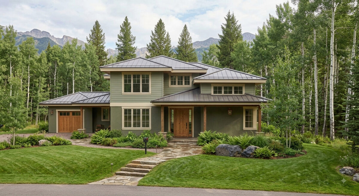
Current exterior house paint color trends are shifting decisively away from the stark whites and cool, blue-toned grays that dominated the previous decade. Instead, the focus is heavily centered on warm, comforting, nature-grounded palettes that blend seamlessly into the surrounding landscape.

If your painter client is looking to pitch the latest on-trend exterior schemes to homeowners, the defining color families and combinations include:

1. Earthy Sages and Olive Greens

Organic, nature-inspired greens have emerged as a breakout trend. Homeowners are choosing these colors because they feel sophisticated, calming, and deeply connected to the environment.

  • The Scheme: Sages and deep olives are typically used for the body of the house, paired with soft cream or warm white trim, and accented by natural wood elements (like a cedar front door).
  • Top Pick: Sherwin-Williams Evergreen Fog

2. Creamy, Warm Neutrals (The New Minimalist Look)

While the high-contrast modern look is still incredibly popular, stark, sterile whites are being replaced by softer, richer variants like cream, greige, and warm khaki.

  • The Scheme: A warm white or greige body paired with sharp, contrasting dark charcoal or bronze trim. This preserves the clean aesthetic of the modern farmhouse or contemporary home while feeling much more inviting.
  • Top Picks: Sherwin-Williams Alabaster, Sherwin-Williams Universal Khaki

3. Warm Charcoals and Espresso Browns

For homeowners wanting a dramatic, dark exterior, cool slate grays have taken a backseat to deeply saturated dark hues with brown or warm undertones.

  • The Scheme: Using a rich charcoal or “near-black” as the primary body color. These are heavily accented with warm wood siding segments, brass house hardware, or soft, warm white trim to keep the look from feeling too surgical.
  • Top Pick: Sherwin-Williams Urbane Bronze

4. Clay, Terracotta, and Desert Tones

Particularly strong in warmer regions or on stucco, Mediterranean, and Southwest-style homes, earthy desert tones are making a noticeable comeback.

  • The Scheme: A muted terracotta or warm ochre clay body paired with dark black or bronze trim and iron hardware to ground the warmth.
  • Top Picks: Sherwin-Williams Cavern Clay or Rookwood Terra Cotta.

5. Classic Coastal Blues

A perennial favorite that remains highly requested across traditional and colonial architecture.

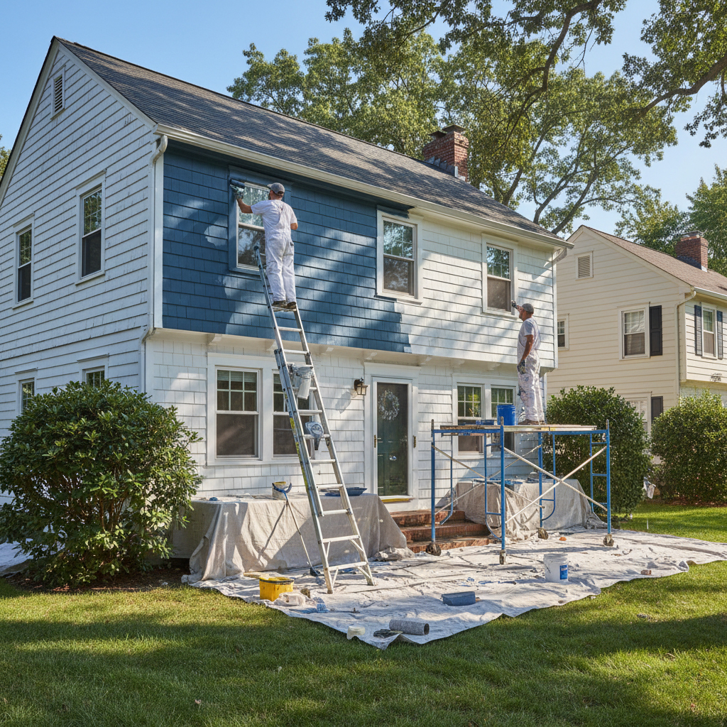
  • The Scheme: Saturated navy on the main siding. The current trend pairs navy with soft ivory or cream trim rather than standard bright white, which gives the exterior a more high-end, classic feel.
  • Top Pick: Sherwin-Williams Naval.

Call us at 541-497-3804

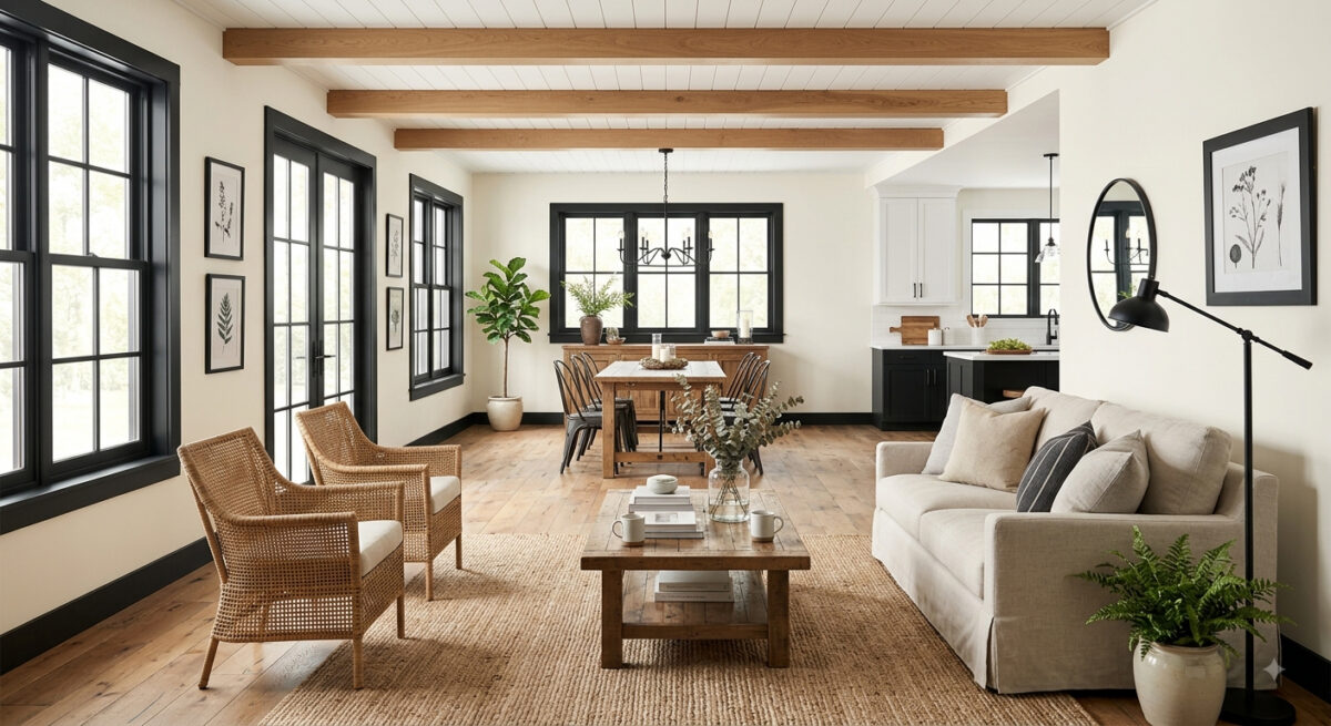
Bright and Timeless: Mastering the Modern Farmhouse Paint Palette

The modern farmhouse style is more than just a trend; it’s a timeless design philosophy that balances rustic warmth with clean, contemporary lines. When it comes to capturing this look on your walls and trim, the right color choices make all the difference.

The Foundation: Light and Airy Main Walls

To set the stage, opt for warm whites, soft creams, or very pale grays. These colors reflect natural light, making spaces feel larger and providing a neutral backdrop for your decor.

The Contrast: Bold Trim and Accents

The signature detail of a modern farmhouse is the use of deep charcoal or midnight black for trim, doors, window sashes, or even kitchen cabinetry. This creates a striking contrast against the light walls without disrupting the overall cohesion.

Transform Your Space with Sherwin-Williams August 2026 Color of the Month: Pennywise (SW 6349)

Bring warmth, personality, and grounding energy into your home this late summer with Sherwin-Williams’ August 2026 Color of the Month: Pennywise (SW 6349). At Paint Doctor’s Painting Service, we love helping homeowners transform their spaces with color choices that feel both modern and timeless.

Why We Love Pennywise (SW 6349)

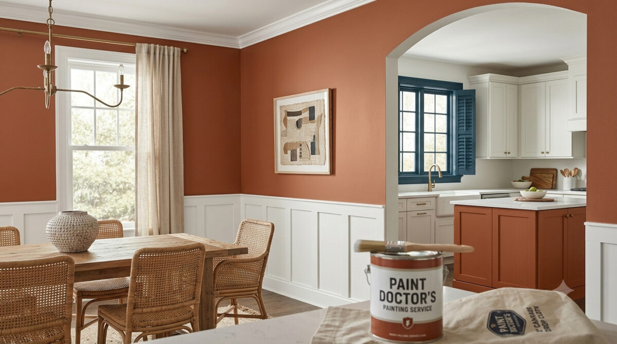
Pennywise is a rich, sun-baked terracotta neutral featuring soft clay undertones. It bridges the gap between vibrant warmth and earthy subtlety, making it an ideal choice for creating inviting, cozy interiors.

  • Versatile Tone: Works beautifully as an accent wall or across entire living rooms, dining spaces, and kitchen islands.
  • Organic Aesthetic: Aligns seamlessly with modern handcrafted design, natural woods, and woven textures.
  • Comforting Aura: Delivers a sophisticated, lived-in feel without overpowering the room.

Winning Color Palettes & Pairings

To highlight the warmth of Pennywise, contrast it with cool tones or crisp whites for a balanced aesthetic:

  • Pure White (SW 7005): Creates a clean, uplifting contrast on surrounding walls, trim, or ceilings to keep the space feeling bright and modern.
  • Bunglehouse Blue (SW 0048): Adds deep, dramatic sophistication. Use it on window trim, cabinetry, or exterior shutters to offset Pennywise’s earthy warmth.
  • Natural Elements: Pair with warm wood finishes, aged brass hardware, and greenery to accentuate its organic terracotta undertones.

Best Places to Use Pennywise in Your Home

  • Kitchen Island Accent: Paint your island base with Pennywise while keeping cabinets light for an instant, high-end focal point.
  • Dining Room Walls: Wrap your dining room in this inviting shade to create a intimate space for gatherings.
  • Front Door & Exterior Accents: Give your home’s entryway a memorable curb appeal boost with a terracotta touch that welcomes guests.

Let Paint Doctor’s Painting Service Bring Your Vision to Life

Achieving a smooth, flawless finish with rich terracotta tones requires proper surface preparation and professional application. Whether you want a single accent wall or a full interior overhaul, Paint Doctor’s Painting Service is here to deliver exceptional results. Contact us today to schedule your consultation and bring the warmth of Pennywise into your home! 541-497-3804

Proactive Approach to Property Maintenance

Waiting until visible damage appears is a costly strategy. At Paint Doctor’s Painting, we recommend a program of proactive maintenance, ensuring your property stays resilient and valuable over time.

The Hidden Threats

External factors like moisture, fluctuating temperatures, and UV exposure constantly attack your building’s surfaces. What begins as a minor crack or fade can lead to severe structural issues, requiring costly repairs down the line.

The “Benefits Package” for Your Building

Think of professional painting as a comprehensive benefits package for your property. It provides durable weatherproofing, sealing vulnerable areas and protecting from environmental stressors. This proactive approach not only maintains your building’s appearance but actively prevents costly damage, ensuring the long-term value and integrity of your investment. It’s a shield against time.

Speaking of time, let’s schedule some to get your maintenance up to date. 541-497-3804

Orange Crush

“Oranges are friendly and welcoming, perfect in family rooms, children’s bedrooms or bonus rooms,” according to Sherwin-Williams.

Radiate warmth, happiness and rejuvenation with orange paint colors, ideal for gathering spaces of all ages. Orange colors are unique because they combine the uplifting energy of reds with the spirited tone of yellow, even offering a slight impact on appetite in the right setting.

Nice orange in the fall color scheme.
Like a bright autumn leaf just turned. Nice shade for a dining room or front door.
bedroom in muted orange

Hey Beaver Believers, there are lots of oranges to choose from!

Call us for an install of your OSU pride accent wall 541-497-3804

Northern Exposure

Here in the Willamette Valley mildew can form on the north side of houses due to the lack of direct sunlight, which keeps the surface cooler and moister. Less sunlight means slower evaporation, which helps the surface stay damp longer promoting mildew growth. Mildew mitigation is an important step when preparing to paint the exterior of your home. One solution? Wash with a solution of TSP.

stiff brush with long handle in TSP solution Paint Doctor's Painting instruction on mitigating mildew
Brushing TSP solution on north facing siding
Using garden hose to clean siding in preparation for paint.

TSP Safety

  • Protective gear: It’s a good idea to wear eye protection, chemical-resistant gloves, and long sleeves and pants.
  • Ventilation: Ensure the area is well-ventilated, especially when working indoors.
  • Protect surfaces: TSP can damage some surfaces, including metal fixtures and glass. Use plastic sheeting to protect areas you do not want to clean.
  • Mixing: Add TSP powder to warm water, not the other way around, to prevent splashing. Typical dilutions range from 1/4 to 1/2 cup of TSP per gallon of warm water, depending on the job.
  • Rinse thoroughly: After cleaning, rinse the surface multiple times with clean water to remove all TSP residue. If not completely rinsed, it can leave a white film.
  • Protect landscaping: If using TSP outdoors, take care to protect plants from runoff by hosing them down with fresh water both before and after applying the solution. 

Paint Guide for Kitchen, Bedrooms and Bathrooms

Choosing the right paint color for each room in your home involves creating the perfect mood, enhancing functionality, and expressing your personal style. Whether you’re planning a full home makeover or just refreshing a single space, this guide will help you pick the best shades for your kitchen, bedroom, and bathroom.

🧑‍🍳 Kitchen Colors: Fresh, Inviting, and Functional

The kitchen is where meals are made and memories are shared. It deserves colors that feel clean, energizing, and welcoming.

Top Picks:

  • Soft Whites & Creams: Classic and versatile, they brighten the space and pair well with any cabinetry.
  • Warm Grays & Greige: A modern neutral that complements stainless steel and wood finishes.
  • Sage Green: Earthy and calming, ideal for farmhouse or cottage-style kitchens.
  • Dusty Blue: Cool and refreshing, especially with white or light wood accents.
  • Terracotta or Clay: Adds rustic warmth and depth, perfect for Mediterranean-inspired designs.

🛏️ Bedroom Colors: Calm, Cozy, and Restful

Your bedroom should be a sanctuary—a place to unwind and recharge. The right colors can help promote relaxation and better sleep.

Top Picks:

  • Muted Blues: Like powder or slate blue, known for their calming effect.
  • Lavender or Mauve: Soft and romantic, great for creating a tranquil atmosphere.
  • Warm Neutrals: Taupe, sand, or mushroom tones offer a cozy, grounded feel.
  • Deep Greens: Forest or olive green creates a cocoon-like vibe.
  • Blush Pink: Gentle and comforting, especially in smaller or sunlit rooms.

Finish Tip: Opt for matte or eggshell finishes to reduce glare and enhance softness.

A bedroom in pale blue

🚿 Bathrooms: Refresh & Rejuvenate

Bathrooms benefit from clean, bright colors that evoke freshness and spa-like calm.

Top Color Picks:

  • Cool Grays & Charcoal: Sleek and modern, especially with chrome fixtures.
  • Seafoam or Aqua: Light and airy, perfect for coastal or spa-inspired designs.
  • Crisp White: Classic and clean—ideal for small spaces or minimalist styles.
  • Pale Peach or Coral: Adds warmth and personality without overwhelming.
  • Soft Mint Green: Refreshing and unique, pairs well with white tile.

Pro Tip:

Use satin or semi-gloss finishes to resist moisture and make cleaning easier.

A modern bathroom in pale peach with floating vanity and toilet

🖌️ Final Thoughts

Paint is one of the easiest and most impactful ways to transform your home. By choosing colors that suit each room’s purpose and personality, you’ll create a space that feels cohesive, comfortable, and uniquely yours.

Need help picking the perfect shade or finish? We are here to guide you every step of the way. Need help with the entire project? Call Mike 541-497-3804.

Quietude

Within a palette of hushed tones, the HGTV 2025 Color of the Year, Quietude, finds its power in its transcendent tranquility. A soft sage with a whisper of blue influence, Quietude is an emerging color for enduring design and soothes any space inside or out.

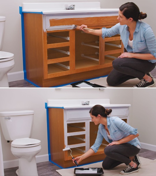
Subtle seafoam green applied to bathroom vanity.

Check out how designers used this color in a variety of settings.

wainscot, raided panels and double doors
great cabinet color
seafoam green chest of drawers
entry door in seafoam green

Let us know if Quietude is your color! Mike 541-497-3804.

When Brush Marks are a Good Thing

Brush marks are a desirable feature in home painting when you are intentionally creating a decorative, textured, or rustic finish, rather than a perfectly smooth, modern look. This technique is often used for furniture, accent walls, and other decorative objects where a handmade, tactile quality adds character. 

For decorative painting techniques

When a project is intended to look artistically or decoratively painted, visible brushstrokes are a key part of the aesthetic. 

  • Faux finishes: Techniques like color washing or rag rolling can be used to add texture and depth to walls. Visible, artistic brushstrokes are essential for creating the varied, dynamic patterns of these faux effects.
  • Creating a hand-painted look: For items like furniture, cabinets, or even doors, a subtle, organized brushstroke can convey that the item was painted by hand rather than in a factory. This adds a custom, artisanal feel, especially when using paints like chalk paint. 

For a rustic or traditional aesthetic

A perfectly smooth, glossy finish often feels very modern. In contrast, visible brushstrokes lend a timeless, rustic, or vintage quality to a piece.

  • Country and cottage decor: A more casual and textured finish suits rustic and farmhouse-style homes better than a flawless finish.
  • Weathered effects: Combining visible brushstrokes with techniques like distressing and sanding can create a charming, weathered finish for furniture. 

To add texture and depth

Visible brushstrokes can be used to add visual interest to a surface and make a flat color appear more dynamic.

  • For architectural features: When painting woodwork, such as trim or paneling, using a consistent brushing technique that leaves subtle, parallel lines can define the details of the feature.
  • To create visual interest: The way light catches the texture of the paint can add movement and energy to the surface. This is an effective strategy for making a statement wall or a piece of furniture more eye-catching. 

To make matching easier for future touchup. If you know an area will likely need touchup in the future, it can be easier to match the existing texture if the original was applied by brush.

The Paint Doctors Painting Service 541-497-3804