
Transforming Your Home with Sherwin-Williams’ Color of the Month: September 2026


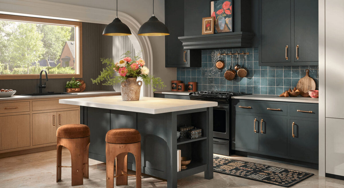
Prioritize depth and complexity in your kitchen or den with Rock Bottom. This deep, moody green-gray is the perfect foundational backdrop for timeless heirlooms and bold decor to create sophisticated spaces that are sure to be a topic of conversation. Subtle charcoal undertones add versatility, proving that neutral shades can be more than traditional grays, browns or beiges.

As summer fades and autumn sets in, many homeowners begin looking for fresh ways to bring warmth, comfort, and style into their living spaces. Choosing the right paint color can completely change how a room feels, and featured seasonal shades offer the perfect inspiration to update your home before the holiday season arrives.

Here are a few creative ways to bring this month’s featured color into your home—along with professional tips to help you get stunning, long-lasting results.

Modern living room corner featuring a dark textured charcoal accent wall behind a vibrant coral tufted armchair and a dark gray dresser
Contrast Rock Bottom walls with warm, vibrant accents like a coral armchair to create a striking seasonal look.

Beautiful Ways to Use Rich Autumn Tones in Your Home

1. Create a Cozy Accent Wall

If you want to introduce a stylish, deeper color without committing an entire room to a dark shade, an accent wall is the perfect solution. A rich accent color behind a bed headboard, around a fireplace, or along a dining room wall adds instant depth and character without overwhelming the space.

2. Give Kitchen Cabinets a Modern Facelift

Darker, sophisticated hues are one of the most popular choices for kitchen islands and lower cabinets. Pairing a bold island base with lighter countertops or classic white perimeter cabinets creates high-end visual contrast that instantly elevates your entire kitchen.

3. Make a Lasting First Impression Outdoors

Your front door is the focal point of your home’s exterior. Applying a rich, welcoming shade to your front door or exterior shutters is an easy, high-impact project that dramatically boosts your home’s curb appeal.

Choosing the Right Sheen for Every Room

The color you choose is only half the equation—selecting the right finish ensures your paint looks great and holds up to daily life:

  • Flat/Matte: Best for low-traffic areas like guest bedrooms or ceilings. It absorbs light, hiding minor wall imperfections while creating a soft, velvety finish.
  • Eggshell & Satin: The ideal middle ground for living rooms, hallways, and family spaces. These finishes offer a gentle sheen that is easy to wipe clean without looking glossy.
  • Semi-Gloss: Highly durable and moisture-resistant, making it the top choice for trim, baseboards, doors, and bathroom walls.

Why Professional Application Makes All the Difference

Deep, rich paint colors require precision to look their best. Achieving smooth coverage without visible roller lines or uneven patches takes proper surface preparation, tinting the primer correctly, and using professional-grade application techniques.

Whether you’re planning a quick room update or a complete home makeover, taking advantage of current color trends is a fantastic way to refresh your living space.

Give us a call for a free estimate, 541-497-3804

Trend Alert: Elevate Your Home with Sherwin-Williams’ Sashay Sand

If you’re looking to refresh your home’s interior with a color that feels both modern and timeless, it’s time to take a look at Sashay Sand (SW 6051). Celebrated as a standout Sherwin-Williams Color of the Month, this stunning shade is redefining how we think about neutrals.

As professional painters, we see a lot of paint colors. For years, cool grays and crisp whites dominated the scene. But lately, homeowners are craving warmth, comfort, and personality. Sashay Sand delivers exactly that.

Here is why this blushing neutral is capturing everyone’s attention—and how you can use it to transform your space.

What Makes Sashay Sand So Special?

Sashay Sand isn’t just another beige, and it isn’t a loud, bright pink. It sits perfectly in the middle: a sophisticated, blushing taupe-pink with a Light Reflectance Value (LRV) of 49.

In plain English? It’s right in the sweet spot. It is deep enough to contrast beautifully against white trim, but light enough to bounce natural sunlight around a room, making spaces feel open, airy, and incredibly welcoming. It brings a “dreamy nostalgia” to a home, blending vintage charm with clean, modern minimalism.

The Best Spaces for Sashay Sand

While this color is incredibly versatile, our crew has seen it absolutely shine in a few specific areas of the home:

  • The Owner’s Suite: Bedrooms should be a sanctuary. Sashay Sand creates a calming, spa-like atmosphere that feels cozy at night and bright in the morning.
  • The Kitchen & Dining Area: Want a kitchen that feels warm and conversational? Pairing Sashay Sand walls with crisp white or deep earthy cabinetry creates a high-end, designer look.
  • Powder Rooms & Accent Walls: If you’re hesitant to commit an entire large room to a blush tone, a powder room or a feature wall is the perfect place to inject this sophisticated pop of color.

Designer-Approved Color Pairings

One of the reasons we love working with Sashay Sand is how beautifully it plays with other shades. If we were designing a palette for your home, we’d recommend pairing it with these Sherwin-Williams classics:

  • For a Clean, Classic Look: Pair it with White Snow (SW 9541) on the trim and ceilings to make the blush undertones pop.
  • For Modern Contrast: Combine it with Silver Gray (SW 0049) or Twilight Gray (SW 0054) for a stunning, balanced contrast between warm and cool tones.
  • For a Bold, Earthy Vibe: Bring in Cascade Green (SW 0066) on an accent piece or an adjacent room to ground the space in a nature-inspired aesthetic.

Why Professional Application Matters for Shades Like This

Colors with subtle pink, taupe, or beige undertones can be notoriously tricky. Depending on your room’s lighting—whether you have cool northern light or warm afternoon sun—Sashay Sand can shift characters throughout the day.

Furthermore, achieving a flawless finish with soft, elegant neutrals requires meticulous wall preparation, the right primer, and clean, sharp cut-ins along the trim. That’s where we come in. Our experienced team doesn’t just apply paint; we ensure the substrate is perfect so the color looks exactly as the designers intended.

Ready to Refresh Your Space?

Whether you’re completely sold on Sashay Sand or want to see how a physical swatch looks on your walls, we are here to help. Let’s bring a touch of warm, modern sophistication to your home.