The Bold Design Trend Taking Over: What Is Color Drenching (and How to Do It Right)?

If you’ve spent any time on interior design blogs or Pinterest lately, you’ve probably noticed room transformations that feel surprisingly cozy, dramatic, and seamless. The secret? Color drenching.

It’s one of the most requested painting techniques right now, and for good reason—it completely changes the vibe of a home without requiring a massive renovation. But while the concept sounds simple, executing it takes strategy, precision, and the right prep work.

Here is everything you need to know about color drenching, why it works, and how to bring it into your home.

What Exactly Is Color Drenching?

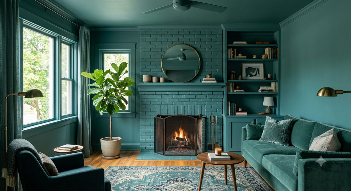
Color drenching is the process of painting everything in a room a single color (or varying tones of the same shade).

Instead of the traditional formula—colored walls paired with crisp white trim, white ceilings, and neutral doors—color drenching wraps the entire space in one cohesive hue.

That includes:

  • Walls and ceilings
  • Baseboards, crown molding, and door frames
  • Doors and window trim
  • Built-ins, radiators, and cabinetry

The result is an immersive, monochromatic look that makes architectural details blend together into a sleek, intentional backdrop.

Why Color Drenching Works So Well

Color drenching isn’t just a gimmick; it fixes several common design challenges:

1. It Makes Small Spaces Feel Larger

High-contrast white trim cuts a room into distinct horizontal line segments, visually chopping up the space. When you paint walls, trim, and ceilings the exact same shade, those visual borders disappear. Your eyes flow across the room uninterrupted, which actually makes small offices, powder rooms, or bedrooms feel larger and airier.

2. It Softens Awkward Architecture

Got sloped attic ceilings, bulky radiators, or asymmetrical doorway trim? Painting them the same shade as the wall masks visual clutter and lets the shape of the room feel intentional rather than chaotic.

3. It Creates Instant Mood and Drama

Deep tones like moody navy, forest green, rich terracotta, or soft charcoal create a cocoon-like environment. If you want a living room, library, or master bedroom that feels warm and inviting, color drenching is unmatched.

Pro Tip: The Secret Is in the Sheens

The biggest mistake DIYers make with color drenching is using the exact same paint sheen on every surface. Doing so can leave a room looking flat or clinical.

Professional painters use sheen variation to create subtle depth and durability while staying within one color family:

  • Ceilings: Flat or Ultramatt (hides imperfections and reduces glare).
  • Walls: Eggshell or Satin (easy to wipe down with a soft, warm glow).
  • Trim & Doors: Semi-Gloss or High-Gloss (adds contrast, resists scuffs, and reflects light beautifully).

Using higher sheens on trim and doors catches the light differently than the matte walls, giving you visual texture without introducing a second color.

3 Great Rooms to Try Color Drenching

  1. The Powder Room: Small, low-risk, and high-impact. Deep, dark shades work magic in small spaces.
  2. The Home Office or Den: Deep moody hues reduce visual distraction and create a focused, cozy atmosphere.
  3. The Master Bedroom: Soft, warm neutrals or muted greens create a calm, boutique-hotel retreat feel.

Ready to Transform Your Space?

While color drenching looks effortless, achieving flawless coverage across different surfaces—woodwork, drywall, and ceilings—takes expert surface prep, precise edging, and the right paint formulations.

If you’re ready to bring this stunning trend into your home without the hassle of taped edges and endless coats, we’re here to help.

Contact us today for a free color consultation and quote! 541-497-3804

Trend Alert: Elevate Your Home with Sherwin-Williams’ Sashay Sand

If you’re looking to refresh your home’s interior with a color that feels both modern and timeless, it’s time to take a look at Sashay Sand (SW 6051). Celebrated as a standout Sherwin-Williams Color of the Month, this stunning shade is redefining how we think about neutrals.

As professional painters, we see a lot of paint colors. For years, cool grays and crisp whites dominated the scene. But lately, homeowners are craving warmth, comfort, and personality. Sashay Sand delivers exactly that.

Here is why this blushing neutral is capturing everyone’s attention—and how you can use it to transform your space.

What Makes Sashay Sand So Special?

Sashay Sand isn’t just another beige, and it isn’t a loud, bright pink. It sits perfectly in the middle: a sophisticated, blushing taupe-pink with a Light Reflectance Value (LRV) of 49.

In plain English? It’s right in the sweet spot. It is deep enough to contrast beautifully against white trim, but light enough to bounce natural sunlight around a room, making spaces feel open, airy, and incredibly welcoming. It brings a “dreamy nostalgia” to a home, blending vintage charm with clean, modern minimalism.

The Best Spaces for Sashay Sand

While this color is incredibly versatile, our crew has seen it absolutely shine in a few specific areas of the home:

  • The Owner’s Suite: Bedrooms should be a sanctuary. Sashay Sand creates a calming, spa-like atmosphere that feels cozy at night and bright in the morning.
  • The Kitchen & Dining Area: Want a kitchen that feels warm and conversational? Pairing Sashay Sand walls with crisp white or deep earthy cabinetry creates a high-end, designer look.
  • Powder Rooms & Accent Walls: If you’re hesitant to commit an entire large room to a blush tone, a powder room or a feature wall is the perfect place to inject this sophisticated pop of color.

Designer-Approved Color Pairings

One of the reasons we love working with Sashay Sand is how beautifully it plays with other shades. If we were designing a palette for your home, we’d recommend pairing it with these Sherwin-Williams classics:

  • For a Clean, Classic Look: Pair it with White Snow (SW 9541) on the trim and ceilings to make the blush undertones pop.
  • For Modern Contrast: Combine it with Silver Gray (SW 0049) or Twilight Gray (SW 0054) for a stunning, balanced contrast between warm and cool tones.
  • For a Bold, Earthy Vibe: Bring in Cascade Green (SW 0066) on an accent piece or an adjacent room to ground the space in a nature-inspired aesthetic.

Why Professional Application Matters for Shades Like This

Colors with subtle pink, taupe, or beige undertones can be notoriously tricky. Depending on your room’s lighting—whether you have cool northern light or warm afternoon sun—Sashay Sand can shift characters throughout the day.

Furthermore, achieving a flawless finish with soft, elegant neutrals requires meticulous wall preparation, the right primer, and clean, sharp cut-ins along the trim. That’s where we come in. Our experienced team doesn’t just apply paint; we ensure the substrate is perfect so the color looks exactly as the designers intended.

Ready to Refresh Your Space?

Whether you’re completely sold on Sashay Sand or want to see how a physical swatch looks on your walls, we are here to help. Let’s bring a touch of warm, modern sophistication to your home.

Accent Walls That Wow

Accent walls are back—and bolder than ever. In 2025, homeowners are embracing statement-making walls that add personality, depth, and drama to their spaces. Whether you’re working with a cozy nook or a sprawling living room, a well-chosen accent wall can elevate the entire vibe of a home.

🎨 Why Accent Walls Work

Accent walls create visual interest by breaking up monotony and drawing the eye to a focal point. They’re perfect for:

  • Highlighting architectural features like fireplaces or built-ins
  • Defining open-concept spaces
  • Adding depth to small rooms
  • Expressing personal style without overwhelming a space

🌈 Trending Sherwin-Williams Colors for Accent Walls

1. Naval SW 6244
A timeless navy that adds richness and sophistication. Ideal for dining rooms, bedrooms, or behind a gallery wall.

2. Urbane Bronze SW 7048
Earthy and dramatic, this deep brown-gray creates a cozy, grounded feel. Perfect for home offices or living rooms.

3. Redend Point SW 9081
Warm and inviting, this blush-beige adds subtle charm. Great for bedrooms or entryways.

4. Evergreen Fog SW 9130
A calming green-gray that pairs beautifully with natural textures. Use it in bathrooms or reading corners.

5. Iron Ore SW 7069
Bold and modern, this charcoal hue makes a powerful statement. Try it behind a bed or on a fireplace wall

🖌️ Pro Tips for Creating Accent Walls That Wow

  • Choose the right wall: Pick a wall that naturally draws attention—behind a bed, sofa, or fireplace.
  • Balance with neutrals: Let your accent wall shine by keeping surrounding walls and decor more subdued.
  • Play with texture: Consider matte finishes, shiplap, or wallpaper for added dimension.
  • Use lighting to your advantage: Accent walls pop under good lighting—think sconces, pendant lights, or natural light

Like the idea but not the work associated with it? All Mike 541-497-3804

Plan Your Interior Update

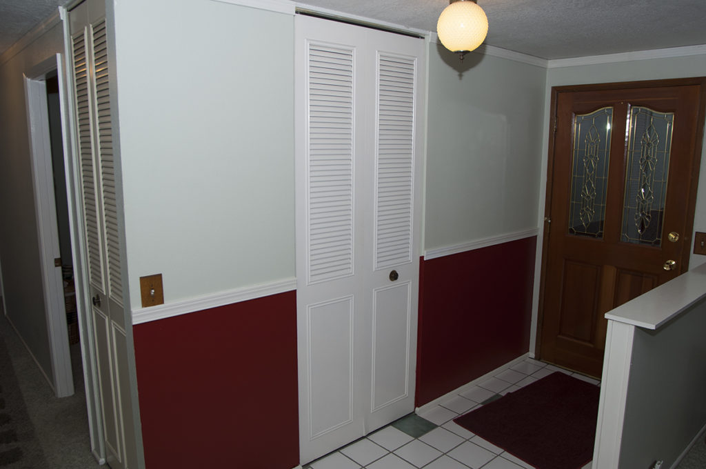
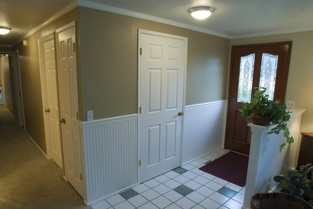
Let’s not spend another winter with these outdated interior colors. This time of year we are preparing to spend a lot more time indoors so it’s a good time to call Mike (541-497-3804) at Paint Doctor’s Painting to schedule your interior paint transformation.

You may notice some changes to doors and wainscot in this update, but by far the biggest impact comes from the change in color.

These days many of us are spending more time at home, so let’s invest in making our interior spaces warm and welcoming by Paint Doctor’s Painting for a bid and checking out Sherwin-Williams for some interior color ideas.

Painting A House In A Day

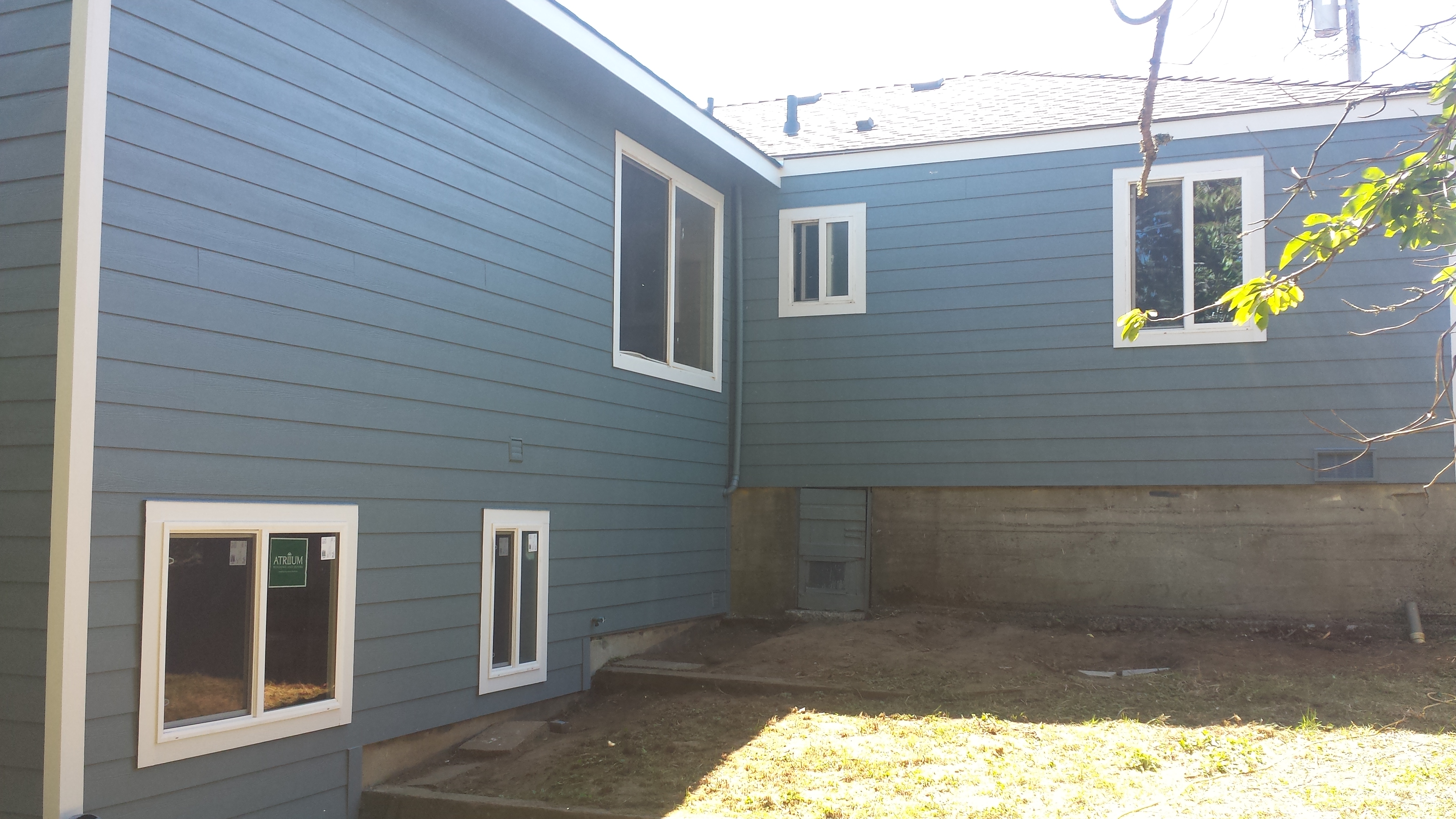
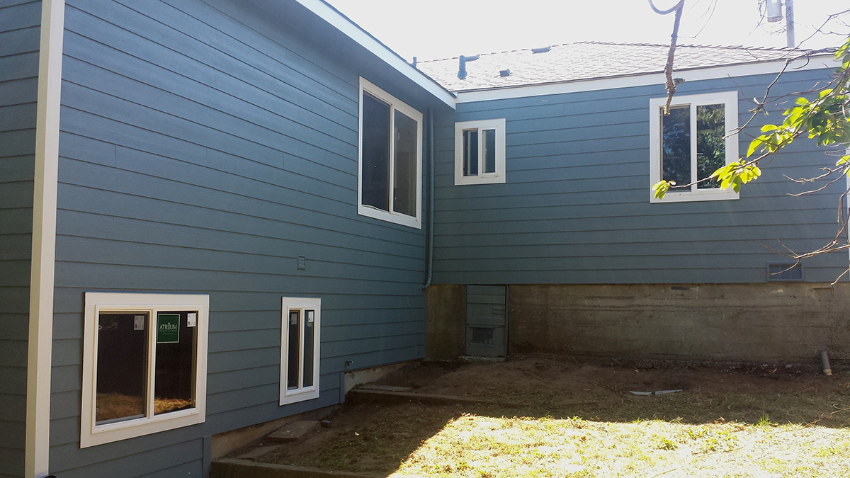
Paint Doctor’s Painting recently had one of those stellar production days when everything went as planned. The combination of a tight schedule and the desire to help out a customer in a bind with a property on the coast launched a plan to paint an entire house in a day.

Included in the plan was all of the prep work, masking, body paint and trim. Of course, it helps when you roll onto the job with an experienced, hard working crew.

What a surprise for the homeowners when they came home from work and found a brand new looking house.

20150624_103030 Corvallis Oregon Painting Contractor 20150624_154509 20150624_154642 Sweet Home Oregon Painting Contractor Sweet Home Oregon Painting Contractor featured house in a day one day_1 one day_2 one day_3 one day_4 Lebanon Oregon Painting Contractor one day_6