
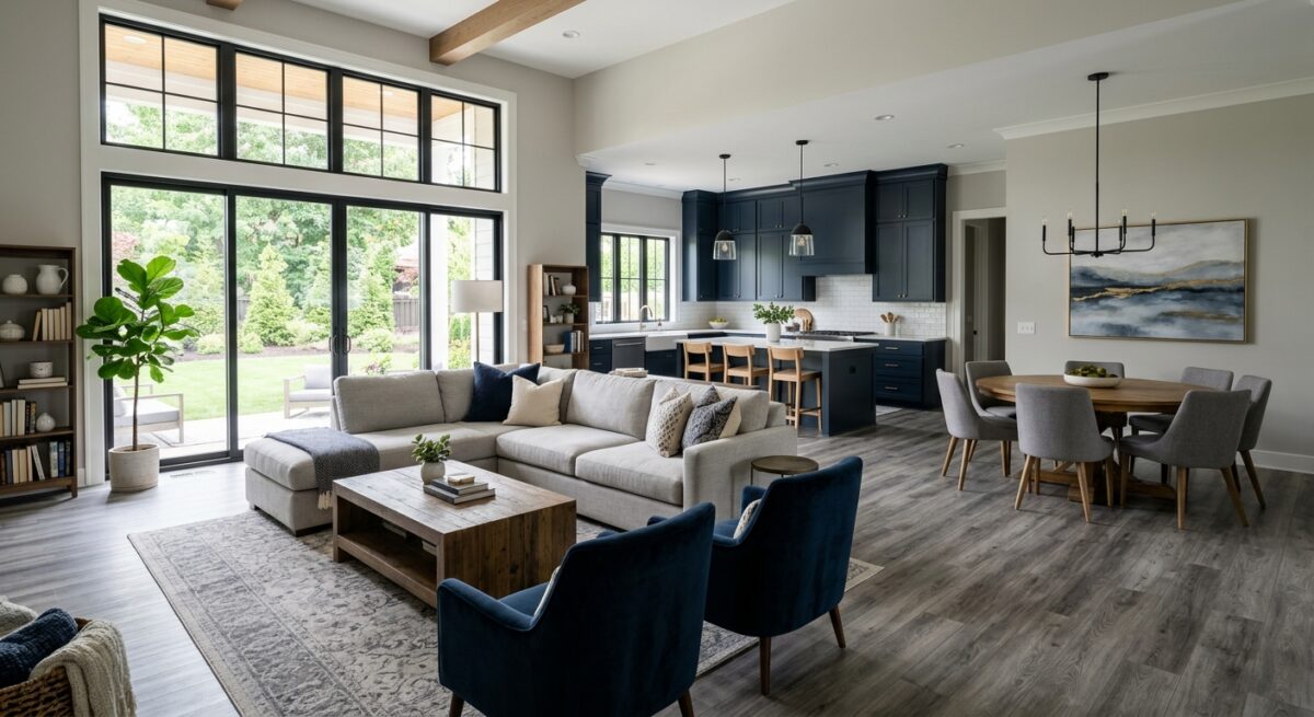
Choosing a paint color is one of the quickest ways to transform a room, but standing in front of a wall of paint swatches can feel overwhelming. The secret to picking a color you will love for years isn’t just about what looks good on a tiny paper chip—it’s about how that color interacts with the elements already in your space: your flooring, trim, and furniture.
As professional painters, we see firsthand how the right combinations can make a room feel cohesive, spacious, and inviting. Here is our insider guide to matching paint colors with the rest of your home’s interior.
1. Start with the Foundation: Matching Paint to Flooring
Your flooring is a major fixed investment, meaning it’s much harder to swap out than a coat of paint. Because it covers a huge surface area, your wall color must complement its undertones.
- Hardwood & Wood-Look Tile:
- Cool/Gray Woods: Pair best with cool grays, crisp whites, soft blues, or muted greens.
- Warm/Honey Woods (like Oak or Pine): Look fantastic with warm off-whites, creamy greiges, olive greens, or rich navy accent walls.
- Dark Walnut or Espresso: Contrast is key! Choose light to mid-tone neutral walls so the space doesn’t feel like a cave.
- Carpet & Tile: Pay close attention to the undertones. A neutral carpet isn’t just “beige”—it might have pink, yellow, or green undertones. Hold paint swatches flat against the floor in natural light to check for clashing undertones before committing.
2. Frames and Accents: Coordinating with Your Trim
Trim work—baseboards, door frames, and crown molding—acts as the frame for your walls. How you match trim to walls completely changes the architecture of a room.
- Classic White Trim: You can rarely go wrong with a crisp, bright white trim. It creates a clean border that makes wall colors pop.
- Tone-on-Tone (Monochromatic): Painting walls and trim the exact same color—using a matte/eggshell finish on the walls and a semi-gloss on the trim—creates a sophisticated, modern look that makes small rooms feel larger.
- Dark or High-Contrast Trim: If you have gorgeous architectural trim, try painting it darker than your walls (e.g., light warm gray walls with deep charcoal trim) for a bold, custom look.
Pro Tip: Choose your trim sheen for durability. Trim takes more wear and tear than walls, so stick to semi-gloss or satin finishes that are easy to wipe down.
3. Pulling It Together: Anchoring with Furniture
Your furniture bridges the gap between your floors and your walls. Instead of trying to match your wall color directly to your sofa, aim for contrast and balance.
- For Bold Furniture: If you have a statement piece—like a emerald velvet sofa or a rich cognac leather armchair—let it shine by choosing neutral walls (soft cream, warm greige, or airy gray).
- For Neutral Furniture: If your furniture consists of beige, cream, or gray tones, you have a clean slate. You can either go dramatic with a deep, moody wall color (like charcoal or dark teal) or keep it light and layer textures with warm off-whites.
- Wood Furniture: If you have wood furniture sitting on wood floors, choose a wall color that sits between the two wood tones to create a visual break.
The Rule of Undertones: Warm vs. Cool
When in doubt, stick to this simple rule: Keep warmth with warmth, and cool with cool.
| Tone | Flooring & Furniture Characteristics | Best Paint Palette |
| Warm | Yellow, red, orange, or golden wood tones; cream or beige fabrics; brass hardware. | Soft warm whites, creams, greiges, warm terracottas, sage greens. |
| Cool | Gray, ash, or dark espresso woods; slate gray or pure white fabrics; chrome/black hardware. | Crisp whites, cool grays, slate blues, deep navy, cool mint. |
Test Before You Paint!
Lighting changes everything. A paint color that looks perfect in the store might look yellow under your living room lamps or washed out near a south-facing window.
- Sample Big: Paint large sample boards (at least 12″ x 12″) or use peel-and-stick samples.
- Move Them Around: Place samples next to your trim, against your flooring, and behind your main furniture pieces.
- Watch the Clock: Check how the color looks in the morning, afternoon, and at night under artificial light.
Ready to Transform Your Space?
Matching colors can be tricky, but you don’t have to figure it out alone! Our team of professional painters is here to help you select the perfect palette and execute it with flawless precision.
Contact us today for a free color consultation and estimate! 541-497-3804