Current Trends in Exterior House Paint Colors

Current exterior house paint color trends are shifting decisively away from the stark whites and cool, blue-toned grays that dominated the previous decade. Instead, the focus is heavily centered on warm, comforting, nature-grounded palettes that blend seamlessly into the surrounding landscape.

If your painter client is looking to pitch the latest on-trend exterior schemes to homeowners, the defining color families and combinations include:

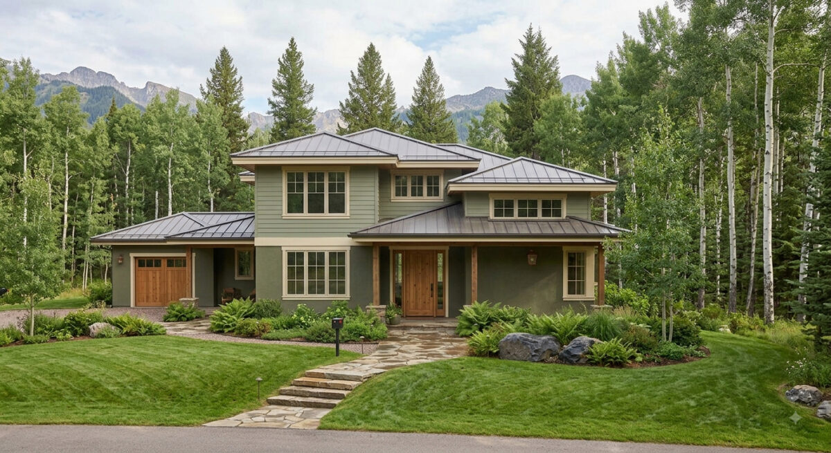
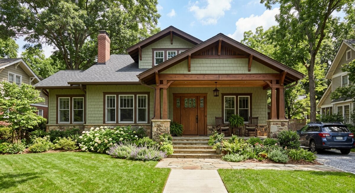
1. Earthy Sages and Olive Greens

Organic, nature-inspired greens have emerged as a breakout trend. Homeowners are choosing these colors because they feel sophisticated, calming, and deeply connected to the environment.

  • The Scheme: Sages and deep olives are typically used for the body of the house, paired with soft cream or warm white trim, and accented by natural wood elements (like a cedar front door).
  • Top Pick: Sherwin-Williams Evergreen Fog

2. Creamy, Warm Neutrals (The New Minimalist Look)

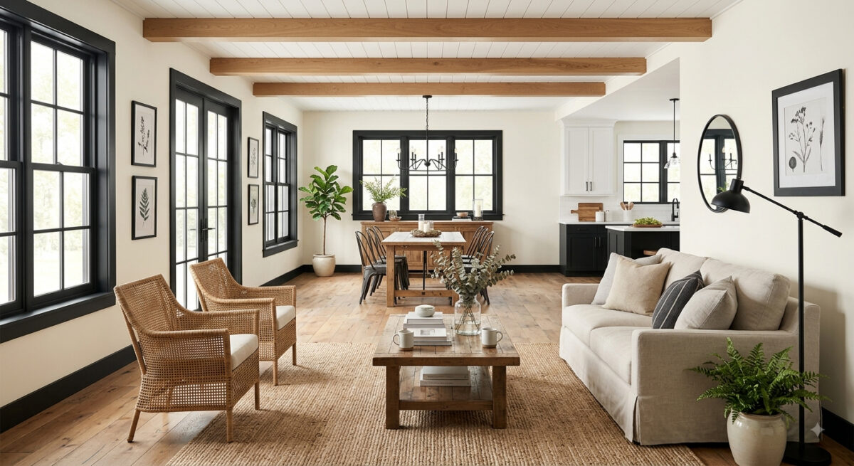
While the high-contrast modern look is still incredibly popular, stark, sterile whites are being replaced by softer, richer variants like cream, greige, and warm khaki.

  • The Scheme: A warm white or greige body paired with sharp, contrasting dark charcoal or bronze trim. This preserves the clean aesthetic of the modern farmhouse or contemporary home while feeling much more inviting.
  • Top Picks: Sherwin-Williams Alabaster, Sherwin-Williams Universal Khaki

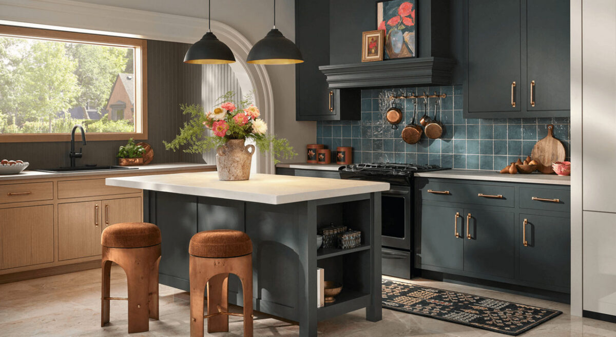
3. Warm Charcoals and Espresso Browns

For homeowners wanting a dramatic, dark exterior, cool slate grays have taken a backseat to deeply saturated dark hues with brown or warm undertones.

  • The Scheme: Using a rich charcoal or “near-black” as the primary body color. These are heavily accented with warm wood siding segments, brass house hardware, or soft, warm white trim to keep the look from feeling too surgical.
  • Top Pick: Sherwin-Williams Urbane Bronze

4. Clay, Terracotta, and Desert Tones

Particularly strong in warmer regions or on stucco, Mediterranean, and Southwest-style homes, earthy desert tones are making a noticeable comeback.

  • The Scheme: A muted terracotta or warm ochre clay body paired with dark black or bronze trim and iron hardware to ground the warmth.
  • Top Picks: Sherwin-Williams Cavern Clay or Rookwood Terra Cotta.

5. Classic Coastal Blues

A perennial favorite that remains highly requested across traditional and colonial architecture.

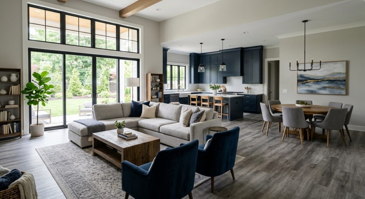
  • The Scheme: Saturated navy on the main siding. The current trend pairs navy with soft ivory or cream trim rather than standard bright white, which gives the exterior a more high-end, classic feel.
  • Top Pick: Sherwin-Williams Naval.

Call us at 541-497-3804

Bright and Timeless: Mastering the Modern Farmhouse Paint Palette

The modern farmhouse style is more than just a trend; it’s a timeless design philosophy that balances rustic warmth with clean, contemporary lines. When it comes to capturing this look on your walls and trim, the right color choices make all the difference.

The Foundation: Light and Airy Main Walls

To set the stage, opt for warm whites, soft creams, or very pale grays. These colors reflect natural light, making spaces feel larger and providing a neutral backdrop for your decor.

The Contrast: Bold Trim and Accents

The signature detail of a modern farmhouse is the use of deep charcoal or midnight black for trim, doors, window sashes, or even kitchen cabinetry. This creates a striking contrast against the light walls without disrupting the overall cohesion.

Transform Your Space with Sherwin-Williams August 2026 Color of the Month: Pennywise (SW 6349)

Bring warmth, personality, and grounding energy into your home this late summer with Sherwin-Williams’ August 2026 Color of the Month: Pennywise (SW 6349). At Paint Doctor’s Painting Service, we love helping homeowners transform their spaces with color choices that feel both modern and timeless.

Why We Love Pennywise (SW 6349)

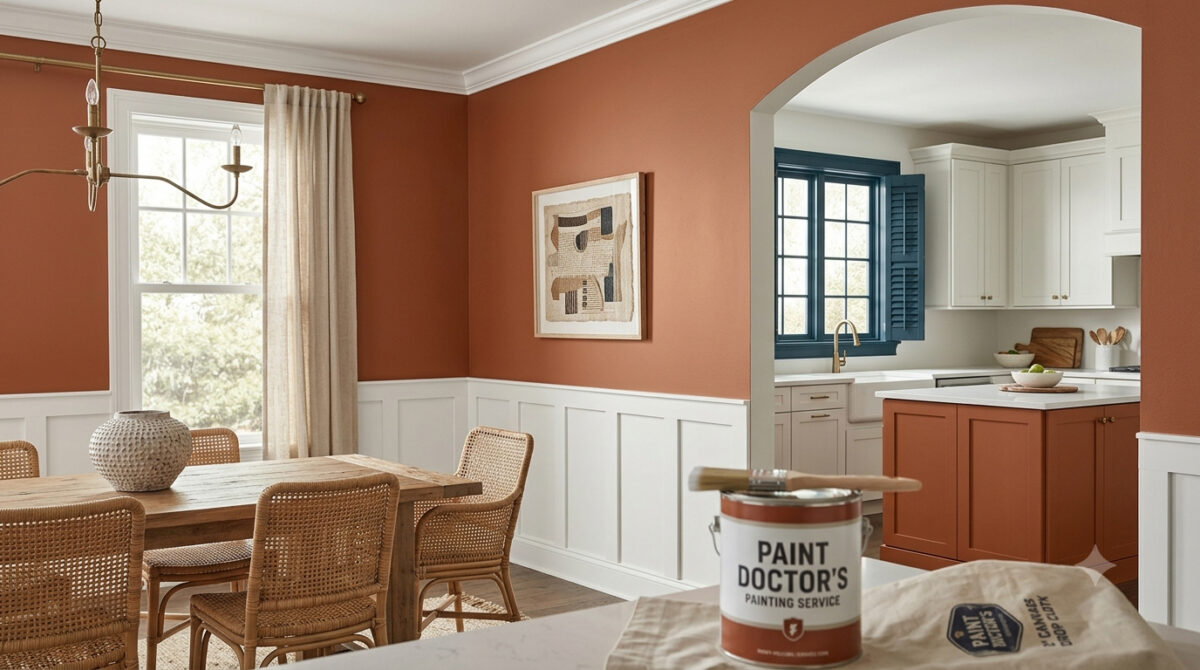
Pennywise is a rich, sun-baked terracotta neutral featuring soft clay undertones. It bridges the gap between vibrant warmth and earthy subtlety, making it an ideal choice for creating inviting, cozy interiors.

  • Versatile Tone: Works beautifully as an accent wall or across entire living rooms, dining spaces, and kitchen islands.
  • Organic Aesthetic: Aligns seamlessly with modern handcrafted design, natural woods, and woven textures.
  • Comforting Aura: Delivers a sophisticated, lived-in feel without overpowering the room.

Winning Color Palettes & Pairings

To highlight the warmth of Pennywise, contrast it with cool tones or crisp whites for a balanced aesthetic:

  • Pure White (SW 7005): Creates a clean, uplifting contrast on surrounding walls, trim, or ceilings to keep the space feeling bright and modern.
  • Bunglehouse Blue (SW 0048): Adds deep, dramatic sophistication. Use it on window trim, cabinetry, or exterior shutters to offset Pennywise’s earthy warmth.
  • Natural Elements: Pair with warm wood finishes, aged brass hardware, and greenery to accentuate its organic terracotta undertones.

Best Places to Use Pennywise in Your Home

  • Kitchen Island Accent: Paint your island base with Pennywise while keeping cabinets light for an instant, high-end focal point.
  • Dining Room Walls: Wrap your dining room in this inviting shade to create a intimate space for gatherings.
  • Front Door & Exterior Accents: Give your home’s entryway a memorable curb appeal boost with a terracotta touch that welcomes guests.

Let Paint Doctor’s Painting Service Bring Your Vision to Life

Achieving a smooth, flawless finish with rich terracotta tones requires proper surface preparation and professional application. Whether you want a single accent wall or a full interior overhaul, Paint Doctor’s Painting Service is here to deliver exceptional results. Contact us today to schedule your consultation and bring the warmth of Pennywise into your home! 541-497-3804

The Bold Design Trend Taking Over: What Is Color Drenching (and How to Do It Right)?

If you’ve spent any time on interior design blogs or Pinterest lately, you’ve probably noticed room transformations that feel surprisingly cozy, dramatic, and seamless. The secret? Color drenching.

It’s one of the most requested painting techniques right now, and for good reason—it completely changes the vibe of a home without requiring a massive renovation. But while the concept sounds simple, executing it takes strategy, precision, and the right prep work.

Here is everything you need to know about color drenching, why it works, and how to bring it into your home.

What Exactly Is Color Drenching?

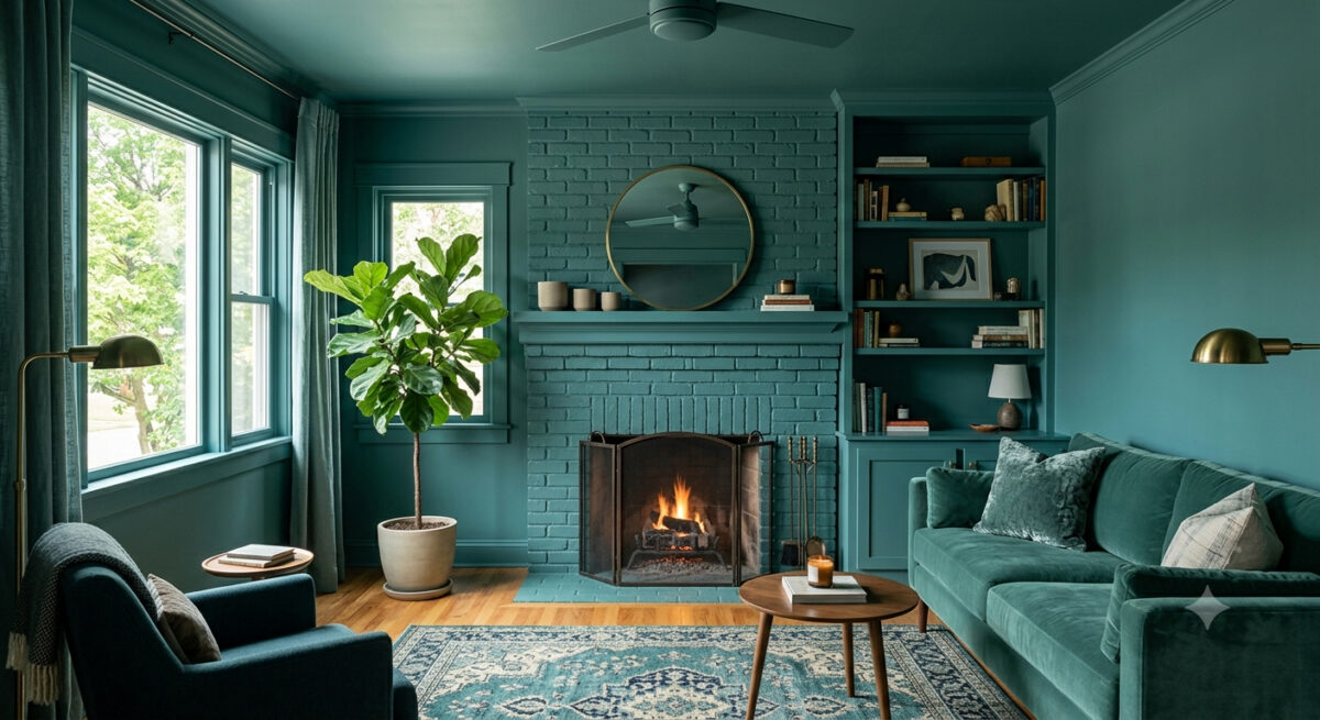
Color drenching is the process of painting everything in a room a single color (or varying tones of the same shade).

Instead of the traditional formula—colored walls paired with crisp white trim, white ceilings, and neutral doors—color drenching wraps the entire space in one cohesive hue.

That includes:

  • Walls and ceilings
  • Baseboards, crown molding, and door frames
  • Doors and window trim
  • Built-ins, radiators, and cabinetry

The result is an immersive, monochromatic look that makes architectural details blend together into a sleek, intentional backdrop.

Why Color Drenching Works So Well

Color drenching isn’t just a gimmick; it fixes several common design challenges:

1. It Makes Small Spaces Feel Larger

High-contrast white trim cuts a room into distinct horizontal line segments, visually chopping up the space. When you paint walls, trim, and ceilings the exact same shade, those visual borders disappear. Your eyes flow across the room uninterrupted, which actually makes small offices, powder rooms, or bedrooms feel larger and airier.

2. It Softens Awkward Architecture

Got sloped attic ceilings, bulky radiators, or asymmetrical doorway trim? Painting them the same shade as the wall masks visual clutter and lets the shape of the room feel intentional rather than chaotic.

3. It Creates Instant Mood and Drama

Deep tones like moody navy, forest green, rich terracotta, or soft charcoal create a cocoon-like environment. If you want a living room, library, or master bedroom that feels warm and inviting, color drenching is unmatched.

Pro Tip: The Secret Is in the Sheens

The biggest mistake DIYers make with color drenching is using the exact same paint sheen on every surface. Doing so can leave a room looking flat or clinical.

Professional painters use sheen variation to create subtle depth and durability while staying within one color family:

  • Ceilings: Flat or Ultramatt (hides imperfections and reduces glare).
  • Walls: Eggshell or Satin (easy to wipe down with a soft, warm glow).
  • Trim & Doors: Semi-Gloss or High-Gloss (adds contrast, resists scuffs, and reflects light beautifully).

Using higher sheens on trim and doors catches the light differently than the matte walls, giving you visual texture without introducing a second color.

3 Great Rooms to Try Color Drenching

  1. The Powder Room: Small, low-risk, and high-impact. Deep, dark shades work magic in small spaces.
  2. The Home Office or Den: Deep moody hues reduce visual distraction and create a focused, cozy atmosphere.
  3. The Master Bedroom: Soft, warm neutrals or muted greens create a calm, boutique-hotel retreat feel.

Ready to Transform Your Space?

While color drenching looks effortless, achieving flawless coverage across different surfaces—woodwork, drywall, and ceilings—takes expert surface prep, precise edging, and the right paint formulations.

If you’re ready to bring this stunning trend into your home without the hassle of taped edges and endless coats, we’re here to help.

Contact us today for a free color consultation and quote! 541-497-3804

Color Spotlight: Bring Natural Serenity Home with Sherwin-Williams Liveable Green (SW 6176)

Meta Description: Looking to refresh your home with a calming, organic shade? Discover why Sherwin-Williams Liveable Green (SW 6176) is the July 2026 Color of the Month and how Paint Doctor’s Painting Service can bring it to life!

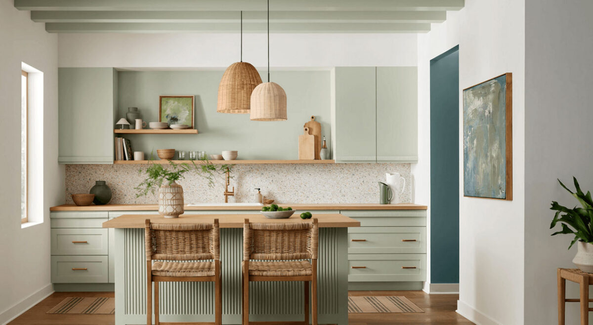
Summer is the season for light, refreshing home updates, and Sherwin-Williams picked the perfect hue to usher in the mid-summer breeze. Named the July 2026 Color of the Month, Liveable Green (SW 6176) is a gentle, breathable shade that brings a subtle, nature-inspired feel into any interior.

If you love the idea of incorporating color into your home but want to keep things soothing and sophisticated, Liveable Green functions almost as an organic neutral. At Paint Doctor’s Painting Service, our professional painters have seen soft greens become a staple in modern home design, and this timeless shade is one of the best on the market.

Here is your guide to styling and using Liveable Green in your home this season!

What Makes Liveable Green (SW 6176) So Unique?

Liveable Green strikes a rare balance: it introduces clear personality without dominating a room. With gentle yellow-gray undertones, it feels warm and grounded rather than chilly or clinical.

Quick Color Specs

  • Color Code: SW 6176
  • Undertones: Soft yellow, gray, and subtle sage
  • Light Reflectance Value (LRV): 61 (Light enough to bounce daylight around, while retaining a rich depth)
  • Vibe: Tranquil, organic, fresh, and effortlessly cozy

Where Liveable Green Shines Best

Because of its muted complexity, Liveable Green transitions effortlessly between different lighting conditions and architectural styles. Here are our favorite ways to use it:

1. Kitchens & Breakfast Nooks

Pair Liveable Green on walls or kitchen cabinets with natural stone countertops, warm oak shelving, and brushed brass hardware. It creates a bright, fresh morning feel that feels high-end and welcoming.

2. Restful Bedrooms & Guest Suites

Green is naturally restorative to the eyes and mind. Using Liveable Green in the bedroom creates a spa-like retreat that pairs beautifully with crisp white linens and rattan or light wood furnishings.

3. Focused Home Offices

Looking to reduce stress during the workday? Liveable Green offers an organic backdrop that promotes calm concentration without feeling dark or heavy.

Perfect Color Pairings

Sherwin-Williams highlights several complementary shades that pair seamlessly with Liveable Green to build a cohesive, balanced palette:

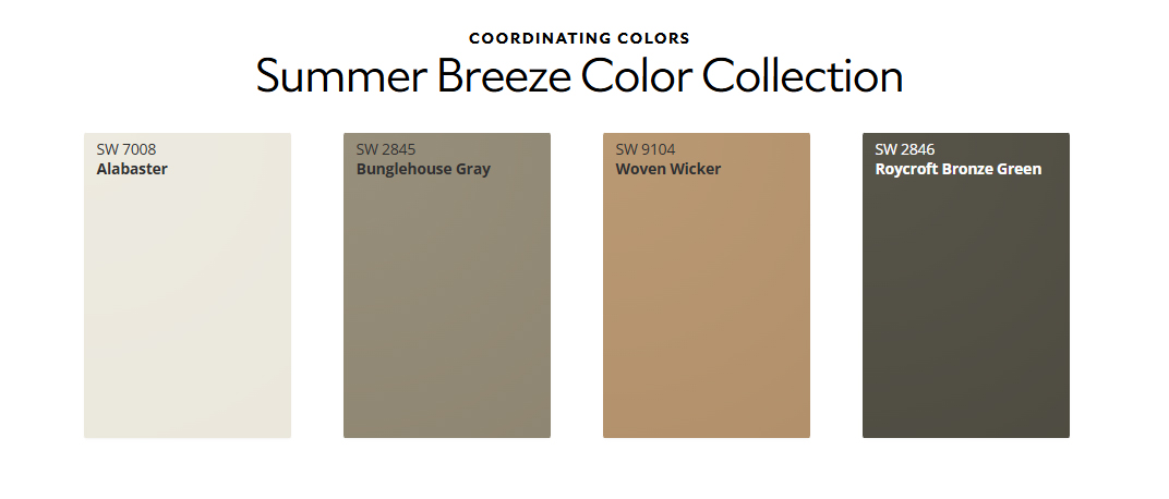
  • Warm White Trim: Alabaster (SW 7008) — Adds subtle, inviting contrast on trim, doors, and ceilings.
  • Earthy Mid-Tones: Woven Wicker (SW 9104) — Introduces a cozy, woven texture effect through paint.
  • Grounded Accent Colors: Roycroft Bronze Green (SW 2846) or Bunglehouse Gray (SW 2845) — Ideal for accent walls, kitchen islands, or interior doors to ground the light green walls.

Transform Your Space with Paint Doctor’s Painting Service

While soft greens are remarkably forgiving and adaptable, achieving clean trim lines, uniform sheen, and flawless coverage requires seasoned expert execution.

Whether you’re looking to update a single feature wall, transform your kitchen cabinets, or repaint your entire main floor, Paint Doctor’s Painting Service ensures a seamless experience from start to finish.

  • Detailed Surface Prep & Priming
  • Sharp Edges & Precision Workmanship
  • Premium Sherwin-Williams Products
  • Free In-Home Consultations & Estimates

Ready to Refresh Your Space This Summer?

Give your home the calm, refreshing update it deserves.

📞 Call Paint Doctor’s Painting Service today to book your color consultation, 541-497-3704

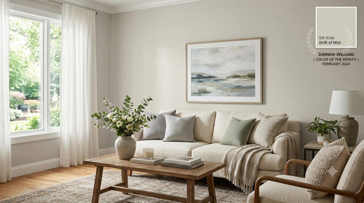
Color Spotlight: Why Sherwin-Williams Drift of Mist (SW 9166) is the Ultimate Light Neutral

Meta Description: Looking for the perfect airy neutral? Discover why Sherwin-Williams Drift of Mist (SW 9166) was named February 2024 Color of the Month and how Paint Doctor’s Painting Service can bring it to life in your home!

If you’ve been searching for a wall color that feels bright and open without looking like a sterile hospital room, you’re not alone. Finding that sweet spot between clean white and oppressive gray can feel nearly impossible—until you meet Sherwin-Williams Drift of Mist (SW 9166).

Selected as the Sherwin-Williams Color of the Month for February 2024, Drift of Mist is one of the most versatile, inviting neutrals on the market. At Paint Doctor’s Painting Service, our professional team has applied this timeless shade across countless homes, and it continues to be a client favorite.

Here is everything you need to know about Drift of Mist and how to use it to elevate your space.

What Makes Drift of Mist (SW 9166) So Special?

Drift of Mist is an off-white warm gray (often described as a light greige). It bridges the gap between modern cool tones and cozy warm tones, giving you maximum flexibility with your interior design.

Quick Color Specs

  • Color Code: SW 9166
  • Light Reflectance Value (LRV): 69 (Light and airy, bounces natural light without washing out completely)
  • Undertones: Soft, muted green and gray with gentle warmth
  • Vibe: Calm, serene, and sophisticated

How Light Affects Drift of Mist

Like any great neutral, Drift of Mist is a chameleon—it shifts subtly depending on the lighting in your room:

  • South-Facing & West-Facing Light: Warm afternoon sunlight brings out its cozy greige undertones, making the space feel inviting and soft.
  • North-Facing Light: Cooler, indirect light highlights its crisp gray side, giving it a sleek, modern finish.
  • Warm Artificial Lighting (2700K–3000K): Enhances the soft, beige nuances, perfect for cozy evening relaxation.

Best Rooms for Drift of Mist

Because of its high LRV and quiet character, Drift of Mist works almost anywhere, but it truly shines in these areas:

1. Open-Concept Main Floors & Hallways

If you want a seamless flow from your entry to your living and kitchen areas, Drift of Mist provides a cohesive backdrop that unifies different spaces without overpowering them.

2. Bedrooms & Spa-Like Bathrooms

Pair Drift of Mist with crisp white linens, light wood vanities, and brushed metal fixtures to create a calming, hotel-inspired retreat.

3. Kitchen Walls & Custom Cabinetry

On walls, it lets white tile and dark stone countertops pop. On kitchen cabinets, it provides a soft, warm alternative to stark white, creating a custom, high-end feel.

Perfect Color Pairings

Pairing neutrals requires an eye for undertones, and Drift of Mist coordinates effortlessly with a variety of accent shades:

  • Crisp Trim Whites: Pure White (SW 7005) or High Reflective White (SW 7757).
  • Soft Earthy Accents: Sea Salt (SW 6204) or Evergreen Fog (SW 9130) for a natural, coastal-inspired palette.
  • Bold Contrast: Iron Ore (SW 7069) or Naval (SW 6244) for built-ins, kitchen islands, or interior doors.

Bring Your Dream Palette to Life with Paint Doctor’s Painting Service

While Drift of Mist is an exceptionally easy color to love, getting a flawless, smooth coat requires professional skill—especially with subtle off-white tones where prep work and finish consistency are key.

Whether you want to refresh a single room, repaint your kitchen cabinets, or update your entire home’s exterior, Paint Doctor’s Painting Service is here to handle every step of the process.

  • Flawless Wall & Trim Prep
  • Clean, Precision Edges
  • Premium Sherwin-Williams Paints
  • Free Consultation & Quotes

Ready to Refresh Your Home?

Don’t guess with paint samples—let our experts deliver the flawless finish your home deserves!

📞 Call Paint Doctor’s Painting Service today to schedule your consultation, 541-4973804

Trend Alert: Elevate Your Home with Sherwin-Williams’ Sashay Sand

If you’re looking to refresh your home’s interior with a color that feels both modern and timeless, it’s time to take a look at Sashay Sand (SW 6051). Celebrated as a standout Sherwin-Williams Color of the Month, this stunning shade is redefining how we think about neutrals.

As professional painters, we see a lot of paint colors. For years, cool grays and crisp whites dominated the scene. But lately, homeowners are craving warmth, comfort, and personality. Sashay Sand delivers exactly that.

Here is why this blushing neutral is capturing everyone’s attention—and how you can use it to transform your space.

What Makes Sashay Sand So Special?

Sashay Sand isn’t just another beige, and it isn’t a loud, bright pink. It sits perfectly in the middle: a sophisticated, blushing taupe-pink with a Light Reflectance Value (LRV) of 49.

In plain English? It’s right in the sweet spot. It is deep enough to contrast beautifully against white trim, but light enough to bounce natural sunlight around a room, making spaces feel open, airy, and incredibly welcoming. It brings a “dreamy nostalgia” to a home, blending vintage charm with clean, modern minimalism.

The Best Spaces for Sashay Sand

While this color is incredibly versatile, our crew has seen it absolutely shine in a few specific areas of the home:

  • The Owner’s Suite: Bedrooms should be a sanctuary. Sashay Sand creates a calming, spa-like atmosphere that feels cozy at night and bright in the morning.
  • The Kitchen & Dining Area: Want a kitchen that feels warm and conversational? Pairing Sashay Sand walls with crisp white or deep earthy cabinetry creates a high-end, designer look.
  • Powder Rooms & Accent Walls: If you’re hesitant to commit an entire large room to a blush tone, a powder room or a feature wall is the perfect place to inject this sophisticated pop of color.

Designer-Approved Color Pairings

One of the reasons we love working with Sashay Sand is how beautifully it plays with other shades. If we were designing a palette for your home, we’d recommend pairing it with these Sherwin-Williams classics:

  • For a Clean, Classic Look: Pair it with White Snow (SW 9541) on the trim and ceilings to make the blush undertones pop.
  • For Modern Contrast: Combine it with Silver Gray (SW 0049) or Twilight Gray (SW 0054) for a stunning, balanced contrast between warm and cool tones.
  • For a Bold, Earthy Vibe: Bring in Cascade Green (SW 0066) on an accent piece or an adjacent room to ground the space in a nature-inspired aesthetic.

Why Professional Application Matters for Shades Like This

Colors with subtle pink, taupe, or beige undertones can be notoriously tricky. Depending on your room’s lighting—whether you have cool northern light or warm afternoon sun—Sashay Sand can shift characters throughout the day.

Furthermore, achieving a flawless finish with soft, elegant neutrals requires meticulous wall preparation, the right primer, and clean, sharp cut-ins along the trim. That’s where we come in. Our experienced team doesn’t just apply paint; we ensure the substrate is perfect so the color looks exactly as the designers intended.

Ready to Refresh Your Space?

Whether you’re completely sold on Sashay Sand or want to see how a physical swatch looks on your walls, we are here to help. Let’s bring a touch of warm, modern sophistication to your home.

Bakelite Gold

Beaver Believers welcome original oranges to their favorite spaces.

According to Sherwin-Williams, “Bakelite Gold is perfect for bringing character and warmth to a kitchen style that blends mid-century modern design with a timeless sensibility. Against a textured backdrop of aged, Alabaster brick, this happy hue grounds the modern-feeling aesthetic in a bright but earthy energy. A luxurious blue like Still Water pairs beautifully, creating a rich and intriguing contrast that pops in such a clean and simple space. The addition of bright brassy fixtures amplifies Bakelite’s shiny and positive attitude.”

Bakelite Gold offers a great element in Environmental Graphic Design.
An accent wall can bring game days in everyday.

Give us a call for some fresh upgrades for the next phase in your life, 541-497-3804.

Tradewind

May 2026 Color of the Month

Sherwin-Williams says, “Gentle and oceanic, Tradewind is a versatile hue that can find a home in coastal or southern-inspired spaces. Subtle green undertones turn high traffic areas like kitchens and hallways into calming spaces to quickly recharge throughout the day. From balancing the wood tones in your space or giving your home a vintage charm, this tranquil blue creates harmony for timeless and trendy spaces alike.”

Let us know if we can help transform your favorite spaces with Tradewind, 541-497-3804.

Whatever Happened to Weekends?

We’ve all seen the “weekend warrior” ads—the ones that make a full-house repaint look like a fun Saturday afternoon project. But as anyone who has actually tried to DIY a living room knows, the reality often involves three trips to the hardware store, paint in your hair, and a project that stretches into next month.

When you hire a professional painting contractor, you aren’t just paying for the color on the walls; you are buying efficiency.

Zero Downtime for Your Life

Your home is your sanctuary, not a construction zone. A DIY project can leave a room unusable for weeks.

The Pro Advantage: What takes a homeowner four weekends to finish, our crew can typically complete in two to three days. We get in, we move the furniture, we execute the work, and we leave your home spotless—allowing you to return to your routine immediately.

Ready to reclaim your weekend? Let us handle the logistics, the ladders, and the clean-up. Contact us today for a quote and see how efficient your next home transformation can be, 541-497-3804