Few architectural styles command the cozy, grounded charm of an American Craftsman home. Defined by low-pitched gable roofs, tapered porch columns, handcrafted knee braces, and exposed rafter tails, Craftsman architecture celebrates structural artistry and natural materials.
However, when it comes time to paint a Craftsman exterior, many homeowners feel overwhelmed. With so many architectural elements—shingles, lap siding, structural beams, window casings, brackets, and stone piers—how do you pull together a cohesive palette that honors history while maximizing curb appeal?
Born out of the early 20th-century Arts and Crafts movement, traditional Craftsman homes rely on exterior colors that harmonize directly with the surrounding landscape. In this guide, we break down the core principles of Craftsman color theory, present five authentic paint palettes, and share practical design tips to make your home’s handcrafted details shine.
1. The Core Principles of Craftsman Exterior Design
Before selecting paint chips, it helps to understand how colors function on a traditional Craftsman facade. Unlike minimalist modern homes or stark monochrome farmhouses, a Craftsman home depends on a carefully layered hierarchy of shades.
The Rule of Three (Body, Trim, Accent)
A successful Craftsman scheme almost always relies on three distinct color roles:
- Body (60–70% of the exterior): This is the main color applied to your lap siding, shingle cladding, or stucco. It serves as the visual anchor and should generally be an organic, muted shade found in nature.
- Trim (25–30% of the exterior): Applied to window casings, porch pillars, fascia boards, and door frames. Trim provides definition and outlines the home’s silhouette.
- Accent (5–10% of the exterior): Reserved for focal points like the front door, window sashes, decorative gable brackets, or exposed rafter tails. This is where you can introduce bolder contrast.
Integrating Natural Materials
Paint should never fight against your home’s permanent hardscaping. Original Craftsman homes rely heavily on unpainted materials like river rock foundations, fieldstone chimneys, red brick pedestals, and stained wood shakes. Always select paint undertones that match the warmth or coolness of your existing masonry and wood tones.
2. 5 Authentic Craftsman Color Palettes
Palette 1: Earth & Forest Green
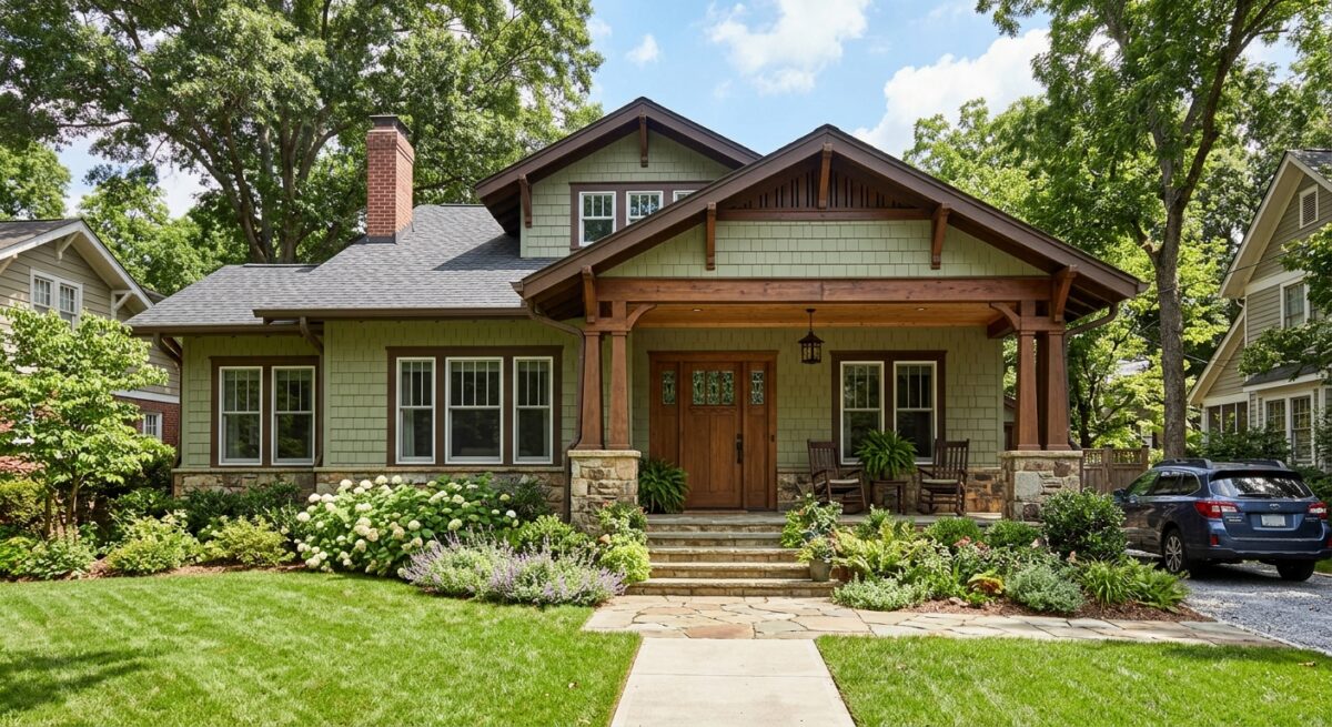
This is perhaps the quintessential American Arts and Crafts combination. Deep, muted greens allow the home to feel as though it grew naturally out of its surrounding landscape.
- Body: Deep Sage or Olive Green
- Trim: Warm Cream or Soft Off-White
- Accent & Door: Crimson, Rust Red, or Natural Stained Dark Wood
- Best For: Properties surrounded by mature trees, lush gardens, or wooded lots.
Palette 2: Warm Earthy Brown & Taupe
Grounding and inviting, a brown-based palette emphasizes warmth and substantial architectural weight. It bridges the gap between raw timber and finished paint.
- Body: Chestnut Brown, Bark, or Warm Taupe
- Trim: Soft Beige or Warm Vanilla
- Accent & Door: Deep Forest Green or Rich Burgundy
- Best For: Homes featuring prominent river rock, fieldstone pedestals, or exposed brickwork.
Palette 3: Pacific Northwest Slate & Cedar
For a slightly cooler, maritime-inspired look that remains thoroughly historic, slate blues and charcoal grays offer striking contrast when paired with warm wood accents.
- Body: Slate Blue or Dusty Charcoal Gray
- Trim: Classic Antique White
- Accent & Door: Natural Cedar Stain, Warm Terracotta, or Mustard Yellow
- Best For: Coastal environments, mountain homes, or modern updates to traditional bungalows.
Palette 4: Warm Clay & Ochre
Inspired by the Prairie School and Southwestern Craftsman interpretations, warm clay and golden ochre tones create a welcoming, sun-drenched appearance.
- Body: Terracotta, Dusty Clay, or Warm Ochre
- Trim: Deep Bronze or Espresso Brown
- Accent & Door: Rich Cream or Forest Green
- Best For: Sunny climates, desert landscapes, and historic bungalow restorations.
Palette 5: Classic Cream & Dark Trim (The Inverted Look)
While most Craftsman homes feature dark body colors with lighter trim, flipping the dynamic creates a light, expansive feel without sacrificing architectural gravity.
- Body: Warm Buff, Soft Tan, or Cream
- Trim: Deep Forest Green, Dark Chocolate Brown, or Charcoal
- Accent & Door: Rich Stained Mahogany or Redwood
- Best For: Smaller bungalows or homes shaded by heavy tree cover, making the structure feel larger and brighter.
3. Highlight Structural Details with Contrast
The magic of a Craftsman home lies in its joinery and woodcraft. Using color strategically ensures these expensive details don’t blend into the background.
| Architectural Element | Recommended Color Placement | Visual Purpose |
|---|---|---|
| Gables & Knee Braces | Dark Accent Color | Draws the eye upward to timber joinery & roof structure |
| Window Casings & Trim | Secondary Trim Color | Defines home silhouette & outlines window openings |
| Window Sashes | Dark Accent Color | Creates visual depth within window recesses |
| Main Siding / Shingles | Dominant Body Color | Grounds the house and anchors it to surroundings |
| Front Door | Vibrant Accent or Stained Wood | Creates a clear, welcoming focal point |
- Tapered Columns & Pillars: Paint the main shaft of porch columns in your trim color to visually anchor the heavy porch roof to stone or brick piers below.
- Gables & Knee Braces: Consider using your accent color—or a shade one step darker than your body color—on decorative gables, timber trusses, and knee braces to create shadow depth.
- Window Sashes vs. Trim: A traditional Craftsman technique is painting window frames/trim light cream while painting the inner moveable window sashes a dark accent (such as dark brown, dark green, or black). This gives windows visual depth and historical accuracy.
- Stained Wood Surfaces: Never paint over high-quality cedar shakes, solid wood front doors, or tongue-and-groove porch ceilings if they are in good condition. A clear protective stain highlights grain patterns that paint conceals.
4. Tips for Selecting Paint Brands & Testing Samples
- Look to Historical Collections: Major manufacturers offer curated historic palettes. Search for lines such as Sherwin-Williams’ Preservation Historic Collection or Benjamin Moore’s Historical Color Collection.
- Account for Natural Light: Exterior colors always appear 1 to 2 shades lighter outdoors under direct sunlight than on a small swatch indoors. Select a shade with enough depth so it doesn’t look washed out at noon.
- Test Large Swatches: Paint a minimum 2 ft. x 2 ft. section directly onto the siding next to your trim and stonework. Observe the test area at different times of day—morning sun, afternoon shade, and dusk—to see how undertones shift.
Conclusion
Choosing traditional Craftsman house exterior colors is all about honoring the relationship between architecture, materials, and nature. By using the Rule of Three, coordinating paint with natural stone and wood, and painting structural accents to highlight craftsmanship, you can create a timeless facade that stands out in any neighborhood.
Give us a call 541-497-3804