
Trend Alert: Elevate Your Home with Sherwin-Williams’ Sashay Sand

If you’re looking to refresh your home’s interior with a color that feels both modern and timeless, it’s time to take a look at Sashay Sand (SW 6051). Celebrated as a standout Sherwin-Williams Color of the Month, this stunning shade is redefining how we think about neutrals.

As professional painters, we see a lot of paint colors. For years, cool grays and crisp whites dominated the scene. But lately, homeowners are craving warmth, comfort, and personality. Sashay Sand delivers exactly that.

Here is why this blushing neutral is capturing everyone’s attention—and how you can use it to transform your space.

What Makes Sashay Sand So Special?

Sashay Sand isn’t just another beige, and it isn’t a loud, bright pink. It sits perfectly in the middle: a sophisticated, blushing taupe-pink with a Light Reflectance Value (LRV) of 49.

In plain English? It’s right in the sweet spot. It is deep enough to contrast beautifully against white trim, but light enough to bounce natural sunlight around a room, making spaces feel open, airy, and incredibly welcoming. It brings a “dreamy nostalgia” to a home, blending vintage charm with clean, modern minimalism.

The Best Spaces for Sashay Sand

While this color is incredibly versatile, our crew has seen it absolutely shine in a few specific areas of the home:

  • The Owner’s Suite: Bedrooms should be a sanctuary. Sashay Sand creates a calming, spa-like atmosphere that feels cozy at night and bright in the morning.
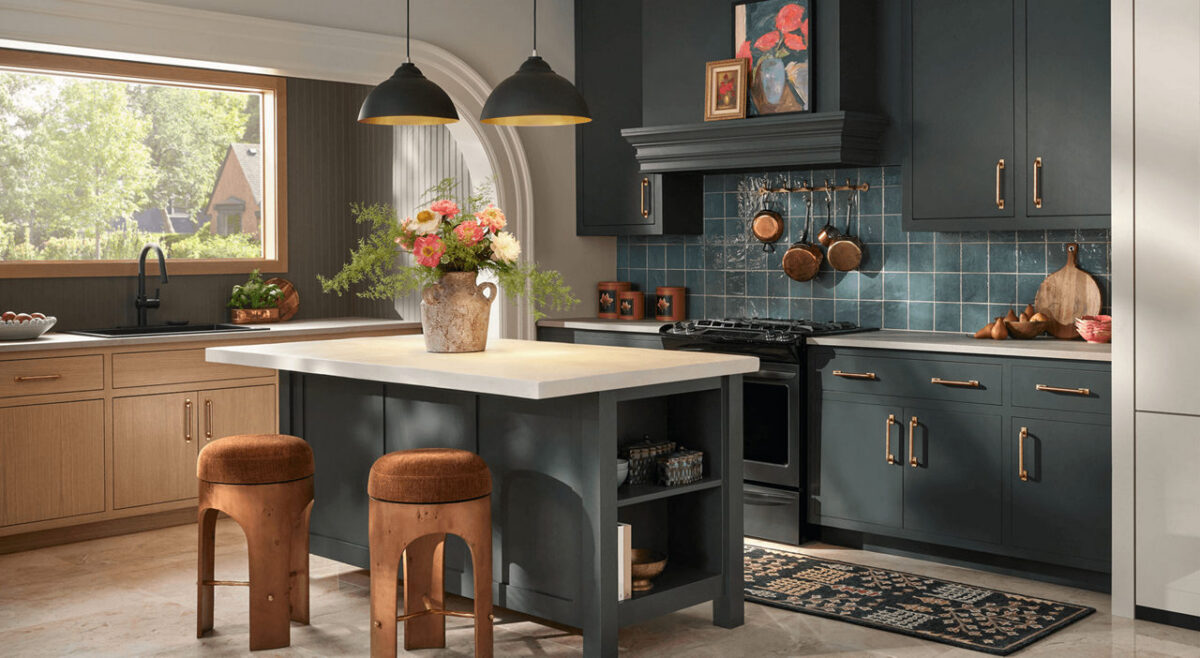
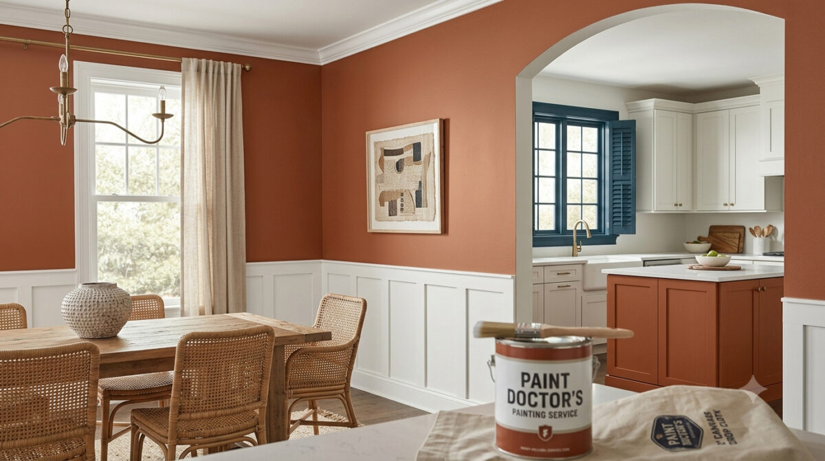
  • The Kitchen & Dining Area: Want a kitchen that feels warm and conversational? Pairing Sashay Sand walls with crisp white or deep earthy cabinetry creates a high-end, designer look.
  • Powder Rooms & Accent Walls: If you’re hesitant to commit an entire large room to a blush tone, a powder room or a feature wall is the perfect place to inject this sophisticated pop of color.

Designer-Approved Color Pairings

One of the reasons we love working with Sashay Sand is how beautifully it plays with other shades. If we were designing a palette for your home, we’d recommend pairing it with these Sherwin-Williams classics:

  • For a Clean, Classic Look: Pair it with White Snow (SW 9541) on the trim and ceilings to make the blush undertones pop.
  • For Modern Contrast: Combine it with Silver Gray (SW 0049) or Twilight Gray (SW 0054) for a stunning, balanced contrast between warm and cool tones.
  • For a Bold, Earthy Vibe: Bring in Cascade Green (SW 0066) on an accent piece or an adjacent room to ground the space in a nature-inspired aesthetic.

Why Professional Application Matters for Shades Like This

Colors with subtle pink, taupe, or beige undertones can be notoriously tricky. Depending on your room’s lighting—whether you have cool northern light or warm afternoon sun—Sashay Sand can shift characters throughout the day.

Furthermore, achieving a flawless finish with soft, elegant neutrals requires meticulous wall preparation, the right primer, and clean, sharp cut-ins along the trim. That’s where we come in. Our experienced team doesn’t just apply paint; we ensure the substrate is perfect so the color looks exactly as the designers intended.

Ready to Refresh Your Space?

Whether you’re completely sold on Sashay Sand or want to see how a physical swatch looks on your walls, we are here to help. Let’s bring a touch of warm, modern sophistication to your home.

How to Use Sherwin-Williams Upward (SW 6239): The Ultimate Painter’s Guide

Choosing the perfect blue paint can feel like a gamble. Go too vibrant, and your living room feels like a nursery. Go too dark, and it feels like a stormy cave.

When Sherwin-Williams featured Upward (SW 6239) as a prominent Color of the Year and headline Color of the Month, they handed homeowners the perfect solution. It is a light, breezy denim blue with calm gray undertones that balances a space without shouting.

As professional painting contractors, we can apply this color in a variety of rooms in your home. Here is the technical breakdown, the best room applications, and the exact coordinating palettes to make your next interior project flawless.

The Technical Specs: What Designers Look For

Before dipping a brush, it helps to understand how a color interacts with light. Here is the technical profile for Upward:

AttributeSpecificationWhat It Means For Your Room
Color FamilyBlue-GrayA muted, dusty denim rather than a bright primary blue.
HEX Code#BFC9D0The precise digital signature for color matching and rendering.
RGB ProfileR: 191, G: 201, B: 208Balanced mid-tones with a slight push toward cool gray.
LRV (Light Reflective Value)57.0Out of 100, this sits just above the midpoint. It bounces plenty of light back into a room without washing out under bright bulbs.

The Undertone Warning: Upward features a subtle hint of silver/violet. In rooms with no natural light (like an interior powder bath), it can lean slightly violet. In spaces with morning sun, it reads as a true, crisp coastal blue.

Best Room Applications for Upward

Where does this color actually work? Because it functions almost like a cool neutral, it is incredibly versatile.

1. Bedrooms & Spa-Like Bathrooms

Upward is inherently meditative. When applied to bedroom walls or paired with white subway tile in a bathroom, it immediately softens the morning light. It creates a serene, relaxed atmosphere that helps you wind down.

2. Kitchen Cabinets or Accent Islands

If you love a clean white kitchen but want a pop of color, Upward is excellent for lower cabinets or a central island. It pairs beautifully with white quartz countertops (especially those with soft gray or gold veining) and brushed nickel hardware.

Bright coastal kitchen featuring a kitchen island and walls painted in Sherwin-Williams Upward SW 6239, three woven rattan barstools, a marble slab backsplash, white cabinetry, and spherical woven pendant lights.

3. Great Rooms with Shiplap

For transitional, coastal, or casual Nordic aesthetics, painting shiplap or accent walls in Upward adds depth without making a large room feel smaller.

Expert Coordinating Palettes for SW 6239

To keep a cool blue from feeling chilly, you have to balance it with the right trim and accent colors. We recommend three distinct palettes depending on your home’s style:

Palette A: The Soft Coastal (Most Popular)

  • Trim & Doors: Snowbound (SW 7004) — A soft, warm white that keeps the blue looking fresh.
  • Grounding Neutral: Drift of Mist (SW 9166) or Natural Linen (SW 9109) — Adds an earthy, sandy balance.
  • Hardware: Warm brass or brushed gold.

Palette B: The Modern Contrast

  • Trim & Doors: Pure White (SW 7005) — Crisp and clean.
  • Dramatic Accent: Gale Force (SW 7605) or Naval (SW 6244) — Deep, moody blues for built-ins or adjacent doors.
  • Hardware: Matte black or polished chrome.

Palette C: The Organic Tonal Look

  • Companion Hue: Evergreen Fog (SW 9130) — A gorgeous chameleon green-gray.
  • Hardware: Oil-rubbed bronze to lean into a rich, historic, or craftsman-style finish.

Ready to Transform Your Space?

While lookbooks and color chips are a great starting point, paint always looks different on your unique walls. Factors like your home’s flooring, window direction, and existing furniture will shift how Upward reflects.

If you are located in our service area and want to see how Sherwin-Williams Upward looks under your home’s lighting, contact our team today. We provide professional color consultations and flawless, mess-free execution to bring your vision to life.

To visually explore how this color shifts under different lighting conditions and see real-world design applications before finalizing your project, check out this comprehensive Sherwin-Williams Upward Paint Color Review, which breaks down exactly how the undertones behave and what design mistakes you should avoid.

If we can help you with transforming your interior vibe, call us today for a color consultation or bid on your project: 541-497-3804