
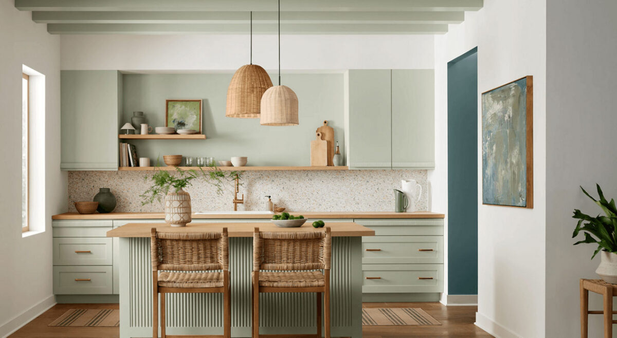

Color Spotlight: Bring Natural Serenity Home with Sherwin-Williams Liveable Green (SW 6176)

Meta Description: Looking to refresh your home with a calming, organic shade? Discover why Sherwin-Williams Liveable Green (SW 6176) is the July 2026 Color of the Month and how Paint Doctor’s Painting Service can bring it to life!

Summer is the season for light, refreshing home updates, and Sherwin-Williams picked the perfect hue to usher in the mid-summer breeze. Named the July 2026 Color of the Month, Liveable Green (SW 6176) is a gentle, breathable shade that brings a subtle, nature-inspired feel into any interior.

If you love the idea of incorporating color into your home but want to keep things soothing and sophisticated, Liveable Green functions almost as an organic neutral. At Paint Doctor’s Painting Service, our professional painters have seen soft greens become a staple in modern home design, and this timeless shade is one of the best on the market.

Here is your guide to styling and using Liveable Green in your home this season!

What Makes Liveable Green (SW 6176) So Unique?

Liveable Green strikes a rare balance: it introduces clear personality without dominating a room. With gentle yellow-gray undertones, it feels warm and grounded rather than chilly or clinical.

Quick Color Specs

  • Color Code: SW 6176
  • Undertones: Soft yellow, gray, and subtle sage
  • Light Reflectance Value (LRV): 61 (Light enough to bounce daylight around, while retaining a rich depth)
  • Vibe: Tranquil, organic, fresh, and effortlessly cozy

Where Liveable Green Shines Best

Because of its muted complexity, Liveable Green transitions effortlessly between different lighting conditions and architectural styles. Here are our favorite ways to use it:

1. Kitchens & Breakfast Nooks

Pair Liveable Green on walls or kitchen cabinets with natural stone countertops, warm oak shelving, and brushed brass hardware. It creates a bright, fresh morning feel that feels high-end and welcoming.

2. Restful Bedrooms & Guest Suites

Green is naturally restorative to the eyes and mind. Using Liveable Green in the bedroom creates a spa-like retreat that pairs beautifully with crisp white linens and rattan or light wood furnishings.

3. Focused Home Offices

Looking to reduce stress during the workday? Liveable Green offers an organic backdrop that promotes calm concentration without feeling dark or heavy.

Perfect Color Pairings
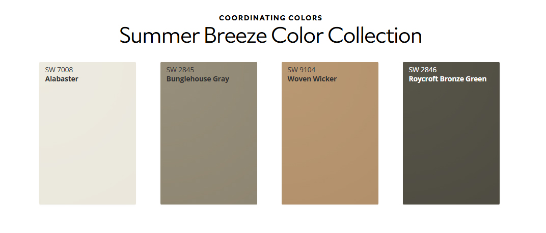
Sherwin-Williams highlights several complementary shades that pair seamlessly with Liveable Green to build a cohesive, balanced palette:

  • Warm White Trim: Alabaster (SW 7008) — Adds subtle, inviting contrast on trim, doors, and ceilings.
  • Earthy Mid-Tones: Woven Wicker (SW 9104) — Introduces a cozy, woven texture effect through paint.
  • Grounded Accent Colors: Roycroft Bronze Green (SW 2846) or Bunglehouse Gray (SW 2845) — Ideal for accent walls, kitchen islands, or interior doors to ground the light green walls.

Transform Your Space with Paint Doctor’s Painting Service

While soft greens are remarkably forgiving and adaptable, achieving clean trim lines, uniform sheen, and flawless coverage requires seasoned expert execution.

Whether you’re looking to update a single feature wall, transform your kitchen cabinets, or repaint your entire main floor, Paint Doctor’s Painting Service ensures a seamless experience from start to finish.

  • Detailed Surface Prep & Priming
  • Sharp Edges & Precision Workmanship
  • Premium Sherwin-Williams Products
  • Free In-Home Consultations & Estimates

Ready to Refresh Your Space This Summer?

Give your home the calm, refreshing update it deserves.

📞 Call Paint Doctor’s Painting Service today to book your color consultation, 541-497-3704
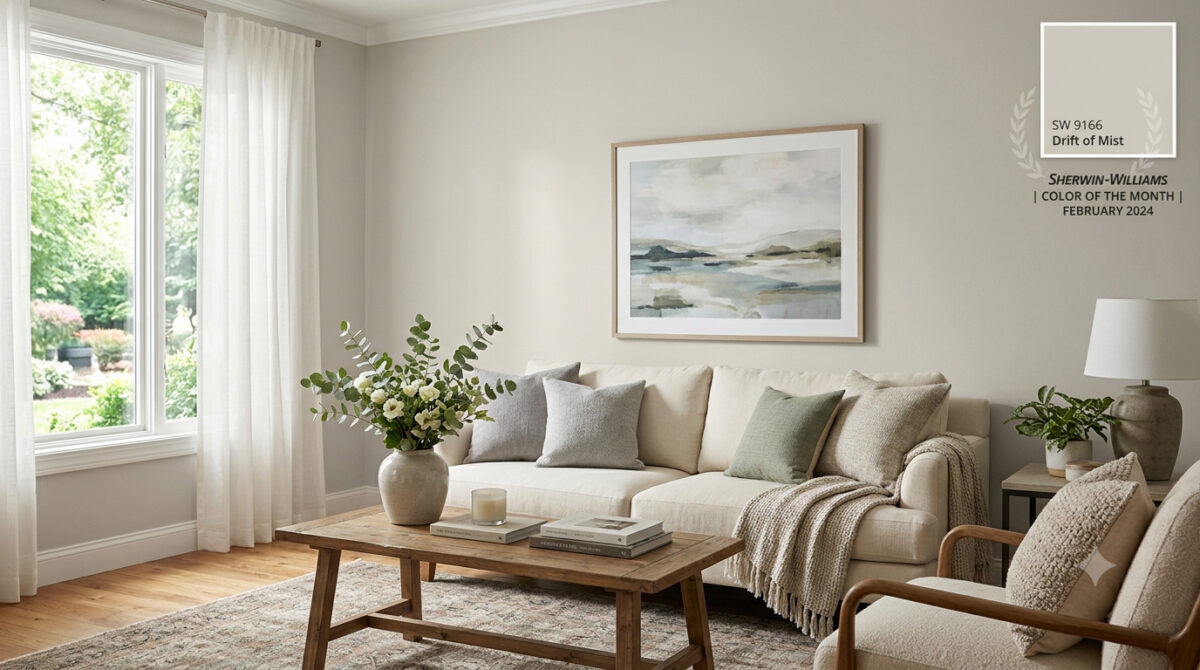
Color Spotlight: Why Sherwin-Williams Drift of Mist (SW 9166) is the Ultimate Light Neutral

Meta Description: Looking for the perfect airy neutral? Discover why Sherwin-Williams Drift of Mist (SW 9166) was named February 2024 Color of the Month and how Paint Doctor’s Painting Service can bring it to life in your home!

If you’ve been searching for a wall color that feels bright and open without looking like a sterile hospital room, you’re not alone. Finding that sweet spot between clean white and oppressive gray can feel nearly impossible—until you meet Sherwin-Williams Drift of Mist (SW 9166).

Selected as the Sherwin-Williams Color of the Month for February 2024, Drift of Mist is one of the most versatile, inviting neutrals on the market. At Paint Doctor’s Painting Service, our professional team has applied this timeless shade across countless homes, and it continues to be a client favorite.

Here is everything you need to know about Drift of Mist and how to use it to elevate your space.

What Makes Drift of Mist (SW 9166) So Special?

Drift of Mist is an off-white warm gray (often described as a light greige). It bridges the gap between modern cool tones and cozy warm tones, giving you maximum flexibility with your interior design.

Quick Color Specs

  • Color Code: SW 9166
  • Light Reflectance Value (LRV): 69 (Light and airy, bounces natural light without washing out completely)
  • Undertones: Soft, muted green and gray with gentle warmth
  • Vibe: Calm, serene, and sophisticated

How Light Affects Drift of Mist

Like any great neutral, Drift of Mist is a chameleon—it shifts subtly depending on the lighting in your room:

  • South-Facing & West-Facing Light: Warm afternoon sunlight brings out its cozy greige undertones, making the space feel inviting and soft.
  • North-Facing Light: Cooler, indirect light highlights its crisp gray side, giving it a sleek, modern finish.
  • Warm Artificial Lighting (2700K–3000K): Enhances the soft, beige nuances, perfect for cozy evening relaxation.

Best Rooms for Drift of Mist

Because of its high LRV and quiet character, Drift of Mist works almost anywhere, but it truly shines in these areas:

1. Open-Concept Main Floors & Hallways

If you want a seamless flow from your entry to your living and kitchen areas, Drift of Mist provides a cohesive backdrop that unifies different spaces without overpowering them.

2. Bedrooms & Spa-Like Bathrooms

Pair Drift of Mist with crisp white linens, light wood vanities, and brushed metal fixtures to create a calming, hotel-inspired retreat.

3. Kitchen Walls & Custom Cabinetry

On walls, it lets white tile and dark stone countertops pop. On kitchen cabinets, it provides a soft, warm alternative to stark white, creating a custom, high-end feel.

Perfect Color Pairings

Pairing neutrals requires an eye for undertones, and Drift of Mist coordinates effortlessly with a variety of accent shades:

  • Crisp Trim Whites: Pure White (SW 7005) or High Reflective White (SW 7757).
  • Soft Earthy Accents: Sea Salt (SW 6204) or Evergreen Fog (SW 9130) for a natural, coastal-inspired palette.
  • Bold Contrast: Iron Ore (SW 7069) or Naval (SW 6244) for built-ins, kitchen islands, or interior doors.

Bring Your Dream Palette to Life with Paint Doctor’s Painting Service

While Drift of Mist is an exceptionally easy color to love, getting a flawless, smooth coat requires professional skill—especially with subtle off-white tones where prep work and finish consistency are key.

Whether you want to refresh a single room, repaint your kitchen cabinets, or update your entire home’s exterior, Paint Doctor’s Painting Service is here to handle every step of the process.

  • Flawless Wall & Trim Prep
  • Clean, Precision Edges
  • Premium Sherwin-Williams Paints
  • Free Consultation & Quotes

Ready to Refresh Your Home?

Don’t guess with paint samples—let our experts deliver the flawless finish your home deserves!

📞 Call Paint Doctor’s Painting Service today to schedule your consultation, 541-4973804

Trend Alert: Elevate Your Home with Sherwin-Williams’ Sashay Sand

If you’re looking to refresh your home’s interior with a color that feels both modern and timeless, it’s time to take a look at Sashay Sand (SW 6051). Celebrated as a standout Sherwin-Williams Color of the Month, this stunning shade is redefining how we think about neutrals.

As professional painters, we see a lot of paint colors. For years, cool grays and crisp whites dominated the scene. But lately, homeowners are craving warmth, comfort, and personality. Sashay Sand delivers exactly that.

Here is why this blushing neutral is capturing everyone’s attention—and how you can use it to transform your space.

What Makes Sashay Sand So Special?

Sashay Sand isn’t just another beige, and it isn’t a loud, bright pink. It sits perfectly in the middle: a sophisticated, blushing taupe-pink with a Light Reflectance Value (LRV) of 49.

In plain English? It’s right in the sweet spot. It is deep enough to contrast beautifully against white trim, but light enough to bounce natural sunlight around a room, making spaces feel open, airy, and incredibly welcoming. It brings a “dreamy nostalgia” to a home, blending vintage charm with clean, modern minimalism.

The Best Spaces for Sashay Sand

While this color is incredibly versatile, our crew has seen it absolutely shine in a few specific areas of the home:

  • The Owner’s Suite: Bedrooms should be a sanctuary. Sashay Sand creates a calming, spa-like atmosphere that feels cozy at night and bright in the morning.
  • The Kitchen & Dining Area: Want a kitchen that feels warm and conversational? Pairing Sashay Sand walls with crisp white or deep earthy cabinetry creates a high-end, designer look.
  • Powder Rooms & Accent Walls: If you’re hesitant to commit an entire large room to a blush tone, a powder room or a feature wall is the perfect place to inject this sophisticated pop of color.

Designer-Approved Color Pairings

One of the reasons we love working with Sashay Sand is how beautifully it plays with other shades. If we were designing a palette for your home, we’d recommend pairing it with these Sherwin-Williams classics:

  • For a Clean, Classic Look: Pair it with White Snow (SW 9541) on the trim and ceilings to make the blush undertones pop.
  • For Modern Contrast: Combine it with Silver Gray (SW 0049) or Twilight Gray (SW 0054) for a stunning, balanced contrast between warm and cool tones.
  • For a Bold, Earthy Vibe: Bring in Cascade Green (SW 0066) on an accent piece or an adjacent room to ground the space in a nature-inspired aesthetic.

Why Professional Application Matters for Shades Like This

Colors with subtle pink, taupe, or beige undertones can be notoriously tricky. Depending on your room’s lighting—whether you have cool northern light or warm afternoon sun—Sashay Sand can shift characters throughout the day.

Furthermore, achieving a flawless finish with soft, elegant neutrals requires meticulous wall preparation, the right primer, and clean, sharp cut-ins along the trim. That’s where we come in. Our experienced team doesn’t just apply paint; we ensure the substrate is perfect so the color looks exactly as the designers intended.

Ready to Refresh Your Space?

Whether you’re completely sold on Sashay Sand or want to see how a physical swatch looks on your walls, we are here to help. Let’s bring a touch of warm, modern sophistication to your home.