Cool Colors

The color experts at Sherwin-Williams describe cool colors: “What comes to mind when we think of cool colors? Whether it’s a serene lake or a clear sky, cooler hues are often associated with feelings of calmness, relaxation, and tranquility. They’re a softer option that can make a space feel larger thanks to the way they make color look like it’s receding.”

Green
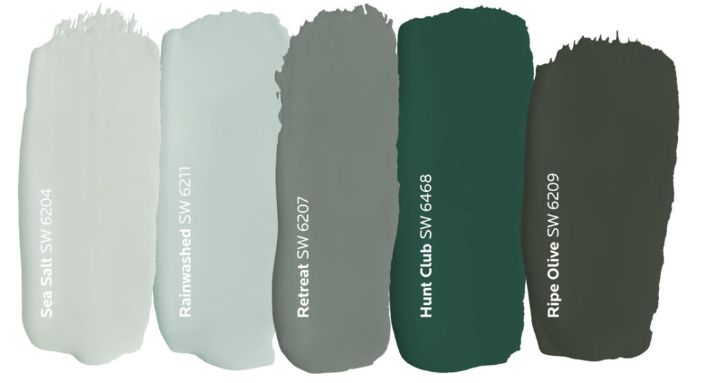
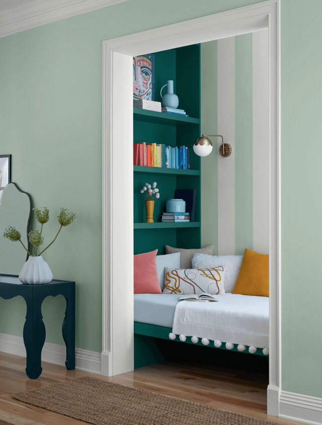
Mixed with the calming nature of blue and vibrancy of yellow, green is a color embodying balance and harmony. This down-to-earth hue is just as diverse as the nature it’s inspired by. Soft sea-greens can bring a restorative energy into a space, while deep olive tones can add depth and stability that feels anchored to the ground. Consider using deep greens to emphasize features you want to stand out like kitchen cabinets.
Blue
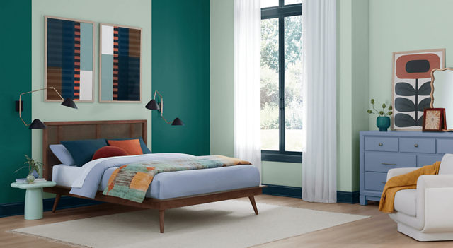
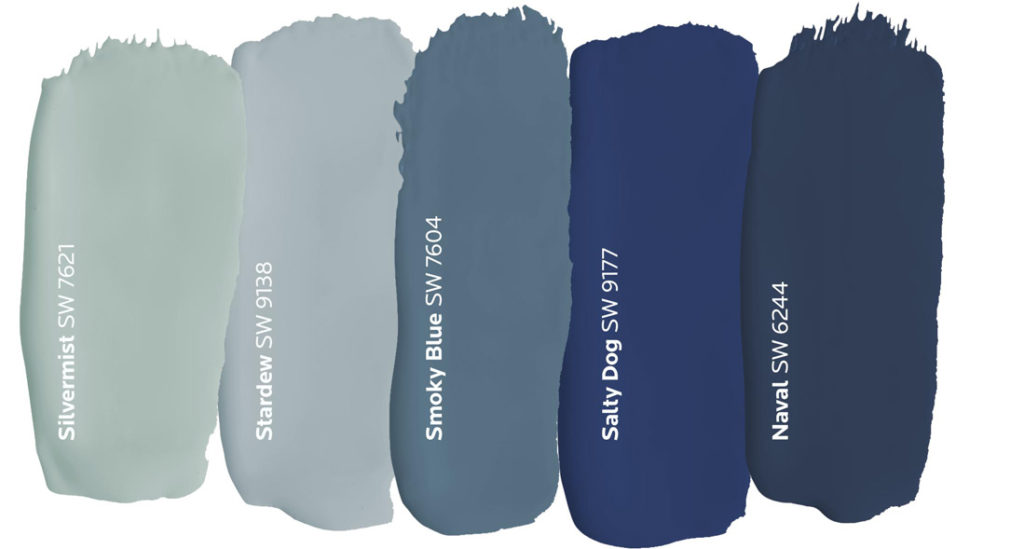
It’s the color of trust and tranquility. Blue is just as refreshing and friendly as it is reserved and sophisticated. It’s representation of sea and sky closely ties to open spaces where inspiration and imagination flourish. Soothing shades of dusty blue create a sense of serenity, while midnight shades of navy can add depth and drama. Blue’s universal energy makes it a hue that works anywhere.
Purple
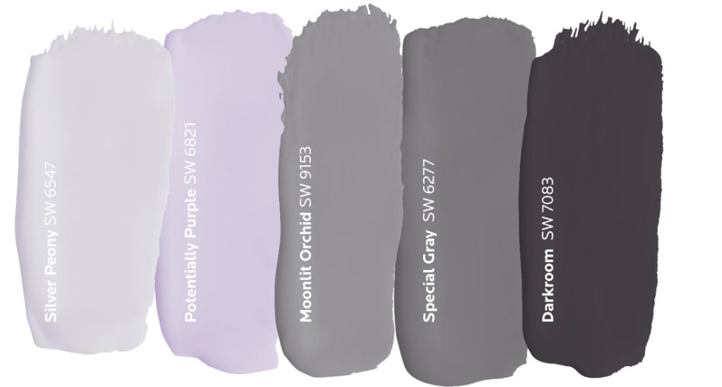
Like green, purple embodies the characteristics of the colors it’s made of. The energy of red and tranquility of blue result in a hue that’s rooted in imagination and poise. With the ability to be both calming and uplifting, purple is an ideal choice for spaces where you seek creative energy and focus. Try this distinguished color in a home office or as an accent wall in a meditation space.

Warm, cool or neutral, we have you covered. Do it right the first time with the Paint Doctor! 541-497-3804

Getting Warmer

Choosing paint colors can be fun for some and challenging for others. Sherwin-Williams can help with some color concepts staring with the warmth of the colors:

“It’s all in the name. Warm shades of red, orange and yellow are associated with the literal warmth that the sun and fire radiate. These vivid shades are closely tied to energy, joy and positivity, to create a space where the emotion feels uplifting and welcoming.”

Red
Red is symbolic of strength, power and passion, but it’s boldness can often overshadow its versatility. The key to using this hue is focusing on the statement you want to make with it. While the brighter shades of red generate more energy, darker ones tend to show a softer side that’s subtle and conservative. Consider a rich burgundy or brick red when designing for a space where the atmosphere is warm and welcoming, like a dining room.
Orange
The overall friendliness of orange makes it an ideal choice for rooms where people gather, but it’s also well suited for front doors that welcome guests into your home. From the bright citrusy hues to the muted earth tones, this happy hue’s versatility allows it to work well with a number of different design styles.
Yellow
A cheery nature follows yellow wherever it goes. This golden hue triggers thoughts of happiness and sunshine especially when it’s used in a room with lots of natural light. Since it’s often considered to be the brightest warm color, a soft, sunny yellow is the perfect choice for guest bedrooms because it makes everyone feel right at home.

Top Interior Paint Color Choices

Sherwin-Williams offers a wide range of popular interior paint colors. Here are some of the top choices that homeowners and designers love:

Neutrals

Accessible Beige (SW 7036): A warm beige with gray undertones, perfect for creating a cozy yet modern look. Alabaster (SW 7008): A warm, off-white color that provides a clean, versatile look.

Grays

Repose Gray (SW 7015): A timeless, light gray that works well in any room. Agreeable Gray (SW 7029): A popular greige (gray-beige) that’s both warm and inviting.

Blues

Naval (SW 6244): A bold, deep navy that adds richness and depth to a space. Misty (SW 6232): A soft, light blue that’s perfect for a calming atmosphere.

Greens

Sea Salt (SW 6204): A light, muted green that’s both soothing and sophisticated3. Evergreen Fog (SW 9130): A versatile blend of green and gray for a timeless look.

Whites

Pure White (SW 7005): A bright white that adds a crisp, clean feel. Snowbound (SW 7004): Another popular choice for a soft white that exudes warmth.

Bold Choices

Tricorn Black (SW 6258): A classic, deep black that can add drama and sophistication. Iron Ore (SW 7069): A deep charcoal gray with a mysterious quality.

These colors are consistent customer favorites because they offer beauty and versatility across various styles and spaces.

Slow Green February 2025 Color of the Month


According to Sherwin-Williams.com, “With blue and green tones on the rise, Slow Green captures the essence of two popular color families within its balanced undertone. It has a subtle demeanor that lets you push the envelope of color exploration without feeling overwhelmed by bold, maximalist shades. Instead, this lively hue feels refreshing and buildable in accordance with their interior styles.”

Perfect for the places and spaces where you like to relax and unwind.