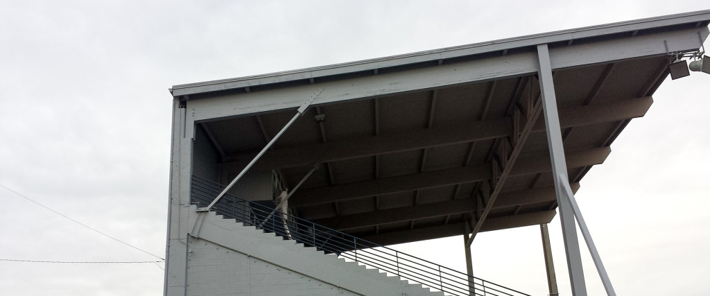
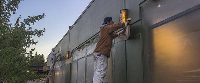
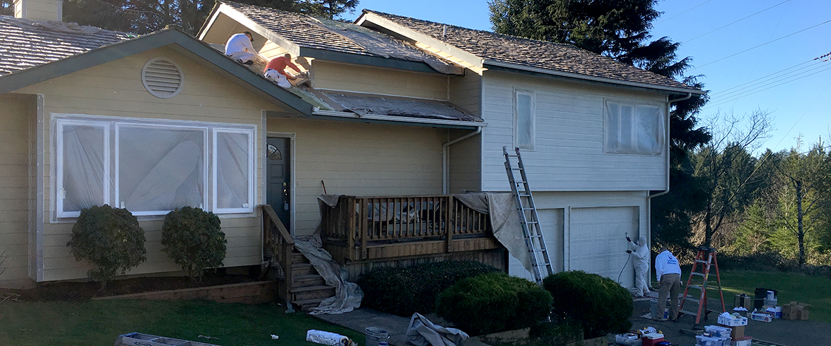
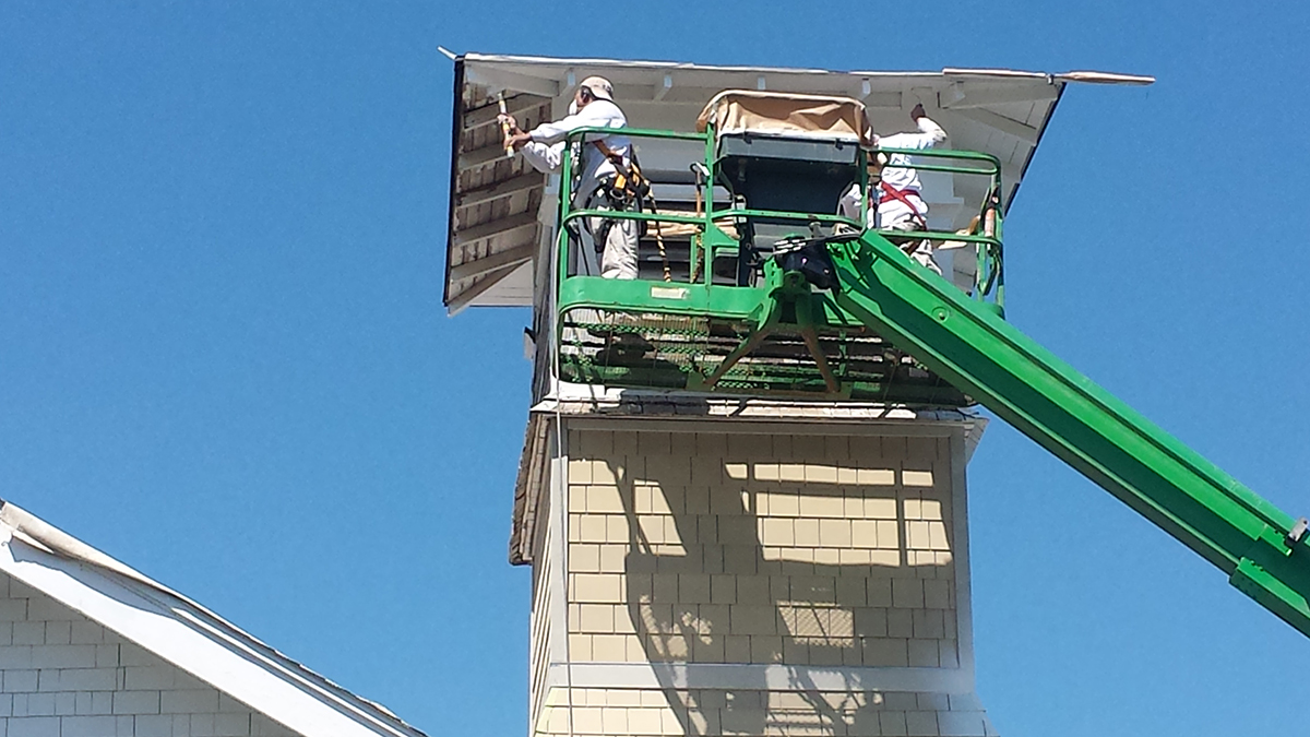
One of the great features of Northwest architecture is the use of natural wood finishes. On a recent job we had plenty of opportunity to show off our natural wood finishing skills on the accent areas of this coastal home. Soffits, exterior ceilings, facia boards, barge rafters and porch posts all needed the TLC of our professional crew to bring out the natural beauty while protecting the wood from the elements.
Good call choosing natural wood and great call on choosing the right painting company, Paint Doctor’s Painting Service 541-497-3804
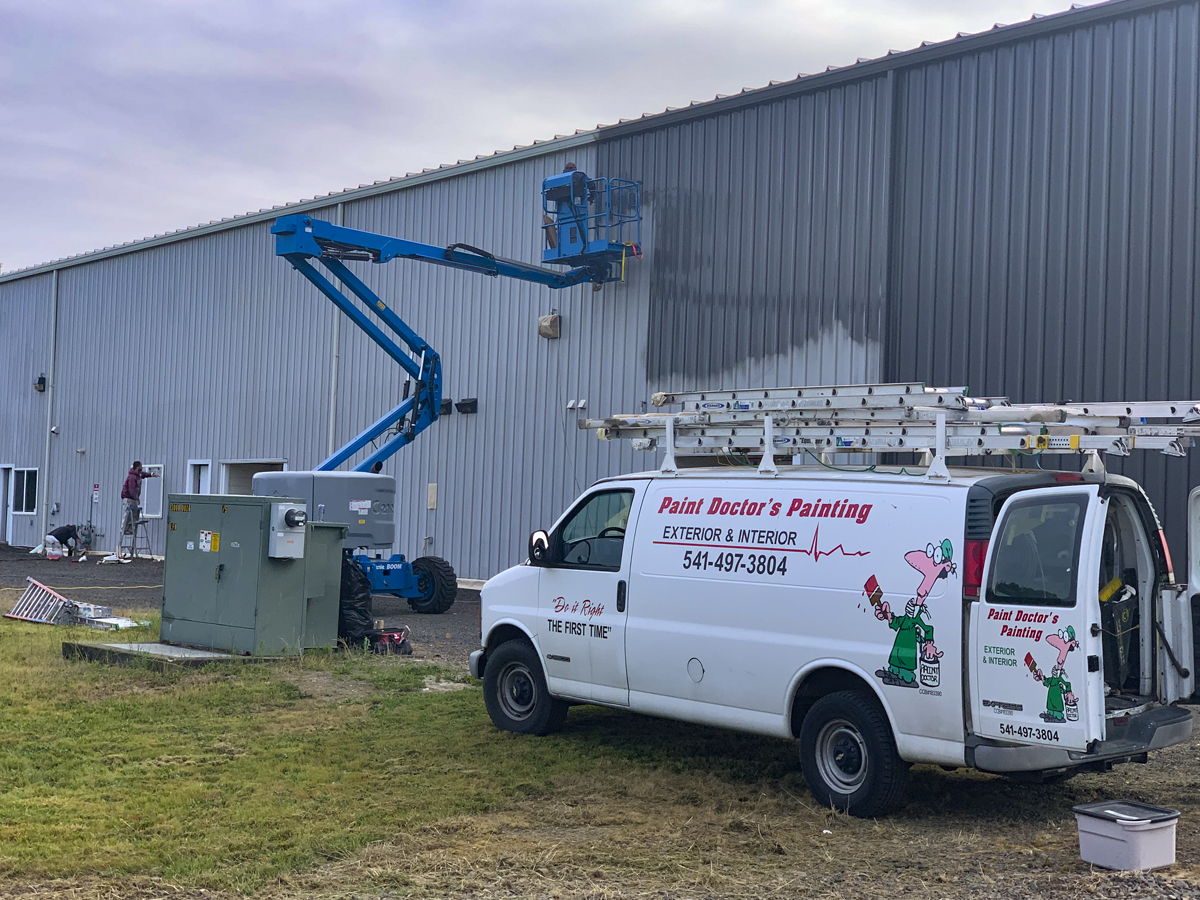
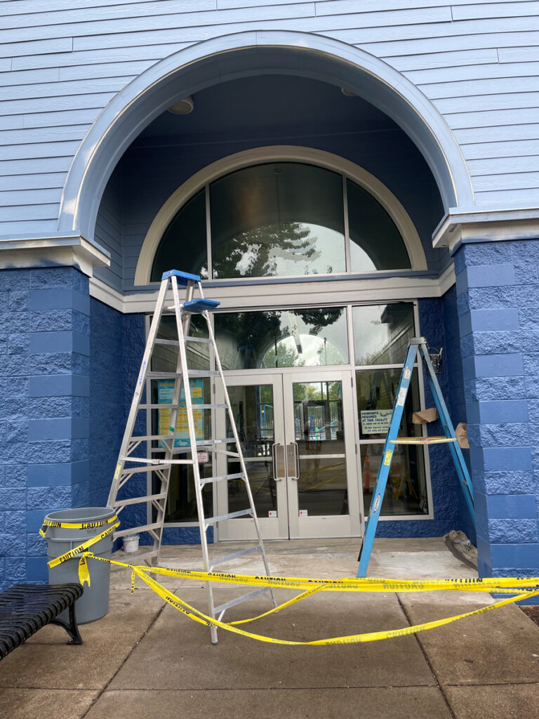
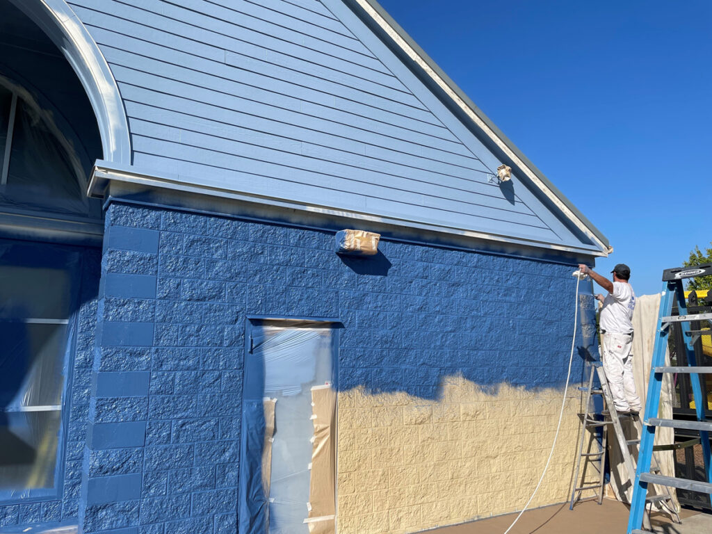
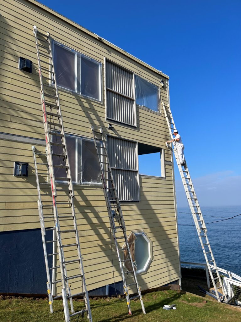
A valued customer called the doctor recently with a severe case of faded gray. What can be done? You choose the hue and we’ll do the blue for you. And so the work began. We measured and ordered and cleaned and prepped and scraped and caulked and masked and climbed and sprayed and rolled and brushed all that faded gray away. Health and happiness returned to this home because, as always, we had done the job right the first time. Enjoy!
The hue we do for you can be blue, or you do you and choose. Call Mike 541-497-3804
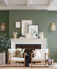
The color of the month is Cascades SW7623, which Sherwin-Williams describes as “Dramatic and moody, yet tranquil and grounded, Cascades’ versatility carries a wide range of design styles. Embrace the serene atmosphere inspired by its soothing shade.”
Bring the timeless and simple beauty of the outdoors in with September’s palette and style. Cascades’ dark, majestic green-blue is the perfect shade for naturalist living style. A nature-loving design deserves a gorgeous green hue like this one that envelops interiors with a lush and dramatic feel. As the grounding color of this collection, Cascades has a refined, balanced tone that can stand out on its own or set the stage for the other colors in the collection to shine.
Rooted in modern organic style, this look is all about creating cozy, harmonious spaces inspired by nature. Cascades is the perfect shade for grounding the space and evoking outdoor vibes. Pair with a soothing gray-green like Evergreen Fog to soften the look and create a nurturing, fresh atmosphere. To really capture the essence of the style, lean into its organic side with soft textures, natural materials and earthy accent tones to make your space feel lived-in, warm and welcoming.
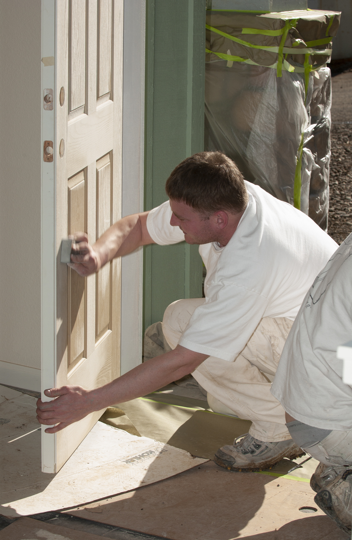
It’s an expression that means “it may seem simple, but…” It’s identifying and dealing with loose paint. It’s filling nail holes and non-nail holes. It’s getting that fill perfectly flat and making sure a change in sheen doesn’t give it away. It’s knowing when, where, why and how to caulk. It’s the chemical properties of a proper bond and what primers are best for adhesion to your particular substrate and adhesion to the finish coat – not to mention coverage and stain blocking, which both have an amazing amount of details to consider.
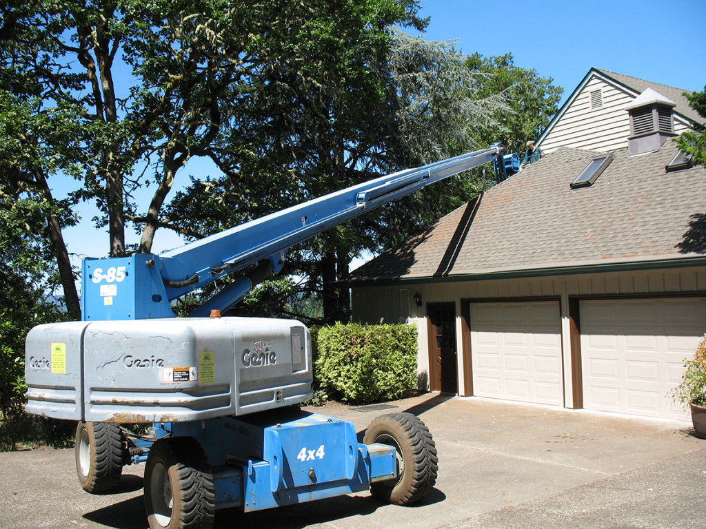
There is way more to painting than spraying, rolling or brushing and way more to these three methods than most might think. Then, oh my friends, then there is the getting there – to every surface, peak, dormer, soffit and lay-on-your-back-to-reach edge.
Leave the devilish details to us. Call Mike 541-497-3804
Stair with color and flair. Not sure what to do with your wood stairs. You’re not alone, it’s complicated, it’s time to call in the pros at Paint Doctor’s Painting.
Check out this recent project, which included some challenging stair work. Mike can fill you in on the details, but foot traffic adds another aspect to the finish selecting process. In addition to the usual water penetration and UV protection considerations, penetration is a key component for trafficked surfaces.
Details on this project included the posts and rails and working around some cool cable infill. Note the metal stays between posts. Getting the right adhesion for this mixed media stair case is among the important components to the selecting the right coatings.
Don’t just stair, stair with the Paint Doctor. Give Mike a call. 541-497-3804.
Got a cinder block wall section? These are not for the faint of heart when it comes to painting. The prep has to be just right. The primer has to be spot on. We always endeavor to do the job right the first time for lasting results. We have the experience for your project. Call Mike 541-497-3804
Sherwin-Williams says, “Just like the surf that inspired it, Silvermist’s cool tone can look both blue and green. You’ll be ready to embrace both as you drift away on the coastal vibes of this gentle hue that’s so serene, you’ll be dreaming of breezy ocean air.”
Let us know if we can help with your interior color update. We also have plenty of good weather your exterior paint project as well. Mike 541-497-3804
One of the biggest challenges for amateurs is keeping the brush properly loaded. In an effort to be careful, they will not dip the brush deep enough and then wipe too much paint off of the brush. This promotes trying to spread too little paint too far resulting in poor coverage and poor flow.
The pros on our team keep the brush loaded which makes the job go faster, produces better coverage and eliminates over brushing. Over brushing causes paint to ball up and interferes with the flow, leaving brush marks and changing the texture of the surface. Experience matters, especially when it comes to handling a paint brush.
Call Mike to get it done right the first time! 541-497-3804
According to Sherwin-Williams, “Kale Green’s lush tone feels like it was picked straight from the tropics and placed into a maximalist oasis where no rules are the rules.”
Make room for more of what you love with a style and color that brings the fun in an eclectic but elevated way. Kale Green’s lush shade adds just the right amount of drama for a maximalist look that rides on tropical boho vibes. Whether you use a lot or a little of this hue, it makes a vibrant statement that sets the mood for your space. In a style that invites you to go for it, be sure to bring it with color!
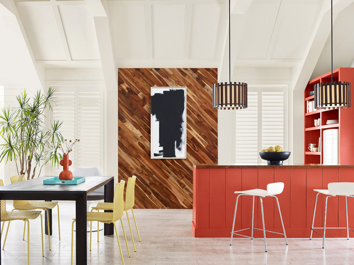
Bold color transforms spaces. A dark neutral like Black Magic has the power to transport. Anchor your maximalist-influenced bathroom in this hue’s dark tone and watch as the brighter shades in the palette combine to create the carefree feel of a tropical escape. Alabaster provides a clean backdrop to heighten the pleasing sense of contrast and acts as a blank canvas. Just a bit of Kale Green amplifies the botanical tone of the foliage and artwork, while a tiny dose of Peppery’s fiery shade pops as an accent. Bringing these tropical pairings together brings an elevated but attainable feel.
When you’re working with such a gorgeous green, why not use it to greet your guests? Kale Green’s dialed-up energy sets the stage for your maximalist story to unfold inside and brings your front porch space alive with a little inspiration from the wild outdoors. Along with just a touch of Peppery, these bolder colors pop against the bright surrounding shade of Alabaster, and create a seamless and harmonious flow to what awaits.