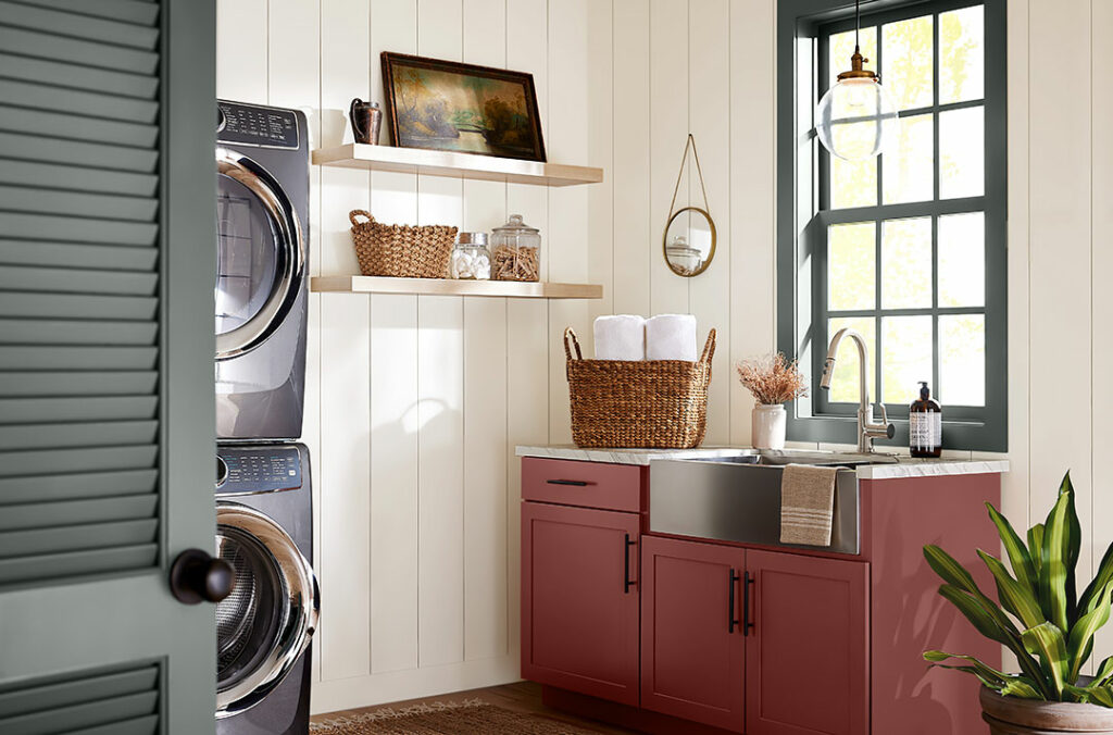
Silver Strand

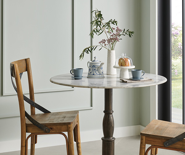
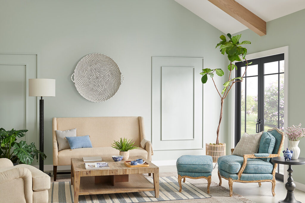
According to Sherwin-Williams, you can “wade into an elegance that ebbs and flows between the laid-back atmosphere of a coastal look and a more elevated yet approachable modern style. With Silver Strand anchoring the collection, May’s Seaside Tranquility palette weaves a harmonious backdrop of refreshing and relaxed comfort that ties it all together.”
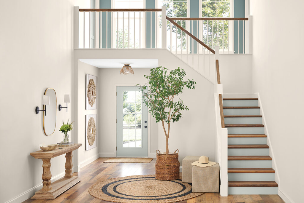
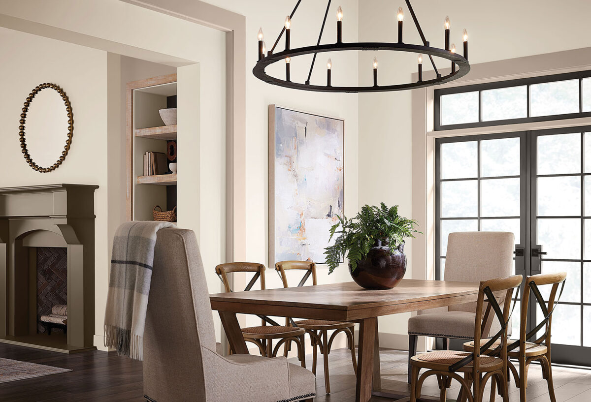
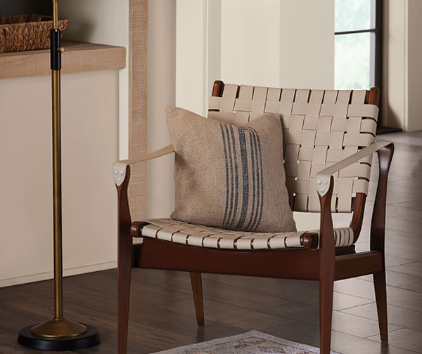
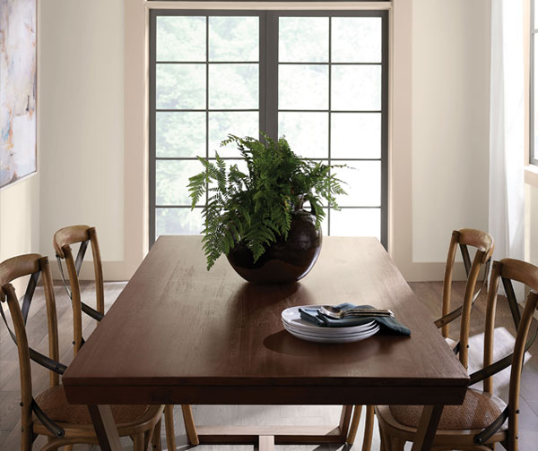
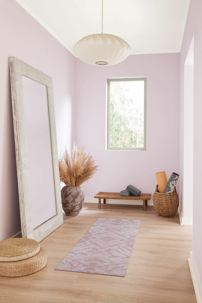
Greet guests with a stunning shade of warm white that bathes spaces with a welcoming feel. As backdrop, Egret White’s bright shade breathes an airy expansiveness into the sun-drenched foyer and sets a tone of serene sophistication. Subtle pops of Silver Strand’s soft, breezy shade evoke the soothing qualities of lounging by the seaside. Warm wood tones coupled with the texture of accents like a jute rug and wicker baskets underscore the rustic charm. The overall uncomplicated, minimalist approach leaves the space with a clean, fresh feel that’s timeless.
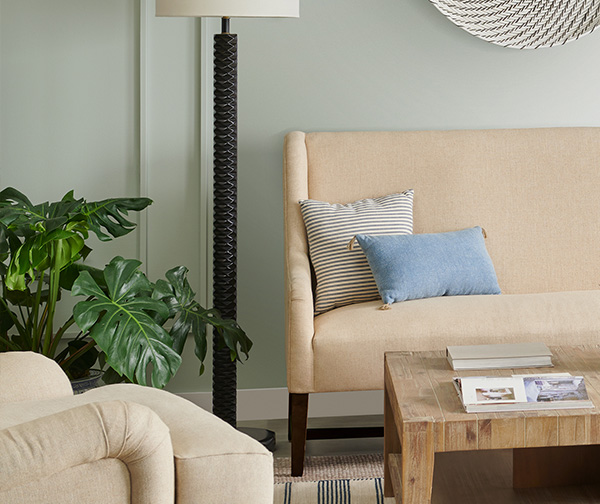
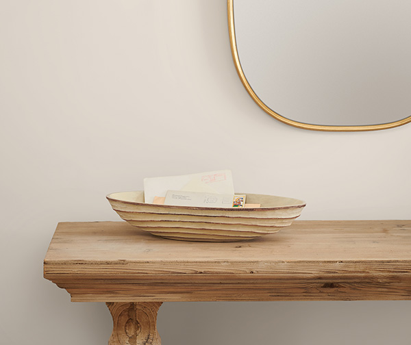
Our coastal customers will appreciate the décor elements and colors that pair well with Silver Strand.

Kestrel White

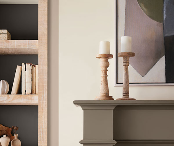
It’s hard to beat the classic color of a well tinted white like Kestrel White from Sherwin-Williams. This is one of those colors you can use throughout the house with no concerns about it going out of style. Are you considering changing furniture soon? Neutral wall colors are a great way to get the latitude you want so other décor will fit right in. Lasting beauty can be applied by our crew while you shop for your new look in wall coverings and furniture. Call us at 541-497-3804.

Color palette to go with off white.

Malted Milk

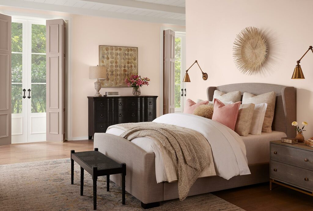
Staying with our spring theme of pastels, here is anther color by Sherwin-Williams, “Malted Milk’s soft shade can turn every day into a sweet escape. Couple this blushing beauty with cottagecore vibes to craft a home where little moments are romanticized.”

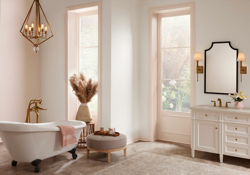
Bathroom with claw foot tub and pink trim.
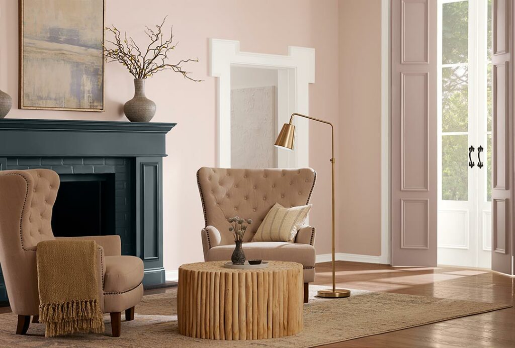
Parlor with green tone fireplace and pink walls
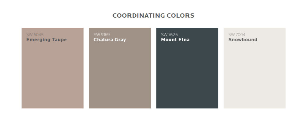
House paint colors that go with pink

Wallflower

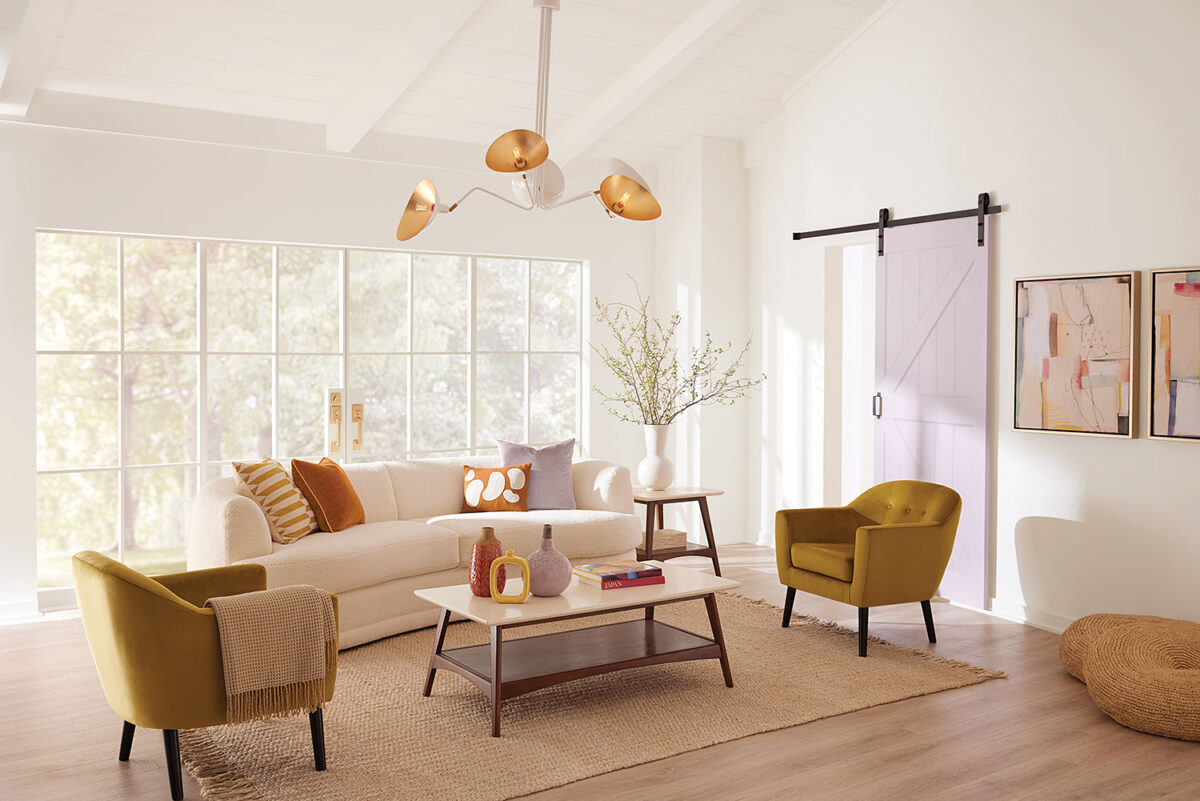
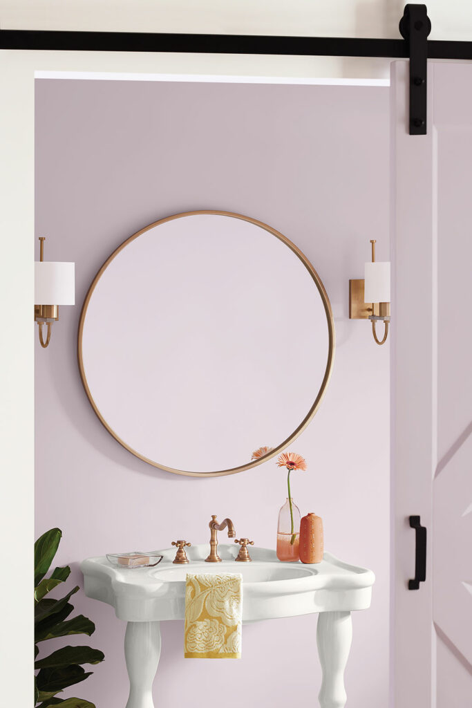
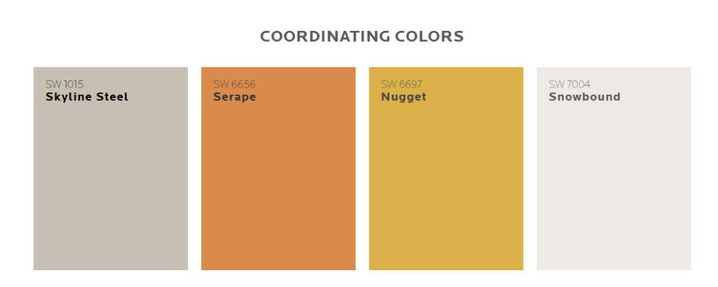
Here’s what Sherwin-Williams says of the Wallflower set of colors: “May’s sunset palette of mood-boosting hues feels made for a slightly eccentric style that blends retro color with a minimalist aesthetic. A Snowbound backdrop provides a blank canvas for the warm 70s-inspired hues of the palette to assert themselves as accents throughout the room. The curved comfort of softly rounded furniture and textured materials like rugs and cozy throws echo the warmth in the palette and bring some cozy balance to the clean “less is more” sensibility of this look.”

We say it’s a nice purplish pastel. Either way, let us know if you have an interior area that needs a color change. 541-497-3804

Homburg Gray

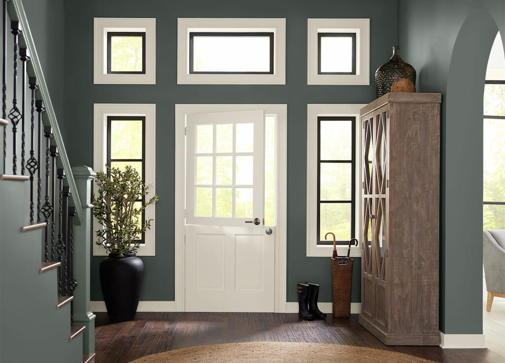
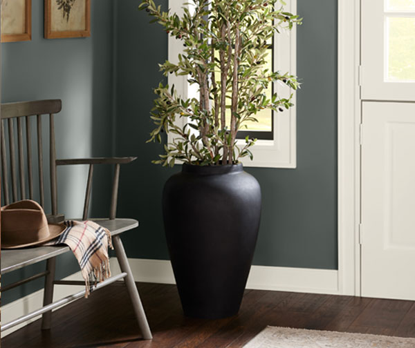
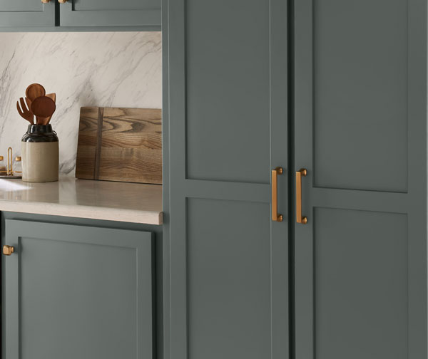
Bring in a hint of cozy and a touch of classic elegance in a welcoming space saturated in this gorgeous gray green color. Sherwin-Williams Homburg Gray SW 7622 is an alluring neutral hue with a little mystery, shifting its look and mood with the light. Bright, open spaces filled with natural light pull its earthy green undertones. And in darker settings, it reveals its deeper blue green character as the more refined side of its personality emerges. Its easy adaptability and versatile style give it a place throughout the home.

Call Mike to get it with gray! 541.497.3804

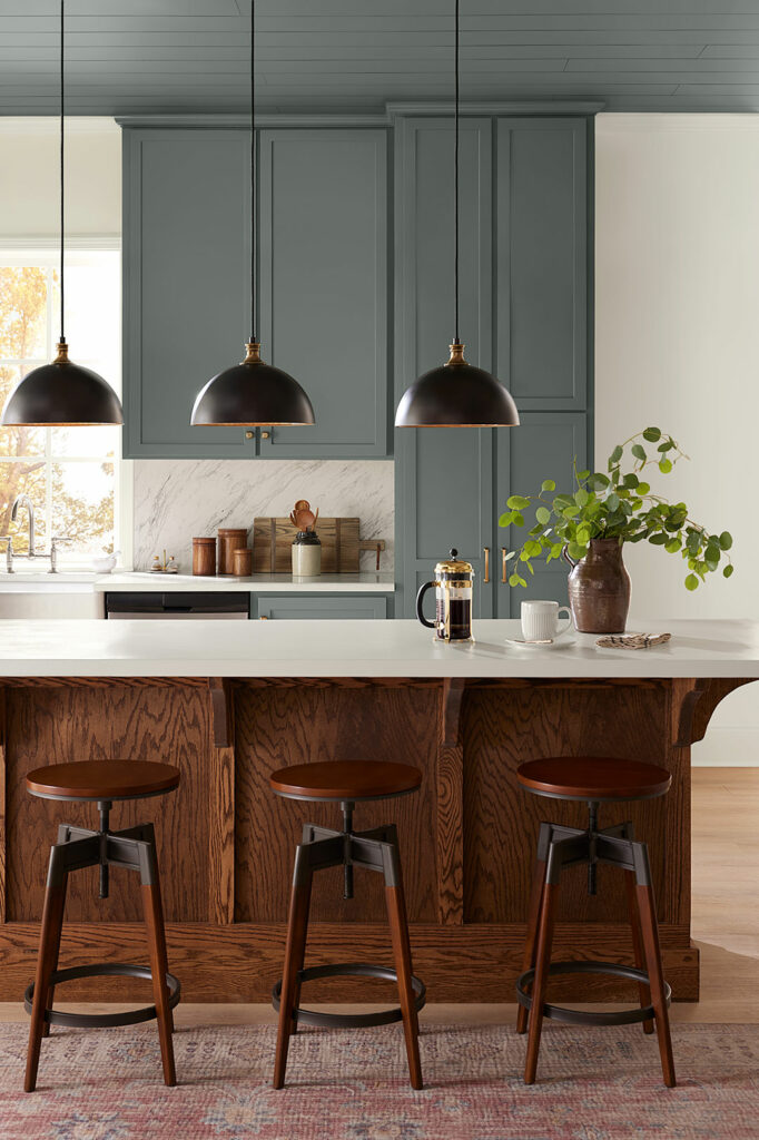
Homburg Gray is a great color for kitchen cabinets.
Homburg Gray pairs very well with natural wood tones.