
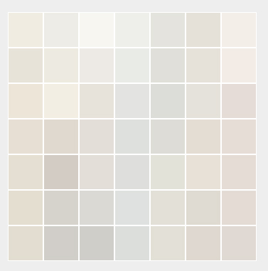
Walk into any paint store, ask for “white paint,” and watch the color specialist pull out a swatch deck with over 150 options. Beyond the marketing names like Alabaster, Chantilly Lace, or Swiss Coffee lies a critical truth every homeowner quickly discovers during a renovation: there is no such thing as a pure, neutral white on your walls.
What looks like a crisp, bright white on a small paper chip can turn dingy yellow, sterile blue, or muddy gray once applied to a full room. As professional painting contractors, understanding how undertones and room lighting interact is the single biggest factor in choosing a color that feels right.
1. Under the Hood: Undertones Control Everything
Every white paint is created by mixing tiny amounts of color pigment into a white base. These hidden pigments create undertones that fall into three primary categories:
- Warm Whites (Yellow, Red, or Gold Undertones): These paints feel cozy, inviting, and soft. They soften hard edges and make spaces feel lived-in.
- Best for: North-facing rooms, traditional architecture, spaces with warm wood floors or rustic accents.
- Cool Whites (Blue, Green, or Violet Undertones): Crisp, clean, and modern. Cool whites make spaces feel larger and more open, but can feel clinical if misapplied.
- Best for: South-facing rooms with abundant natural light, minimalist designs, bathrooms, and modern kitchens.
- True/Neutral Whites (Minimal Pigment): Balanced between warm and cool, giving a clean look without heavy color cast.
- Best for: Ceilings, interior trim, art galleries, or spaces where you want bold wall art to stand out.
2. Natural Light Changes Color Throughout the Day
Paint does not have a fixed color; it reflects the light that hits it. The directional orientation of your windows completely alters how white paint renders:
North-Facing Windows (Cool, grayish light)
└─► Needs: Warm White (e.g., Alabaster, Simply White) to counteract blue shadows.
South-Facing Windows (Warm, golden light all day)
└─► Needs: Cool or Balanced White (e.g., Chantilly Lace, Decorator’s White) to prevent overly yellow walls.
East-Facing Windows (Warm morning light, cool afternoon shade)
└─► Needs: Balanced White that transitions smoothly as natural light shifts.
West-Facing Windows (Cool morning light, intense warm late-afternoon sun)
└─► Needs: Neutral to slightly cool white to tame heavy late-day orange tones.
3. The Surrounding Environment (Reflection Matters)
White paint acts as a mirror for everything around it. Your walls don’t exist in a vacuum:
- Flooring & Cabinetry: Dark hardwood or warm oak floors will bounce yellow and orange tones up onto white walls.
- Exterior Foliage: Large green trees outside a window will cast a noticeable green hue onto bright white interior walls.
- Artificial Lighting: The Color Rendering Index (CRI) and Kelvin temperature of your lightbulbs matter. A warm 2700K LED bulb will turn a cool white wall creamy, while a 5000K daylight bulb will make a soft warm white look harsh.
4. Sheen Alters Color Perception
The same paint formula will look visually different depending on the finish you choose:
| Finish | Light Reflection | Color Effect | Best Use |
| Flat / Matte | Absorbs light | Softens undertones, hides wall imperfections | Ceilings, low-traffic bedrooms |
| Eggshell / Satin | Subtle sheen | Balance of light reflection and durability | Living rooms, hallways, walls |
| Semi-Gloss / Gloss | High reflection | Makes whites look brighter and crisper | Trim, doors, baseboards, cabinets |
How to Test White Paint Like a Pro
- Skip the wall swatches: Never paint sample patches directly onto an existing colored wall—the old background color will distort your perception of the new white.
- Use sample boards: Paint two coats of sample paint onto 12″x12″ drywall pieces or poster boards.
- Move them around: Hold the sample board against different walls, near trim, next to flooring, and observe it at morning, noon, and night under artificial light.