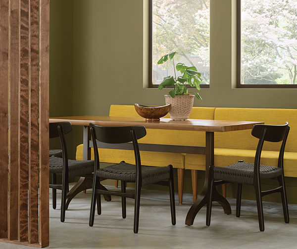
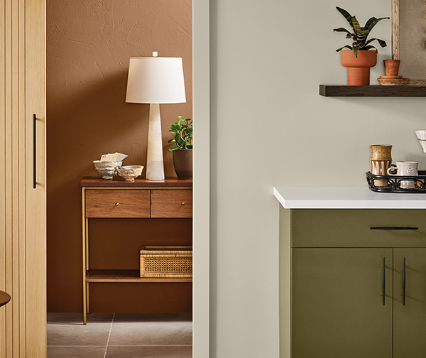
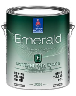
Neutral Colors

According to the color experts at Sherwin-Williams, “It’s not always warm or cool. Sometimes color falls in the middle for a hue that’s a perfect blend of both. Neutrals can take on the meaning of the colors they’re paired with or they can stand on their own. Either way, these transitional hues are tried and true thanks to their timeless appeal and versatility.”

An air of mystery surrounds this bold hue that’s commonly associated with power, elegance and an ability to coordinate with any design style. While this color is most often used as an accent, we’re starting to see it take center stage in newer design trends. Dark shades are working their way into our homes more and more to create a space that’s rich, dramatic and full of dimension. Create a contemporary look by pairing black with rich jewel tones or play up its softer side with natural wood tones and neutral furnishings.
It’s technically the absence of color, but when it comes to white, there’s more than meets the eye. Known for its light and innocence, this hue can often be viewed as simple, but a variety of tints and tones proves there’s more complexity than you’d think. Bright whites can help design a space that feels larger and spacious, while softer whites create a sense of warmth and coziness. No matter which way it’s used, this neutral provides a backdrop for endless options.
The conservative nature of this balanced shade infuses spaces with the mystery of black and the lightness of white. Lighter shades of gray can be used to achieve bright modern looks, whereas darker shades can be used to create a bolder space that’s more dramatic, but gray’s versatility doesn’t stop there. It comes in a variety of shades with undertones ranging from red to blue and everything in between.
Rounding out the warm end of the neutral spectrum is a nurturing hue that comes in a variety of tints and tones. Like its gray counterpart, beige is a great transitional color that can take on warm or cool depending on what’s surrounding it. Its natural warmth derives from brown undertones that capture the comfort and calmness that we all seek in a home.

Whatever your color choice, we can apply with all of the expert care and preparation a long-lasting paint job requires. Call the Paint Doctor 541-497-3804

Cool Colors

The color experts at Sherwin-Williams describe cool colors: “What comes to mind when we think of cool colors? Whether it’s a serene lake or a clear sky, cooler hues are often associated with feelings of calmness, relaxation, and tranquility. They’re a softer option that can make a space feel larger thanks to the way they make color look like it’s receding.”

Green
Mixed with the calming nature of blue and vibrancy of yellow, green is a color embodying balance and harmony. This down-to-earth hue is just as diverse as the nature it’s inspired by. Soft sea-greens can bring a restorative energy into a space, while deep olive tones can add depth and stability that feels anchored to the ground. Consider using deep greens to emphasize features you want to stand out like kitchen cabinets.
Blue
It’s the color of trust and tranquility. Blue is just as refreshing and friendly as it is reserved and sophisticated. It’s representation of sea and sky closely ties to open spaces where inspiration and imagination flourish. Soothing shades of dusty blue create a sense of serenity, while midnight shades of navy can add depth and drama. Blue’s universal energy makes it a hue that works anywhere.
Purple
Like green, purple embodies the characteristics of the colors it’s made of. The energy of red and tranquility of blue result in a hue that’s rooted in imagination and poise. With the ability to be both calming and uplifting, purple is an ideal choice for spaces where you seek creative energy and focus. Try this distinguished color in a home office or as an accent wall in a meditation space.

Warm, cool or neutral, we have you covered. Do it right the first time with the Paint Doctor! 541-497-3804

Slow Green February 2025 Color of the Month


According to Sherwin-Williams.com, “With blue and green tones on the rise, Slow Green captures the essence of two popular color families within its balanced undertone. It has a subtle demeanor that lets you push the envelope of color exploration without feeling overwhelmed by bold, maximalist shades. Instead, this lively hue feels refreshing and buildable in accordance with their interior styles.”

Perfect for the places and spaces where you like to relax and unwind.

Top Reasons to Call the Paint Dr

1. Expertise and Experience

Here at the Paint Doctors Painting Service our painters have the skills and experience to handle a variety of surfaces, conditions and hard to reach applications. They know the right products and techniques to achieve a flawless finish. Experience helps us plan for the realities of your project and it helps us handle any unexpected issues that may arise during the job.

2. Quality Results

With us, you can expect a high-quality, long-lasting finish. We use the best materials and tools, ensuring that the paint job looks great and holds up over time.

3. Time-Saving

Painting can be a time-consuming task, especially if you have a large area to cover or intricate details to consider. We can complete the job much faster, allowing you to focus on other important tasks or simply enjoy your free time.

4. Proper Preparation

Proper surface preparation is key to a successful paint job. We know how to clean, sand, patch, prime, caulk and mask surfaces to ensure the paint adheres properly and looks its best.

5. Access to Better Tools and Materials

Our painters have access to high-quality paints, primers, and tools that may not be available to the average DIYer. This can make a significant difference in the final result.

6. Insurance and Safety

We have all of the required insurance and bonds in place, which means you’re protected in case of accidents or damage during the project. We also follow the best practices of safety protocols to prevent injuries and ensure the job is done safely.

7. Stress Reduction

Hiring our company can significantly reduce the stress and hassle associated with painting. You won’t have to worry about doing the job yourself, and you can rest assured that it will be done right the first time.

8. Color and Design Advice

We can help you with advice on color schemes, finishes, and design trends, making it easier for you to choose the right colors and techniques to achieve the look you want.

9. Property Protection and Clean-Up

Painting can be messy, but we take great care in drop cloths, masking and property protection followed by the proper handling of the product. We also handle all the clean-up for you. Upon completion, your space will be left clean and tidy.

Call the Doctor 541-497-3804

How Sherwin-Williams Does COTM

Every month here on the Doctor’s blog we feature Sherwin-Williams Color of the Month (COTM). Here’s how they choose the color and the coordinating colors that go with it:

Each year, the Sherwin-Williams Trendsight Team, a group of experts in color and design, come together to map out the Colormix® Forecast – a collection of carefully chosen hues that predicts what’s in for the months ahead. From those palettes, we spotlight stand-out shades to feature as Color of the Month.

Sherwin-Williams color experts select a star shade to set the tone for the month.
A palette of beautifully-paired colors is crafted to help bring our color story to life.
See it all come together in collections that capture every nuance of design and style.

I Love Your Accent

Adding an accent color can bring new life to an old room with a minimum of effort. Check out these projects with an interesting color inserted into the scene.

This room benefits greatly with the trim color used inside the open shelves.
Shade of white in living room setting
This fireplace surround breaks up a large wall with a warm vertical accent.
This kitchen island is an oasis of color in a sea of grays and whites.
This vanity brings vibrancy to this business-like bathroom.
Too shallow for a conventional closet, this entry space really comes to life with an accent color and functional coat rack.
This converted closet makes a cool office alcove with its own color scheme.

We can help you spice up your interior space with an accent color. Call Mike 541-497-3804

Dark and Light Color Inspiration

When the colors are called Dark Night and Extra White, you know you are going to see some serious contrast. We found this combination at HGTV Home by Sherwin Williams. It was featured on Christina on the Coast Episode 505.

Throughout the open concept, natural wood and leather add to the contrast of colors.
Black appliances and black hardware add drama to the dark blue cabinets.
Sherwin Williams Alabaster, Extra White and Dark Night

September 2024 Color of the Month

Sherwin-Williams says, “Palm Leaf harnesses the retro charm of earthy avocado green tones from a bygone era. Nestled in the middle of a throwback collection of fun colors, this free-spirited shade channels a fresh take on classic ‘70s style.”

Call it olive green or avocado green, this is Palm Leaf by Sherwin-Williams and it's a retro delight.
Modern dining room with green walls.
Claw foot tub with two tone walls in green and yellow.

Palm Leaf effortlessly bridges the gap between old and new, infusing a modern feel into a vintage look. This shade shines as the center of attention or easily makes an impact in a backup role. With Oat Milk’s light, neutral hue providing a clean backdrop for retro styling, our Color of the Month adds depth, definition and contrast.

If we can get some Palm Leaf into your life (or whatever color you choose) give us a call. 541-497-3804

Sheen

You’ve finally narrowed down your paint colors, and now you must make another decision – it’s time to choose a sheen.


A non-reflective sheen that helps hide surface imperfections, making walls appear smooth. Visually this finish smooths walls that are dented or rough. However, it can be harder to clean. Best for:

Adult bedrooms
Formal Living Rooms
Ceilings
Uneven or textured walls
This flat finish is great for hiding surface imperfections, while its angular shine helps make walls smooth and washable. Use this sheen for:

Living rooms
Dining rooms
Exterior siding
With a slight shine, Satin and Eg-Shel finishes offer a richer look. Washability makes these sheens ideal for high-traffic areas most likely to attract nicks and scuff marks such as:

Hallways
Woodwork
Children’s bedrooms
Family rooms
Exterior surfaces
This moderately reflective, durable finish is perfect for areas that get cleaned frequently, such as:

Kitchens
Bathrooms
Utility area
Closet doors
Trim
Gloss sheens have higher light-reflective characteristics. This shiny, durable finish works great for any element of a room you would like to highlight such as:
Wood trim
Cabinets
Doors
Furniture

If you have questions about choosing the sheen of paint to use for interior or exterior finishes, give us a call at 541-497-3804.

August 2024 Color of the Month

The color of the month is Smoky Azurite which lives somewhere between casual and formal, subtle but vibrant, his classical and her rock and roll – all rolled into one uplifting blend. Let’s get started transforming your space by calling Mike at 541-497-3804

The pro designers at Sherwin-Williams describe it: “Brimming with thoughtful details, this look seamlessly blends easy comfort with a sophisticated flair to create a cozy countryside atmosphere. A backdrop of Smoky Azurite’s relaxed vibrance infuses the room with freshness, lending a subtle contemporary vibe to the otherwise quiet and simple space. Adding rich contrast and a rustic note, dark brown wood tones make a beautiful pairing with the natural shades of this palette.”
Paint Doctor's Painting can get you started with the right blue interior wall, Smoky Azurite
Craft an inviting atmosphere of laid-back sophistication in the heart of the home with a buttoned-up blue that knows how to unwind. Smoky Azurite’s captivating shade stands out against Black Fox’s rich, grounded hue to make a refined statement. Arrowroote provides the perfect neutral backdrop, creating a bright, clean canvas for the bolder shades to shine.
Paint Doctor entry cubby idea.
“The humble hues of the Modern Brit palette instantly impart the warm and familiar charm of home to any space. Smoky Azurite’s welcoming shade casts its soft, soothing energy even in a supporting role, as Earthy Ochre balances the carefree, airiness of the space with its down to earth, rooted hue. A collection of shades as uncomplicated and approachable as these brings timeless, comfortable style easily within reach,” according to Sherwin-Williams.