How Sherwin-Williams Does COTM

Every month here on the Doctor’s blog we feature Sherwin-Williams Color of the Month (COTM). Here’s how they choose the color and the coordinating colors that go with it:

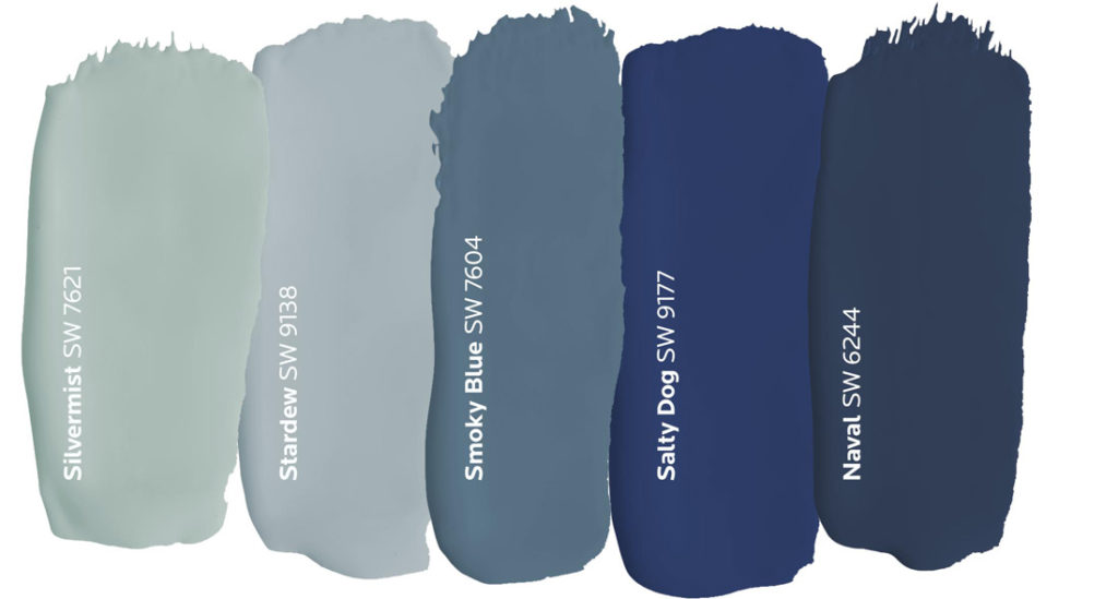
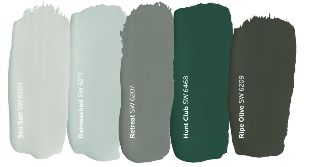
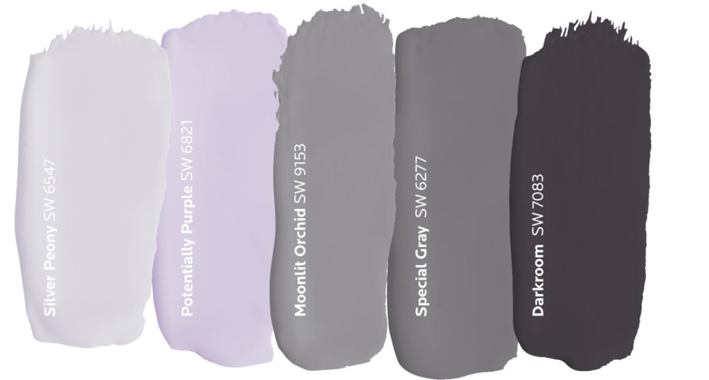
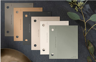
Each year, the Sherwin-Williams Trendsight Team, a group of experts in color and design, come together to map out the Colormix® Forecast – a collection of carefully chosen hues that predicts what’s in for the months ahead. From those palettes, we spotlight stand-out shades to feature as Color of the Month.

Sherwin-Williams color experts select a star shade to set the tone for the month.
A palette of beautifully-paired colors is crafted to help bring our color story to life.
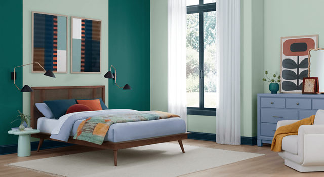
See it all come together in collections that capture every nuance of design and style.

I Love Your Accent

Adding an accent color can bring new life to an old room with a minimum of effort. Check out these projects with an interesting color inserted into the scene.

This room benefits greatly with the trim color used inside the open shelves.
Shade of white in living room setting
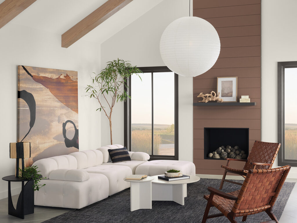
This fireplace surround breaks up a large wall with a warm vertical accent.
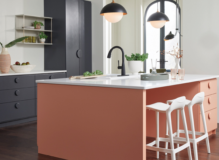
This kitchen island is an oasis of color in a sea of grays and whites.
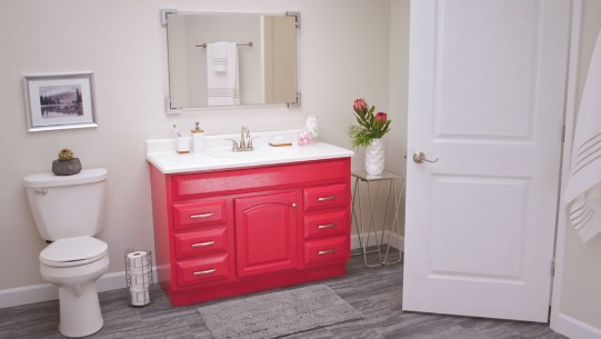
This vanity brings vibrancy to this business-like bathroom.
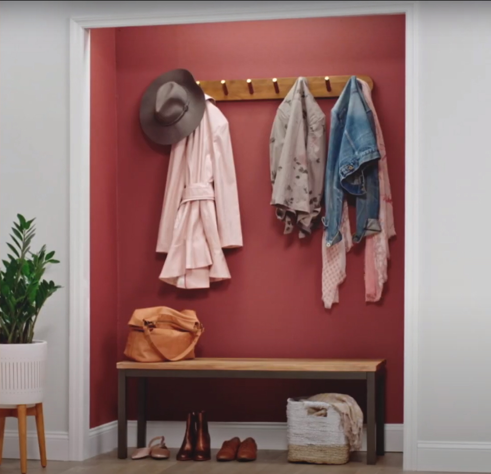
Too shallow for a conventional closet, this entry space really comes to life with an accent color and functional coat rack.
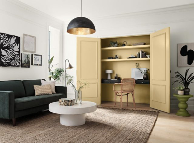
This converted closet makes a cool office alcove with its own color scheme.

We can help you spice up your interior space with an accent color. Call Mike 541-497-3804

Dark and Light Color Inspiration

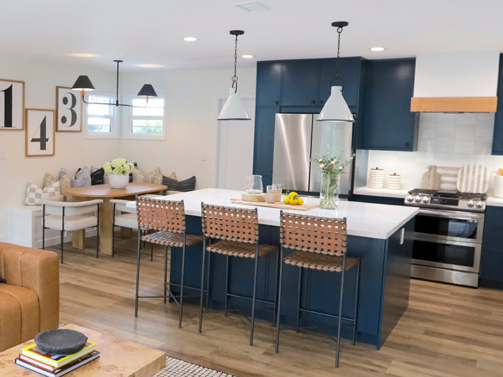
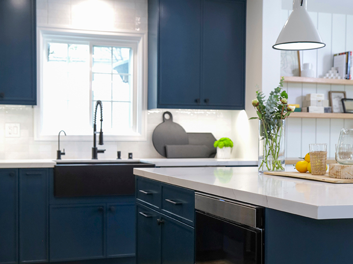
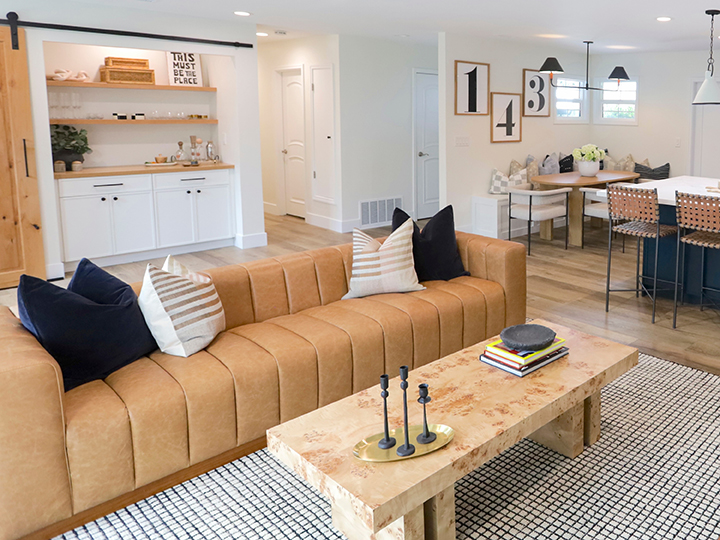
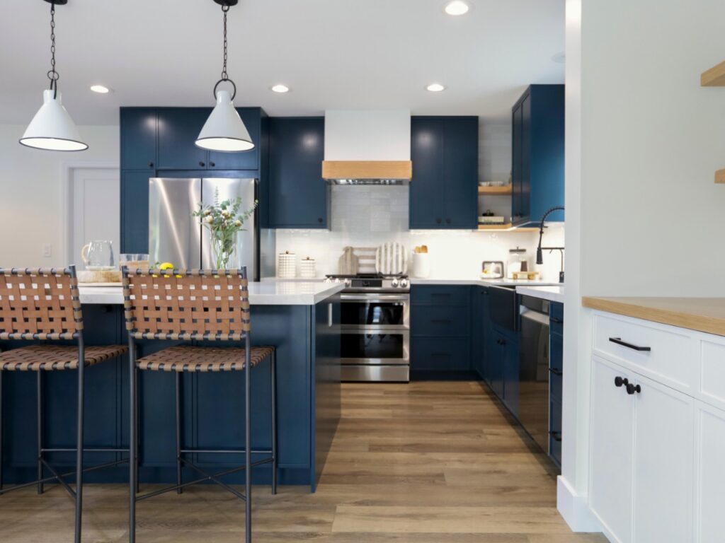
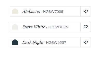
When the colors are called Dark Night and Extra White, you know you are going to see some serious contrast. We found this combination at HGTV Home by Sherwin Williams. It was featured on Christina on the Coast Episode 505.

Throughout the open concept, natural wood and leather add to the contrast of colors.
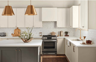
Black appliances and black hardware add drama to the dark blue cabinets.
Sherwin Williams Alabaster, Extra White and Dark Night

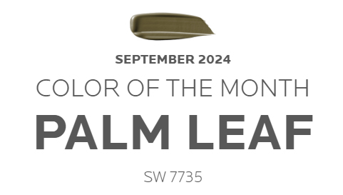
September 2024 Color of the Month

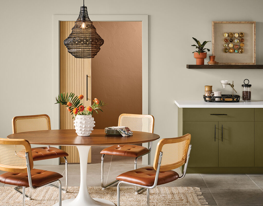
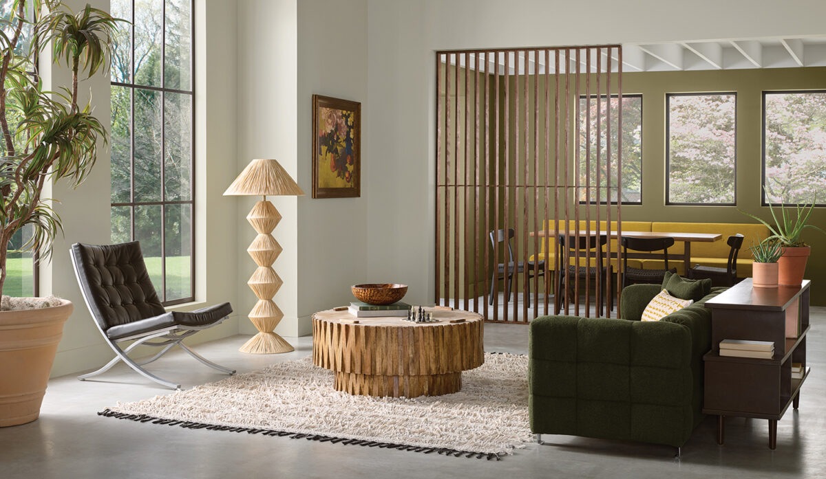
Sherwin-Williams says, “Palm Leaf harnesses the retro charm of earthy avocado green tones from a bygone era. Nestled in the middle of a throwback collection of fun colors, this free-spirited shade channels a fresh take on classic ‘70s style.”

Call it olive green or avocado green, this is Palm Leaf by Sherwin-Williams and it's a retro delight.
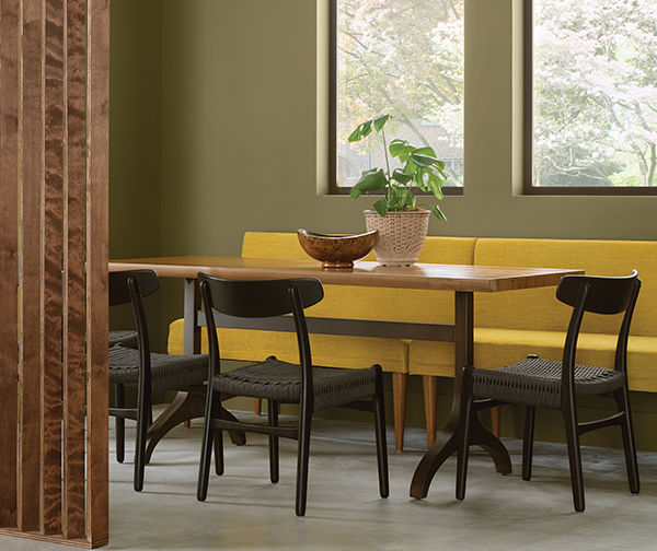
Modern dining room with green walls.
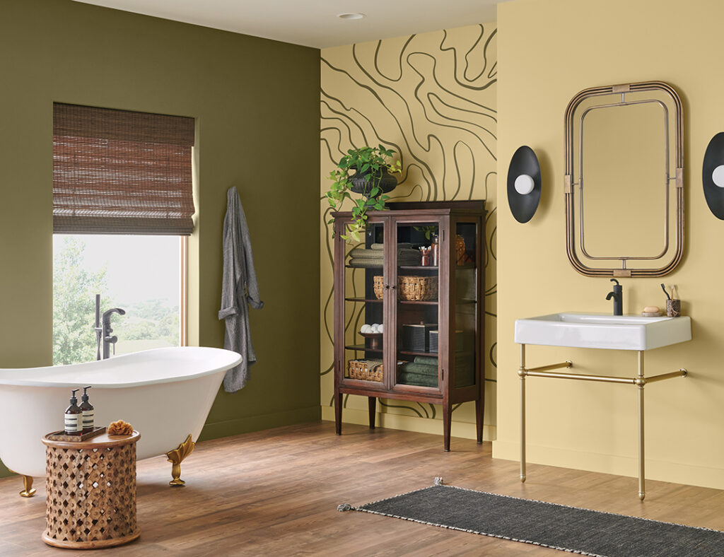
Claw foot tub with two tone walls in green and yellow.

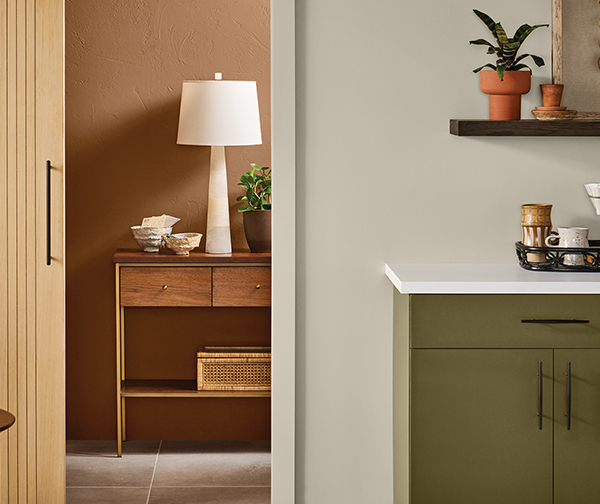
Palm Leaf effortlessly bridges the gap between old and new, infusing a modern feel into a vintage look. This shade shines as the center of attention or easily makes an impact in a backup role. With Oat Milk’s light, neutral hue providing a clean backdrop for retro styling, our Color of the Month adds depth, definition and contrast.

If we can get some Palm Leaf into your life (or whatever color you choose) give us a call. 541-497-3804

Sheen

You’ve finally narrowed down your paint colors, and now you must make another decision – it’s time to choose a sheen.


A non-reflective sheen that helps hide surface imperfections, making walls appear smooth. Visually this finish smooths walls that are dented or rough. However, it can be harder to clean. Best for:

Adult bedrooms
Formal Living Rooms
Ceilings
Uneven or textured walls
This flat finish is great for hiding surface imperfections, while its angular shine helps make walls smooth and washable. Use this sheen for:

Living rooms
Dining rooms
Exterior siding
With a slight shine, Satin and Eg-Shel finishes offer a richer look. Washability makes these sheens ideal for high-traffic areas most likely to attract nicks and scuff marks such as:

Hallways
Woodwork
Children’s bedrooms
Family rooms
Exterior surfaces
This moderately reflective, durable finish is perfect for areas that get cleaned frequently, such as:

Kitchens
Bathrooms
Utility area
Closet doors
Trim
Gloss sheens have higher light-reflective characteristics. This shiny, durable finish works great for any element of a room you would like to highlight such as:
Wood trim
Cabinets
Doors
Furniture

If you have questions about choosing the sheen of paint to use for interior or exterior finishes, give us a call at 541-497-3804.

August 2024 Color of the Month

The color of the month is Smoky Azurite which lives somewhere between casual and formal, subtle but vibrant, his classical and her rock and roll – all rolled into one uplifting blend. Let’s get started transforming your space by calling Mike at 541-497-3804

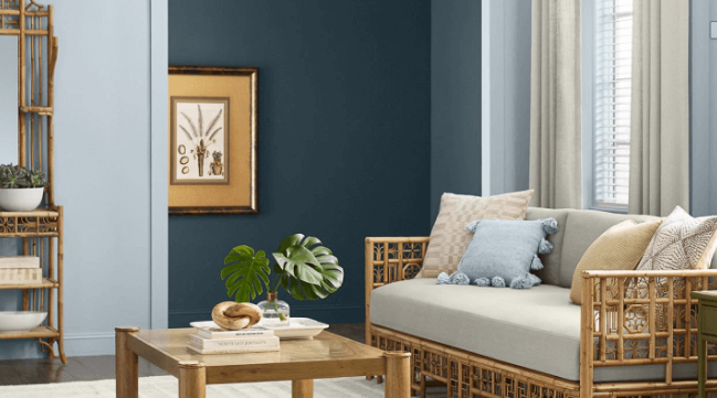
The pro designers at Sherwin-Williams describe it: “Brimming with thoughtful details, this look seamlessly blends easy comfort with a sophisticated flair to create a cozy countryside atmosphere. A backdrop of Smoky Azurite’s relaxed vibrance infuses the room with freshness, lending a subtle contemporary vibe to the otherwise quiet and simple space. Adding rich contrast and a rustic note, dark brown wood tones make a beautiful pairing with the natural shades of this palette.”
Paint Doctor's Painting can get you started with the right blue interior wall, Smoky Azurite
Craft an inviting atmosphere of laid-back sophistication in the heart of the home with a buttoned-up blue that knows how to unwind. Smoky Azurite’s captivating shade stands out against Black Fox’s rich, grounded hue to make a refined statement. Arrowroote provides the perfect neutral backdrop, creating a bright, clean canvas for the bolder shades to shine.
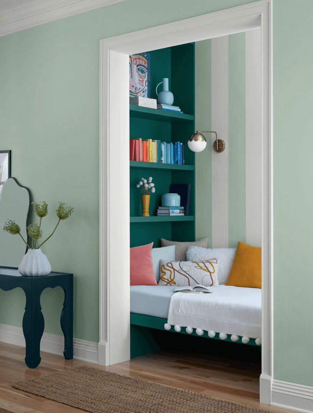
Paint Doctor entry cubby idea.
“The humble hues of the Modern Brit palette instantly impart the warm and familiar charm of home to any space. Smoky Azurite’s welcoming shade casts its soft, soothing energy even in a supporting role, as Earthy Ochre balances the carefree, airiness of the space with its down to earth, rooted hue. A collection of shades as uncomplicated and approachable as these brings timeless, comfortable style easily within reach,” according to Sherwin-Williams.

Swatches, Chips and Samples, Oh My!

We really want you to be happy with your paint project, which is why we encourage you to use the available resources for choosing your paint color. Here are some you can find at Sherwin-Williams.

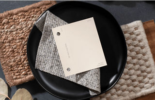
Sherwin-Williams says, “Order color chips, peel & stick or Color to Go samples to see how your top color picks look and feel in your space.”
Visualize any color by experimenting directly on the surface. Eliminate the guesswork with Twist-n-Pour Color to Go® paint samples.
No mess. No dry time. Our 8″ x 8″ peel & stick color samples are available in our most popular colors. Order now for only $3.95 per sample, with free shipping for a limited time.
Have a lot of color ideas for your space? Color chips are the perfect solution. Order up to 10 FREE 2″x3″ color chips online from Sherwin-Williams. Ships free.

July 2024 Color of the Month-Heron Plume

Sherwin-Williams says, “This inviting shade of warm white seamlessly blends modern simplicity with traditional style. Heron Plume’s laid-back energy is perfect for the refined yet relaxed sophistication of California coastal style. When paired with the nature-inspired coordinating hues of the California Love palette, this airy shade makes crafting casual style a breeze.”

Heron Plume white is combined with Pachyderm SW 9596 wainscot.

Settle into serenity with the subtle, relaxing influence of simple color. A layered approach to the soft, tonal neutrals of this month’s palette builds to evoke a cozy sense of tranquility in a bedroom retreat. Heron Plume’s warming shade of creamy white paired with Pachyderm’s soft greige tone creates a clean backdrop for other elements of coastal style to stand out. Textured natural materials like jute and wicker mix with layered wood tones to add depth and contrast while highlighting the organic, outdoor feel of the space.

paintdrspainting.com suggests this shade of white for modern décor
Whether inside or out, Heron Plume’s warmth radiates an easygoing, welcoming vibe to greet guests. A rich blue-green shade like Mount Etna makes a striking first impression, adding bold contrast that elevates the exterior and sets the tone.

At Paint Doctor’s Painting we often say white is never really just white. Subtle tints make a white warmer or cooler or comfy. Call Mike with help to choose your white and expert help in applying it in your home or business. 541-497-3804

Malted Milk

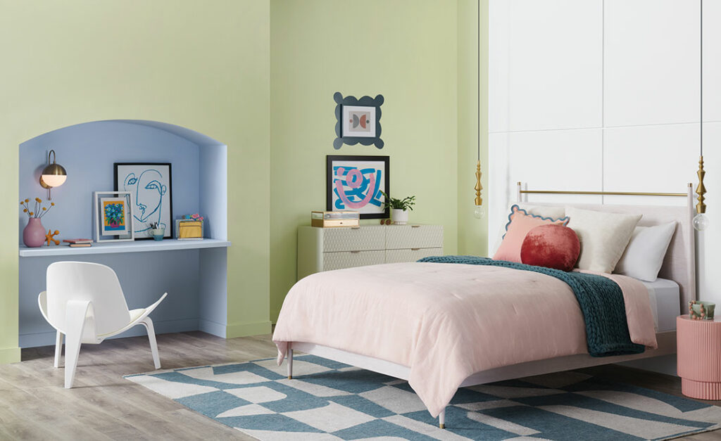
Staying with our spring theme of pastels, here is anther color by Sherwin-Williams, “Malted Milk’s soft shade can turn every day into a sweet escape. Couple this blushing beauty with cottagecore vibes to craft a home where little moments are romanticized.”

Bathroom with claw foot tub and pink trim.
Parlor with green tone fireplace and pink walls
House paint colors that go with pink

Homburg Gray

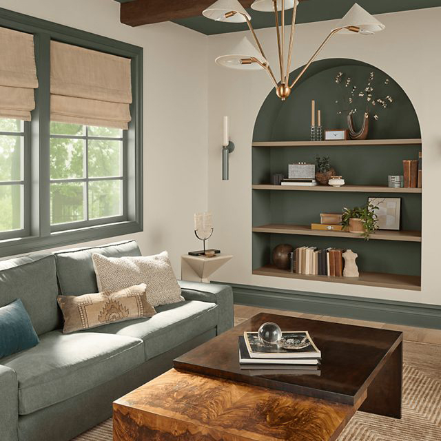
Bring in a hint of cozy and a touch of classic elegance in a welcoming space saturated in this gorgeous gray green color. Sherwin-Williams Homburg Gray SW 7622 is an alluring neutral hue with a little mystery, shifting its look and mood with the light. Bright, open spaces filled with natural light pull its earthy green undertones. And in darker settings, it reveals its deeper blue green character as the more refined side of its personality emerges. Its easy adaptability and versatile style give it a place throughout the home.
Call Mike to get it with gray! 541.497.3804

Homburg Gray is a great color for kitchen cabinets.
Homburg Gray pairs very well with natural wood tones.