Quietude

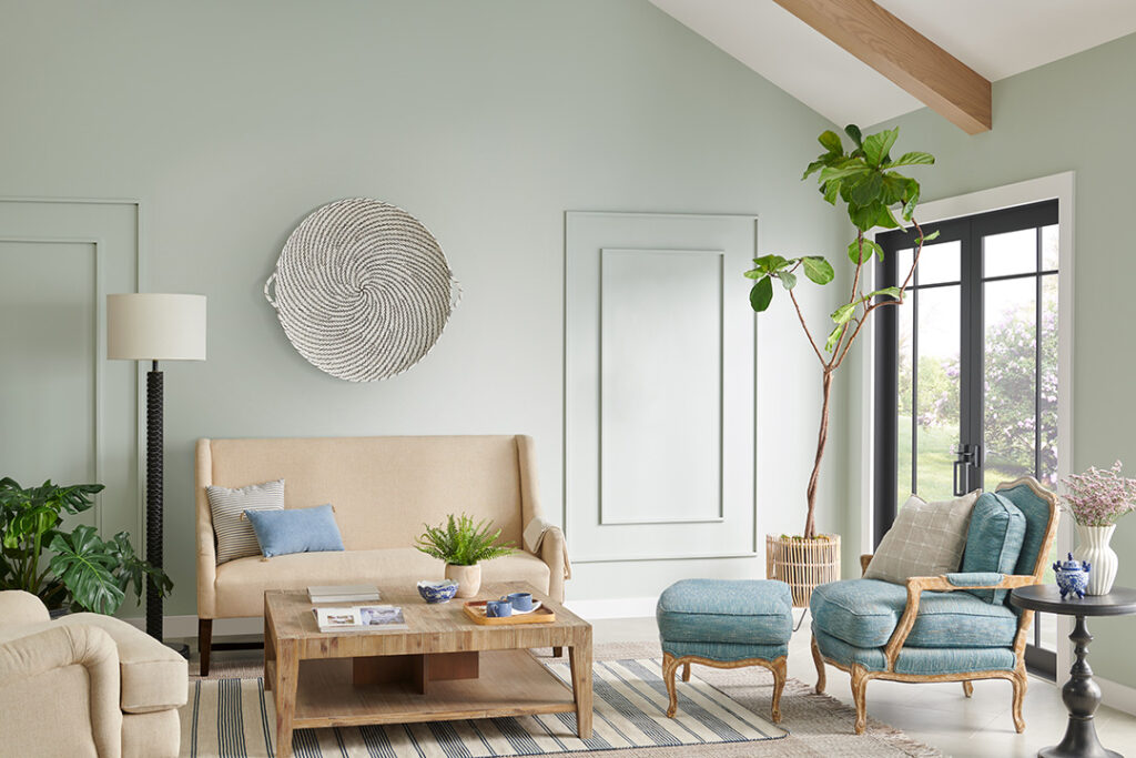
Within a palette of hushed tones, the HGTV 2025 Color of the Year, Quietude, finds its power in its transcendent tranquility. A soft sage with a whisper of blue influence, Quietude is an emerging color for enduring design and soothes any space inside or out.

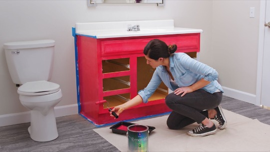
Subtle seafoam green applied to bathroom vanity.

Check out how designers used this color in a variety of settings.

wainscot, raided panels and double doors
great cabinet color
seafoam green chest of drawers
entry door in seafoam green

Let us know if Quietude is your color! Mike 541-497-3804.

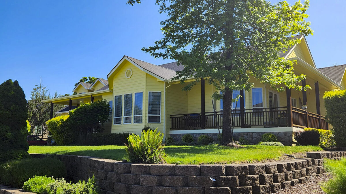
Let’s Get That Exterior Paint Job Scheduled

Benefits of scheduling now

Schedule your exterior painting project before our beautiful Oregon rains begin again.

  • Ensure optimal results: Ideal weather conditions contribute to better paint adhesion and a more durable finish that will withstand the elements for years to come.
  • Enjoy a refreshed look: A fresh coat of paint instantly boosts your home’s curb appeal and creates a welcoming atmosphere.
  • Protect your investment: Quality exterior paint protects your home’s siding from sun, wind, and moisture, extending its lifespan and preventing costly repairs down the road.

Planning for success

If you’re considering an exterior paint job, don’t wait until the last minute. The window of ideal weather in Twin Falls and similar regions can be shorter than you think. Here’s what to do:

  • Call the Paint Doctor for a quote, which will include surface preparation, materials, labor, and a clear timeline for the project. 541-497-3804
  • Book your project soon. It;s peak season and our schedule is filling up quickly.

Don’t let the changing weather deter you from revitalizing your home’s exterior. By planning ahead and scheduling your paint job now, you can enjoy a beautiful, long-lasting finish and protect your valuable investment for years to come.

Avoiding Common DIY Painting Mistakes

So you’ve decided to tackle a painting project yourself? Excellent! DIY painting can be incredibly rewarding, transforming your space with a fresh look and injecting new life into your home. However, to achieve that professional-looking finish you dream of, it’s essential to avoid some common pitfalls that can derail even the most enthusiastic DIY painter. 

1. Skipping surface preparation

This is a common and damaging mistake. Even with the perfect color and paint, the paint won’t adhere properly if the surface isn’t ready, leading to peeling, cracking, or an uneven finish. 

How to avoid it:

  • Clean thoroughly to remove dust, dirt, grease, and grime. A mild detergent or sugar soap solution works well.
  • Repair imperfections by filling in any holes, cracks, or dents with spackle or filler. Sand smooth once dry.
  • Sand glossy surfaces lightly to create a better grip for the paint, and sand patched areas smooth.
  • Prime where necessary. Always use a primer, especially over dark colors, bare wood, new drywall, or patched areas. Primer helps with adhesion, provides a uniform base, and ensures the true color shines through. Products such as Kilz 2 All-Purpose Primer, a water-based, multi-surface primer, sealer, and stain blocker with excellent adhesion and mildew resistance, are ideal for covering stains and enhancing hiding, which potentially reduces the number of topcoats needed. Alternatively, the Zinsser Cover Stain Primer, an oil-based option, offers premium hiding power for both interiors and exteriors. 

2. Using the wrong tools or paint

Using cheap or unsuitable brushes and rollers can lead to an uneven application, streaks, visible roller marks, or bristles shedding into the paint. Similarly, choosing the wrong type of paint for the surface or area can lead to a less than ideal finish or durability issues. 

How to avoid it:

  • Invest in quality tools. Good quality brushes and rollers distribute paint evenly and create a smoother finish. Different brushes are designed for different types of paint and surfaces.
  • Choose the right roller nap. A short nap roller is ideal for smooth walls, while a longer nap works best on textured surfaces.
  • Select appropriate paint. Consider the surface (interior/exterior), the room’s function (e.g., high-traffic areas may need a durable finish like semi-gloss), and the existing paint type (oil-based vs. water-based).
  • Don’t skimp on paint quality. High-quality paints offer better coverage, richer color, and longer-lasting results. 

3. Not testing colors and sheens

A small paint chip in a store can look vastly different on a wall under varying lighting conditions. Choosing the wrong color or sheen can significantly impact the room’s overall ambiance. 

How to avoid it:

  • Sample, sample, sample. Always test small swatches of your chosen colors and finishes on your wall. Observe them at different times of the day and under various lighting conditions to see how they truly appear.
  • Consider the sheen. Glossy finishes are easier to clean but highlight imperfections, while matte finishes conceal flaws but are more susceptible to damage. 

4. Improper application techniques

Rushing the painting process, using too much or too little paint, or using incorrect brush and roller techniques can lead to drips, runs, streaks, and uneven coverage. 

How to avoid it:

  • Don’t overload the brush or roller. Dip brushes about one-third of the way into the paint and roll off excess from rollers.
  • Work in sections, maintain a wet edge. Apply paint with a roller in a “W” or “M” pattern, overlapping strokes and filling in the gaps to ensure even distribution.
  • Use thin, even coats. Avoid thick coats, as they take longer to dry and can cause drips.
  • Allow adequate drying time. Follow the manufacturer’s instructions for drying time between coats.
  • Remove painter’s tape carefully. Remove painter’s tape at a 45-degree angle while the paint is still slightly wet to prevent peeling. 

5. Ignoring environmental conditions

Painting in extreme temperatures or high humidity can significantly affect paint drying and adhesion, leading to defects like blistering, cracking, or uneven drying. 

How to avoid it:

  • Paint in mild conditions. Aim for days with mild temperatures and low humidity, especially for exterior projects.
  • Ensure good ventilation. Open windows or use fans when painting indoors to promote even drying and prevent moisture buildup. 

The best way to avoid making these mistakes is to call the Paint Doctor 541-497-3804.

July 2025 Color of the Month: Storm Cloud

Bring sophisticated style to your space with Storm Cloud, Sherwin-Williams’ July 2025 Color of the Month.

Gray interior scene featuring Sherwin-Williams Storm Cloud


Storm Cloud effortlessly finds the balance between understated drama and simplicity, proving to be an ideal candidate for spaces that need a dose of depth. This rich, dark-toned blue paint color can adapt to various aesthetics, all while adding a touch of elegance and modernity. Storm Cloud’s versatility makes it a great color choice for focus areas like home offices or gathering spaces like dining rooms.

The Power of Paint to Boost Curb Appeal

Make a stunning first impression with the help of a fresh coat of paint

Your home’s exterior is the first thing guests, neighbors, and potential buyers see. It sets the tone for your property and reflects your personal style. A fresh coat of paint is one of the most effective ways to instantly enhance your curb appeal, making a significant impact on how your home is perceived. 

Why is curb appeal important?

Beyond simply looking good, a well-maintained exterior contributes to your home’s overall value. Research suggests that homes with better curb appeal can sell for more than those that appear less inviting. It also sends a message to potential buyers that the home has been well-cared for and maintained, increasing their confidence in the property. 

The transformative power of paint

  • Instantly refreshes: A new paint job instantly breathes life into a tired exterior, covering imperfections and creating a clean, polished look.
  • Updates style: Repainting allows you to update your home’s color scheme and style, giving it a modern and attractive look that reflects your taste and complements its architecture.
  • Highlights architectural features: Strategic color choices can accentuate your home’s unique features, such as trim, windows, or intricate details, enhancing its character and making it stand out. 

Choosing the right colors for curb appeal

When selecting exterior paint colors, consider the following:

  • Home’s architectural style: Different architectural styles lend themselves to different color palettes. For instance, Craftsman-style homes often embrace earthy tones, while modern designs may favor grays, blacks, and whites.
  • Neighborhood aesthetics: Consider the prevalent colors and styles in your neighborhood to choose a color that harmonizes with the surroundings while still reflecting your personality.
  • Permanent features: Consider your roof color and other materials (e.g., brick, stone) when choosing paint colors to ensure a cohesive look.
  • Lighting: Exterior paint colors can appear differently in various lighting conditions. Test samples on different sides of your home at different times of the day to see how they truly look.
  • Professional advice: If you’re feeling overwhelmed, don’t hesitate to consult with experienced painters who can provide valuable insights based on their knowledge of color, architectural styles, and local aesthetics. 

The Curb Appeal of Fresh Paint

First impressions matter—especially when it comes to your home’s curb appeal. Whether you’re looking to increase property value, attract potential buyers, or simply take pride in your residence, a fresh exterior paint job can completely transform the way your home is perceived.

The Power of a Fresh Coat

Over time, exposure to the elements can make exterior paint fade, crack, or peel. A new paint job instantly revitalizes your home, giving it a clean, polished look that makes it stand out in the neighborhood.

Benefits of a Well-Painted Exterior:

  • Boosts Property Value – Homes with updated exteriors tend to sell faster and at higher prices.
  • Enhances Visual Appeal – A fresh color scheme can modernize your home and complement its architecture.
  • Protects Against the Elements – High-quality paint acts as a barrier against moisture, UV rays, and other environmental factors that can cause damage.

Choosing the Right Color

Selecting the perfect exterior color is key to maximizing curb appeal. Neutral tones like greys, beiges, and whites provide timeless elegance, while deeper hues like navy or forest green add sophistication. Want a pop of personality? A bold front door can make a memorable statement.

A Small Investment with Big Results

Refreshing your home’s exterior paint is one of the most cost-effective ways to enhance curb appeal. It’s a project that makes an immediate impact while protecting your home for years to come.

If your home’s exterior is looking tired, a fresh coat of paint could be the perfect solution. Ready to transform your curb appeal?

The Power of Paint

Ever walked into a freshly painted room and felt an instant mood boost? That’s no coincidence—color has a profound impact on our emotions, energy, and overall well-being. A fresh coat of paint isn’t just about aesthetics; it’s about creating a space that supports mental clarity, relaxation, and productivity.

Color Psychology: The Secret to a Happier Home

Different colors evoke different emotional responses, making your choice of paint more important than you might realize. For example:

  • Blues and Greens – These hues promote calmness and relaxation, perfect for bedrooms or home offices.
  • Yellows and Oranges – Energetic and cheerful, warm tones bring vitality to kitchens and living spaces.
  • Neutrals – Whites, grays, and beiges provide a sense of balance and sophistication, creating a clean slate for creativity.

The Refresh Effect

Beyond color selection, the simple act of repainting can refresh your environment and mindset. Dull, fading walls can subconsciously drag down your mood, while a crisp new layer of paint can make your space feel brighter, cleaner, and more inviting.

A Productivity Boost

Working from home? Studies show that an intentional use of color can increase focus and efficiency. Soft blues and greens enhance concentration, while subtle pops of energizing colors can keep motivation high.

Transform Your Space, Transform Your Mind

A fresh paint job is more than just an upgrade—it’s an investment in your mental well-being. Whether you’re repainting an entire home or adding an accent wall, the right colors can inspire positivity, relaxation, and creativity. Ready to breathe new life into your space? Call Mike at 541-497-3804

Paint Rollers

When you think about painting, the first tool that comes to mind might be the trusty brush, but let’s take a moment to appreciate the real workhorse of the painting world—the paint roller. If you’re tackling a large surface, nothing beats the efficiency, coverage, and smooth finish that a well-chosen roller can provide.

The Paint Doctor describes the benefits of using a paint roller
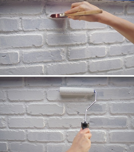
Some DIY projects require brushes and rollers.

Why Paint Rollers Matter

Paint rollers are designed to hold and distribute paint evenly, making them the perfect tool for painting walls, ceilings, and other broad surfaces. They reduce streaks, help you work faster, and can even add texture when used creatively.

Choosing the Right Roller

Not all rollers are created equal. Here’s a quick guide to help you pick the perfect one:

  • Foam Rollers – Ideal for ultra-smooth surfaces and glossy finishes.
  • Nap Rollers – Available in different thicknesses (or “nap” sizes). A thicker nap (like ¾”) is great for textured walls, while a thinner nap (like ¼”) works best on smooth surfaces.
  • Microfiber Rollers – Perfect for minimal splatter and maximum coverage, making them a favorite for DIY painters.

Pro Tips for Using a Paint Roller

  1. Load Properly – Roll it in the tray and make sure it’s evenly coated but not dripping.
  2. Use the “W” Technique – Start by rolling in a “W” shape to distribute the paint, then fill in the gaps.
  3. Avoid Over-Rolling – Too many strokes over the same spot can leave unwanted texture or uneven coverage.
  4. Keep It Clean – Rinse your roller after use and store it properly for future projects.

Elevate Your Painting Game

A great roller can make all the difference in your painting experience. Whether you’re revamping a room or tackling a big project, choosing the right roller ensures a smooth, professional-looking finish with minimal effort.

So next time you’re gearing up for a paint job, don’t underestimate this unsung hero—your walls will thank you!

Of course, you can avoid all of the hassles of rollers, brushes and sprayers by giving us a call, 541-497-3804

Getting Warmer

Choosing paint colors can be fun for some and challenging for others. Sherwin-Williams can help with some color concepts staring with the warmth of the colors:

“It’s all in the name. Warm shades of red, orange and yellow are associated with the literal warmth that the sun and fire radiate. These vivid shades are closely tied to energy, joy and positivity, to create a space where the emotion feels uplifting and welcoming.”

Red
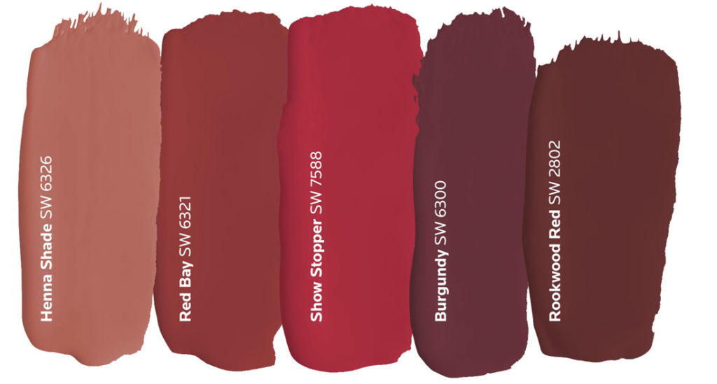
Red is symbolic of strength, power and passion, but it’s boldness can often overshadow its versatility. The key to using this hue is focusing on the statement you want to make with it. While the brighter shades of red generate more energy, darker ones tend to show a softer side that’s subtle and conservative. Consider a rich burgundy or brick red when designing for a space where the atmosphere is warm and welcoming, like a dining room.
Orange
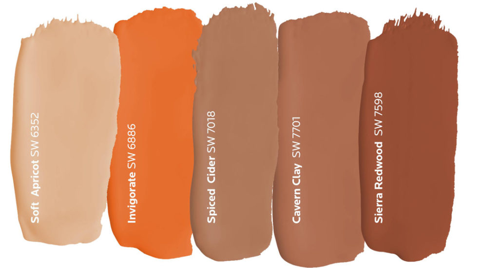
The overall friendliness of orange makes it an ideal choice for rooms where people gather, but it’s also well suited for front doors that welcome guests into your home. From the bright citrusy hues to the muted earth tones, this happy hue’s versatility allows it to work well with a number of different design styles.
Yellow
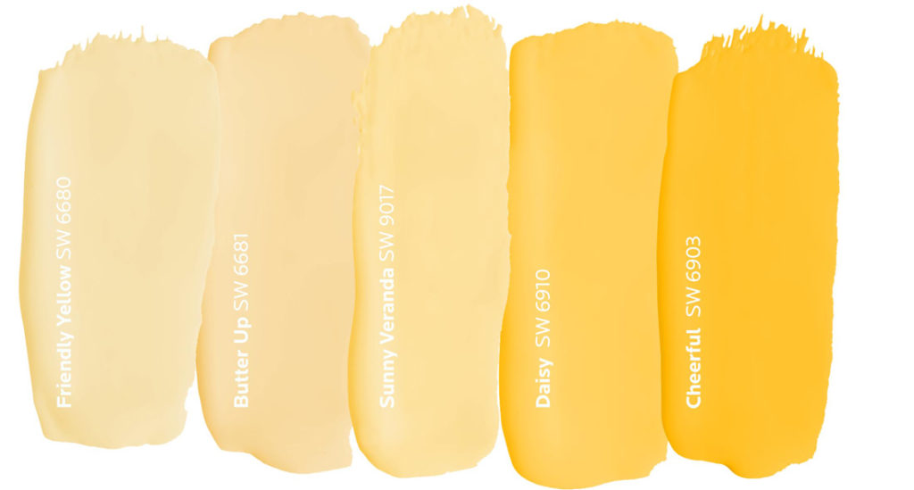
A cheery nature follows yellow wherever it goes. This golden hue triggers thoughts of happiness and sunshine especially when it’s used in a room with lots of natural light. Since it’s often considered to be the brightest warm color, a soft, sunny yellow is the perfect choice for guest bedrooms because it makes everyone feel right at home.

June 2024 Color of the Month: Honeydew

Soft yet energizing, Honeydew’s citrus hue easily fills any space with a fresh and frothy feel. With Fresh Zest as an accent color, you get the perfect combination for infusing a burst of vibrant liveliness without the boldness of more saturated shades. Bring them into a room with lots of natural light to meet the zestier, more expressive side of these hues.

Nook counter top featuring flowers in a vase and floating shelf. Paintdrspainting.com
Bedroom with pinks, baby blues and honeydew green. Paint Doctor's Painting Service
Colors that go with honeydew by the Paint Doctor