Chemical Exposure for DIY Painters

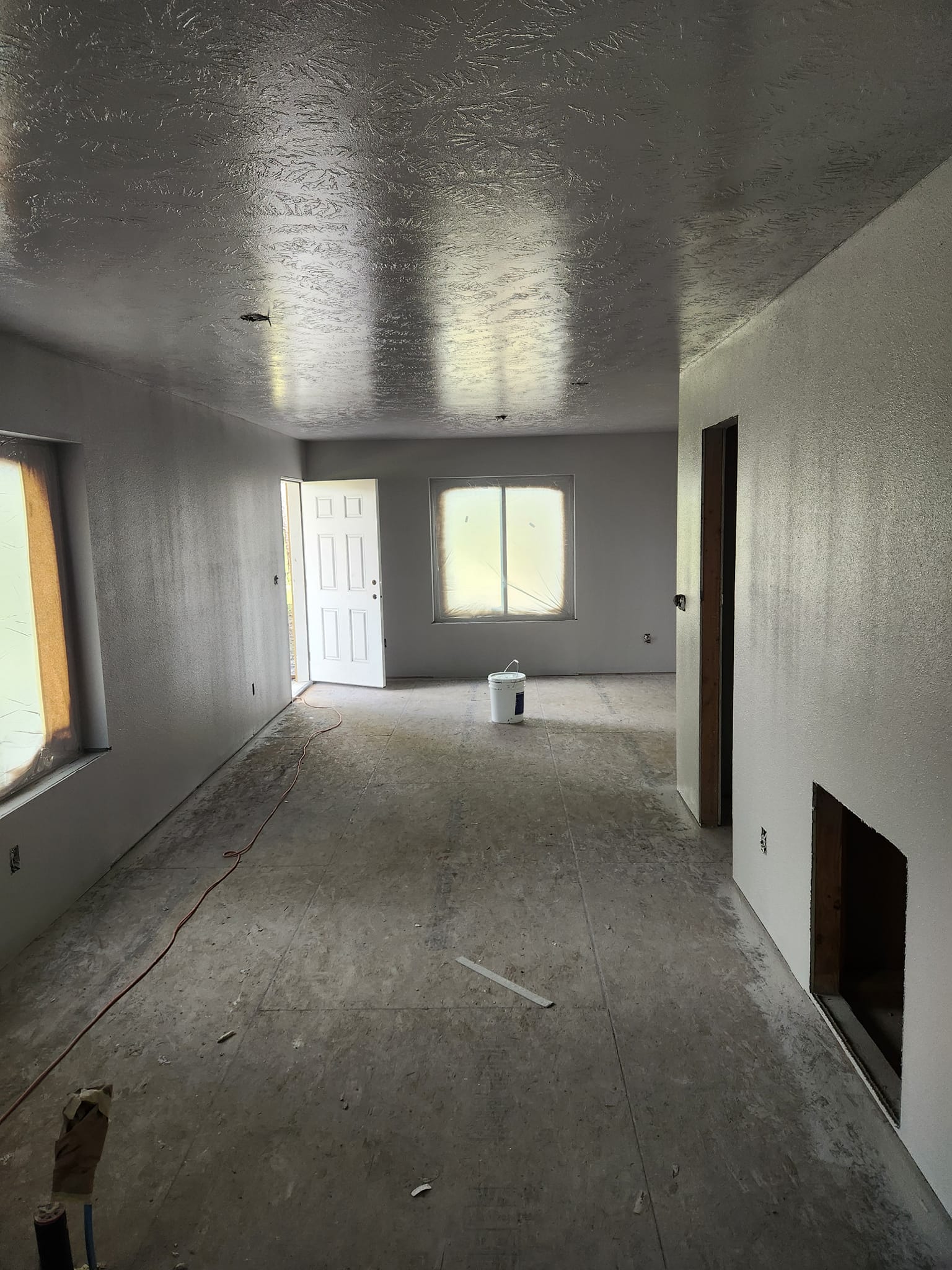
Painting your home can be a rewarding project, but many DIY painters overlook the potential health risks of chemical exposure. Paints, primers, and cleaning solvents contain volatile organic compounds (VOCs) and other hazardous substances that, when inhaled or absorbed, can lead to serious health issues.

Common Chemical Risks in Painting

  1. Volatile Organic Compounds (VOCs) – Found in oil-based paints, primers, and thinners, VOCs can cause headaches, dizziness, and respiratory irritation. Long-term exposure may lead to organ damage.
  2. Lead-Based Paint – Older homes (built before 1978) may contain lead paint, which can cause neurological damage if sanded or scraped without proper precautions.
  3. Mold & Mildew Resistant Chemicals – Some paints contain antimicrobial agents that may irritate skin and lungs if not handled properly.
  4. Solvent-Based Cleaners – Paint removers and degreasers often contain harmful solvents like acetone or methylene chloride, which can affect the nervous system.

How to Stay Safe While Painting

  • Choose Low-VOC or Water-Based Paints – These are safer alternatives with fewer harmful fumes.
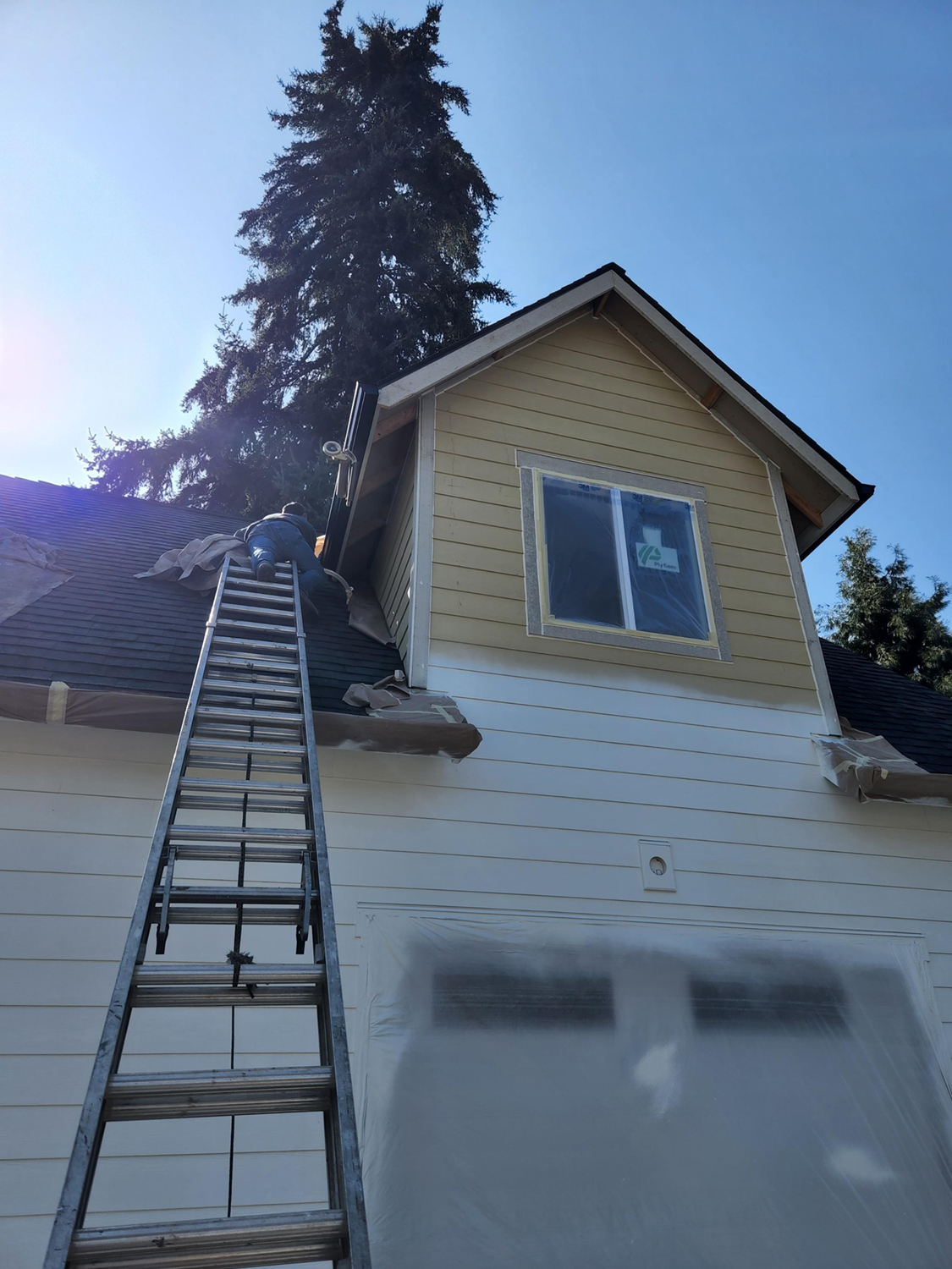
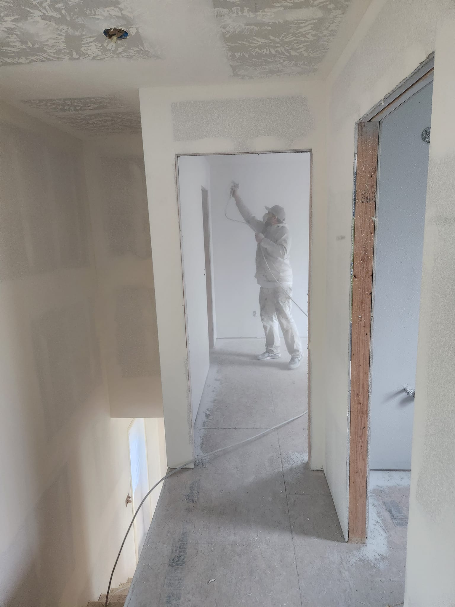
  • Ventilate the Area – Always work in well-ventilated spaces with open windows or fans to disperse fumes.
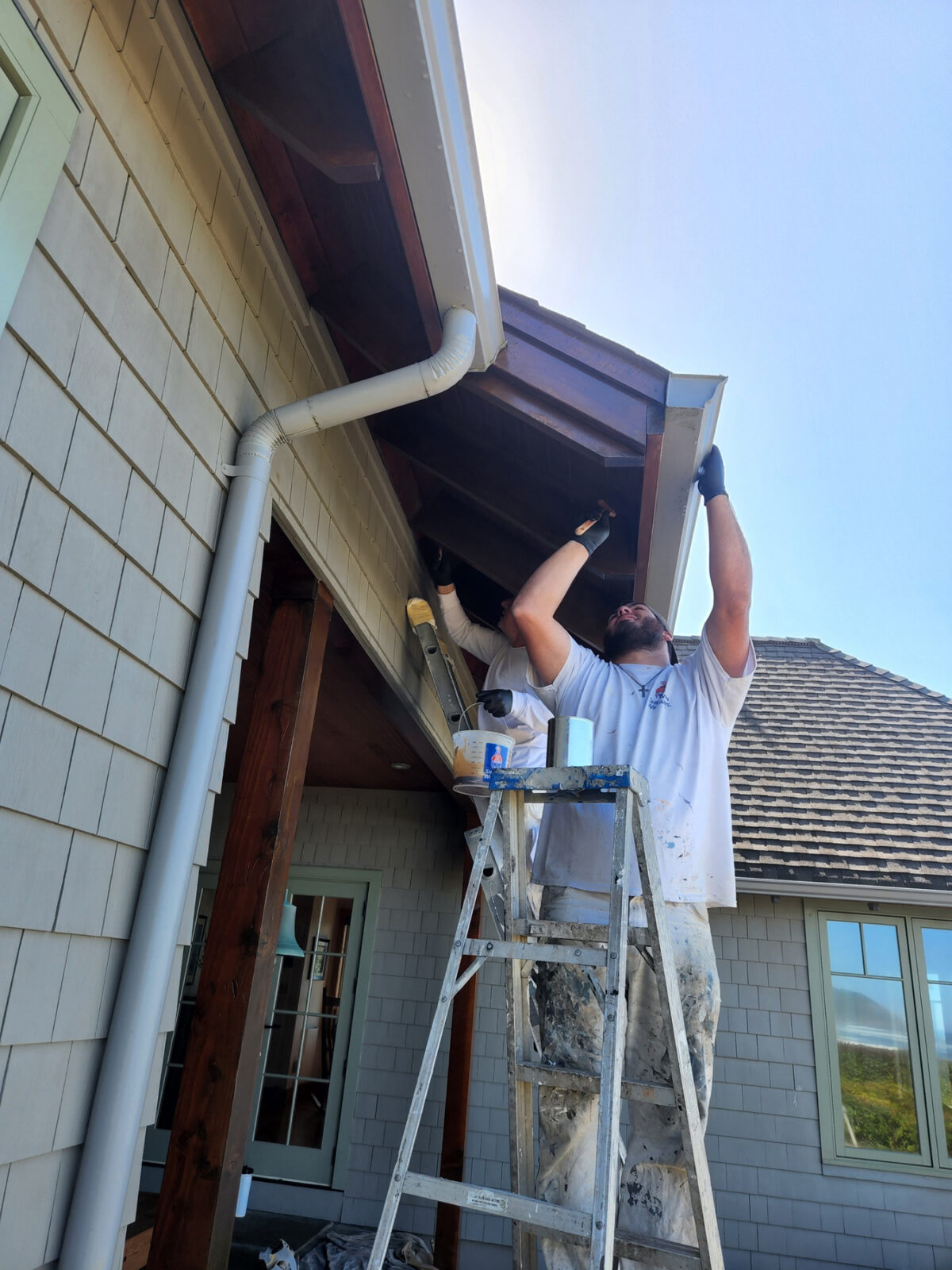
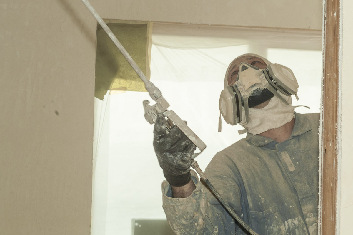
  • Wear Protective Gear – Use gloves, masks, and safety goggles to limit skin and inhalation exposure.
  • Avoid Eating or Drinking Near Paints – Prevent accidental ingestion of harmful substances.
  • Properly Dispose of Paint & Chemicals – Follow local regulations for disposing of hazardous materials responsibly.

Painting is a great DIY project, but safety should always come first. Protect yourself and your home by being mindful of chemical exposure risks. The very best way to avoid hidden chemical exposure is to hire the professionals at Paint Doctor’s Painting Service, 541-497-3804

The Hidden Hazards of DIY Ladder Use in Home Painting

Painting a home is a satisfying DIY project, but when ladders come into play, the risks quickly multiply. Many homeowners underestimate the dangers, assuming a sturdy ladder and steady hands are enough. Unfortunately, falls from ladders are one of the leading causes of home improvement injuries.

Why Ladders Can Be Dangerous for DIY Painters

  1. Lack of Experience – Professionals train extensively in ladder safety, but homeowners often lack the knowledge needed to use them correctly.
  2. Improper Setup – A ladder that isn’t on stable ground or secured properly can tip over in an instant.
  3. Overreaching – Leaning too far to the side while painting can cause the ladder to lose balance. It’s always safer to move the ladder instead.
  4. Slippery Surfaces – Paint spills or wet conditions can make ladder steps slick, increasing the likelihood of slipping.
  5. Fatigue & Distraction – Painting is physically demanding. A tired or distracted homeowner is far more likely to lose focus and make a dangerous misstep.

Safe Alternatives for Home Painting

  • Use an Extension Pole – Instead of climbing high, consider using an extendable roller for hard-to-reach areas.
  • Consider Scaffolding – For exterior projects, renting scaffolding provides a much more stable platform.
  • Hire a Professional – If a project requires significant ladder use, it may be best left to experienced contractors who know how to navigate ladder safety. Give us a call 541-497-3804.

Home improvement is rewarding, but safety must always come first. If you’re considering a DIY painting project that involves a ladder, think twice about the risks—and take every precaution to protect yourself and your home.

Stay safe, and happy painting!

ladder work at the Oregon coast
ladder work during house painting

The Power of Paint

Ever walked into a freshly painted room and felt an instant mood boost? That’s no coincidence—color has a profound impact on our emotions, energy, and overall well-being. A fresh coat of paint isn’t just about aesthetics; it’s about creating a space that supports mental clarity, relaxation, and productivity.

Color Psychology: The Secret to a Happier Home

Different colors evoke different emotional responses, making your choice of paint more important than you might realize. For example:

  • Blues and Greens – These hues promote calmness and relaxation, perfect for bedrooms or home offices.
  • Yellows and Oranges – Energetic and cheerful, warm tones bring vitality to kitchens and living spaces.
  • Neutrals – Whites, grays, and beiges provide a sense of balance and sophistication, creating a clean slate for creativity.

The Refresh Effect

Beyond color selection, the simple act of repainting can refresh your environment and mindset. Dull, fading walls can subconsciously drag down your mood, while a crisp new layer of paint can make your space feel brighter, cleaner, and more inviting.

A Productivity Boost

Working from home? Studies show that an intentional use of color can increase focus and efficiency. Soft blues and greens enhance concentration, while subtle pops of energizing colors can keep motivation high.

Transform Your Space, Transform Your Mind

A fresh paint job is more than just an upgrade—it’s an investment in your mental well-being. Whether you’re repainting an entire home or adding an accent wall, the right colors can inspire positivity, relaxation, and creativity. Ready to breathe new life into your space? Call Mike at 541-497-3804

Shiitake, May 2025 Color of the Month

Add a touch of cozy elegance with Shiitake, Sherwin-Williams’ May 2025 Color of the Month.

An adaptable stone gray, Shiitake strikes a balance between composed and casual.

Slow Green February 2025 Color of the Month


According to Sherwin-Williams.com, “With blue and green tones on the rise, Slow Green captures the essence of two popular color families within its balanced undertone. It has a subtle demeanor that lets you push the envelope of color exploration without feeling overwhelmed by bold, maximalist shades. Instead, this lively hue feels refreshing and buildable in accordance with their interior styles.”

Perfect for the places and spaces where you like to relax and unwind.

Creamy – January 2025 Color of the Month

“The quest for quiet luxury continues to dominate design trends, and shades like Creamy give homeowners a sense of serenity and solitude,” according to Emily Kantz of Sherwin-Williams.

Off-whites and beiges are here to stay, and with good reason. Elevated neutral paint colors like Creamy make homes look chic without feeling over-designed. Bright and inviting, Creamy features a delicate yellow undertone that adds subtle warmth to any room. Resounding versatility and ability to pair with corresponding colors makes this understated shade a go-to for homeowners and designers alike.

We can help you get back to basics with Creamy or any other color of your choosing. 541-497-3804

October 2024 Color of the Month

Pairing the rich blue-green of Mount Etna by Sherwin-Williams with leathers and natural wood adds a level of sophistication to existing casual décor. Call Mike 541-497-3804 to schedule your interior transformation.

New Construction Schedule Options

Painting for our long-time general contractor clients requires that our team learns the sequence the builder prefers and bids the jobs accordingly. The interior photos in this blog post are from a recent project where the general contractor wanted a “wall-out” right after the drywall texture was completed and before any cabinets, doors or trim were installed. One advantage to this approach is that wall paint is much tougher than drywall texture so the paint protects the wall from minor scrapes and impacts during the finishing stages. This order works well for contrasting trim colors.

Other contractors may do the sequence differently for a variety of reasons. Perhaps they want to paint all of the trim and doors the same color and sheen as the wall paint. Maybe they want to eliminate an additional time slot for the painters before the finish carpenters begin, which can help a tight construction schedule. We can even put more than one crew (each with their own equipment) on one job to speed up the process.

In addition to the two approaches listed above, hybrids of these approaches can be employed such as primer between drywall prep and texture to help hide drywall joints.

Whatever the approach, we can accommodate your construction schedule and will bid the job according to your system. As a valuable member of your trade team, we can make suggestions and work with your other trade partners to help make up for some lost days on the construction schedule when needed.

Call Mike 541-497-3804 to talk schedule, bids and sequence for your upcoming new construction projects.

July 2024 Color of the Month-Heron Plume

Sherwin-Williams says, “This inviting shade of warm white seamlessly blends modern simplicity with traditional style. Heron Plume’s laid-back energy is perfect for the refined yet relaxed sophistication of California coastal style. When paired with the nature-inspired coordinating hues of the California Love palette, this airy shade makes crafting casual style a breeze.”

Heron Plume white is combined with Pachyderm SW 9596 wainscot.

Settle into serenity with the subtle, relaxing influence of simple color. A layered approach to the soft, tonal neutrals of this month’s palette builds to evoke a cozy sense of tranquility in a bedroom retreat. Heron Plume’s warming shade of creamy white paired with Pachyderm’s soft greige tone creates a clean backdrop for other elements of coastal style to stand out. Textured natural materials like jute and wicker mix with layered wood tones to add depth and contrast while highlighting the organic, outdoor feel of the space.

paintdrspainting.com suggests this shade of white for modern décor
Whether inside or out, Heron Plume’s warmth radiates an easygoing, welcoming vibe to greet guests. A rich blue-green shade like Mount Etna makes a striking first impression, adding bold contrast that elevates the exterior and sets the tone.

At Paint Doctor’s Painting we often say white is never really just white. Subtle tints make a white warmer or cooler or comfy. Call Mike with help to choose your white and expert help in applying it in your home or business. 541-497-3804

New Blue Review

Blue is a very popular paint color. Blue can appear more traditional in its darker tones but feel breezy and cool when you add white. The calming effect of many blues make them perfect for spaces where you want to relax. Here are a few shades and tones of blue to consider for your next home project.

Moscow Midnight SW 9142
Raindrop SW 6485
Naval SW 6244
Slate Tile SW 7624
Sleepy Blue SW 6225

If you’re hunting for that perfect blue to set the scene, from formal to laid-back, you’ll be sure to find it in a Sherwin-Williams blue paint color. Whether it’s a subdued blue gray like Sleepy Blue or a cheerful blue green like Raindrop, a serious dark blue like Loyal Blue or a playful light blue like Sky High, the best blue paint colors for your space can be expertly applied by the Paint Doctor, 541-497-3804.

Azure Tide 9684