“An evolution of the classic bachelor aesthetic – add a touch of moody maturity with this rich neutral.”
Sealskin lands somewhere between charcoal and bronze, let’s call it a brown-gray. It sets the mood for any room, giving way to personal touches and casual comfort. Compatible with a range of neutrals, Sealskin’s deep hue strikes a balance between warm and cool tones — making it an ideal choice for concealing wear.
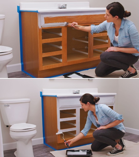
As a professional paint contracting business, Paint Doctor’s Painting is licensed and insured. We hire skilled and experienced painters and emphasize strong project management. We endeavor to give meticulous attention to detail at every level. We go beyond proper surface preparation and product application and purpose to have excellent client-facing attributes with clear communication, guarantees, and a professional attitude.
Our Operational and Skill-Based Characteristics
Skilled workforce: We employ experienced painters who are knowledgeable about different surfaces, materials, and techniques.
Surface preparation: We prioritize proper prep work, including cleaning, sanding, patching, and priming, for a durable and high-quality finish.
Meticulous attention to detail: We demonstrate a commitment to quality through careful, detailed work on every project.
Proper management: We utilize good time management and organizational skills to keep projects on track.
Quality materials: We use high-grade primers and paints from reliable manufacturers.
Our Legal and Financial Characteristics
Licensing and insurance: We are properly licensed to operate and carry comprehensive insurance, including liability and workers’ compensation, to our clients, our business, and our employees.
Guarantees and warranties: We back our work with guarantees and warranties to ensure client satisfaction and protect their investment.
Transparent pricing: We provide clear, upfront pricing and are transparent about costs.
Our Client-Facing and Professionalism Characteristics
Clear communication: We communicate promptly, honestly, and clearly with clients, answering questions and providing details about the project timeline and potential contingencies.
Professionalism and respect: We treat clients and their property with respect, maintaining a courteous and professional attitude throughout the project.
Strong references: We have a history of satisfied customers and can provide strong references.
Client management: We focus on customer service to ensure satisfaction and build relationships for repeat business and referrals.
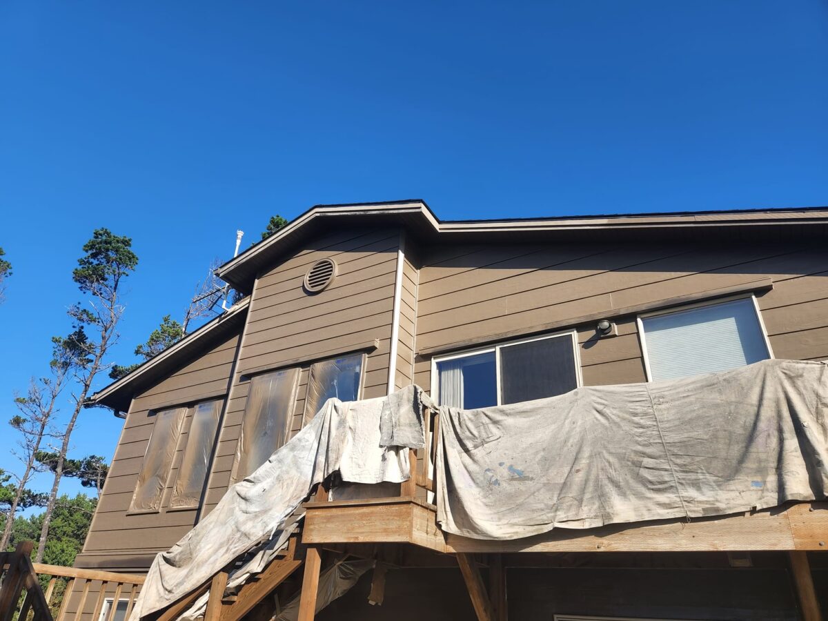
Here in the Willamette Valley mildew can form on the north side of houses due to the lack of direct sunlight, which keeps the surface cooler and moister. Less sunlight means slower evaporation, which helps the surface stay damp longer promoting mildew growth. Mildew mitigation is an important step when preparing to paint the exterior of your home. One solution? Wash with a solution of TSP.
TSP Safety
Protective gear: It’s a good idea to wear eye protection, chemical-resistant gloves, and long sleeves and pants.
Ventilation: Ensure the area is well-ventilated, especially when working indoors.
Protect surfaces: TSP can damage some surfaces, including metal fixtures and glass. Use plastic sheeting to protect areas you do not want to clean.
Mixing: Add TSP powder to warm water, not the other way around, to prevent splashing. Typical dilutions range from 1/4 to 1/2 cup of TSP per gallon of warm water, depending on the job.
Rinse thoroughly: After cleaning, rinse the surface multiple times with clean water to remove all TSP residue. If not completely rinsed, it can leave a white film.
Protect landscaping: If using TSP outdoors, take care to protect plants from runoff by hosing them down with fresh water both before and after applying the solution.
You hire a professional painting company for one main reason: to transform your space with a beautiful, lasting finish. But what if we told you that the secret to that perfect paint job often lies in what happens before the first drop of paint ever touches your walls?
At The Paint Doctor’s Painting Service, we believe a superior paint job starts with superior preparation. That’s why, unlike many others, our comprehensive painting service includes expert minor repairs as a standard part of our prep work.
Why Minor Repairs Aren’t So “Minor” for Your Paint Job
Imagine painting over a small crack, a nail pop, or a dent. What happens?
They don’t magically disappear. In fact, paint often highlights these imperfections, making them even more noticeable. A truly smooth, uniform finish can only be achieved on a smooth, uniform surface.
This is where our attention to detail truly shines. Our skilled painters don’t just “paint over” problems; they meticulously address them, ensuring your walls are in optimal condition before any paint is applied.
What Kind of Minor Repairs Do We Handle?
During our thorough preparation phase, our team will identify and expertly repair common imperfections such as:
Nail Pops: Those small bumps caused by nails working their way out of drywall.
Small Holes & Dings: From picture hangers to everyday wear and tear.
Hairline Cracks: Minor structural cracks that can detract from a smooth wall.
Drywall & Plaster Patches: Filling in and smoothing out damaged areas.
Stress Cracks: Often found around doorframes or windows.
Caulking: Sealing gaps around trim, windows, and doors for a clean line and improved insulation.
The Benefits for YOU:
A Truly Flawless Finish: The most obvious benefit! Your new paint job will look incredibly smooth, professional, and vibrant.
Enhanced Durability: Addressing imperfections prevents them from worsening, helping your paint job last longer.
Save Time & Money: No need to hire a separate handyman or spend your own precious time tackling repairs. We handle it all in one seamless process.
Streamlined Project Management: One point of contact, one schedule, one team focused on delivering excellence from start to finish.
Peace of Mind: You can trust that every aspect of your painting project, from prep to prime to final coat, is being handled by experienced professionals.
Our Process: Preparation for Perfection
Thorough Inspection: We start with a detailed assessment of your walls and ceilings, identifying all areas needing attention.
Expert Repair: Using industry-best techniques and materials, we mend and smooth noticeable problem areas.
Sanding & Cleaning: Repaired areas are sanded and cleaned as needed to ensure optimal paint adhesion.
Priming (if necessary): We may prime repaired areas to ensure a uniform absorption of the topcoat.
Flawless Painting: With the perfect canvas prepared, our painters apply your chosen colors with precision and care, delivering the beautiful results you expect.
We’re not just painters; we’re surface specialists. Our commitment to including minor repairs in our standard service is a testament to our dedication to quality and our desire to provide you with the best possible results.
What about bigger repairs? We work closely with remodel specialists and give you contact information or get a bid for you on larger repairs if requested.
Ready for a truly flawless finish? Contact us today for a free estimate and discover the Paint Doctor difference! 541-497-3804
Peeling, Cracking, or Bubbling Paint: These indicate the paint is failing to adhere to the surface and is no longer providing protection.
Fading Color: A significant change in color shows that the paint has been damaged by UV rays and weather.
Stains and Discoloration: Stubborn water stains, mold, or mildew that can’t be washed off suggest the paint has lost its protective qualities.
Chalking: When the paint disintegrates, it leaves a fine, chalky powder on your hands when you touch the surface.
Deteriorating Caulking: Cracks in the caulking around windows and trim can allow moisture to seep in, causing damage.
Visible Gaps: Gaps or shrinking wood can indicate movement in the structure, and damaged paint can’t adequately protect these areas.
If any of these symptoms describe the exterior finish of your house, you’re going to need a new paint job to protect your investment. Call Mike 541-497-3804
Color is more than just a design choice—it’s a reflection of personality, mood, and lifestyle. Let’s explore what different colors might be saying as you enter a room.
🔵 Blue: Calm, Trustworthy, and Thoughtful
Blue is a favorite for bedrooms and bathrooms because it evokes serenity and stability. Soft blues or navy tones bring a sense of peace, order, and introspection. It’s also a color that builds trust—no wonder it’s popular in professional settings too.
🔴 Red: Bold, Passionate, and Energetic
Red walls make a statement. Whether it’s a deep burgundy in the dining room or a cherry accent wall, red signals confidence and vitality. It’s often chosen by those who love entertaining and aren’t afraid to stand out.
🟢 Green: Balanced, Natural, and Restorative
Green connects us to nature and renewal. Homeowners who choose green often seek harmony and wellness in their environment. It’s a great choice for living rooms or home offices where focus and calm are key.
Choosing interior paint colors can be fun when you think about transforming the mood of a room in your house. Give us a call when you are ready to update your mood! 541-497-3804
Choosing the right paint color for each room in your home involves creating the perfect mood, enhancing functionality, and expressing your personal style. Whether you’re planning a full home makeover or just refreshing a single space, this guide will help you pick the best shades for your kitchen, bedroom, and bathroom.
🧑🍳 Kitchen Colors: Fresh, Inviting, and Functional
The kitchen is where meals are made and memories are shared. It deserves colors that feel clean, energizing, and welcoming.
Top Picks:
Soft Whites & Creams: Classic and versatile, they brighten the space and pair well with any cabinetry.
Warm Grays & Greige: A modern neutral that complements stainless steel and wood finishes.
Sage Green: Earthy and calming, ideal for farmhouse or cottage-style kitchens.
Dusty Blue: Cool and refreshing, especially with white or light wood accents.
Terracotta or Clay: Adds rustic warmth and depth, perfect for Mediterranean-inspired designs.
🛏️ Bedroom Colors: Calm, Cozy, and Restful
Your bedroom should be a sanctuary—a place to unwind and recharge. The right colors can help promote relaxation and better sleep.
Top Picks:
Muted Blues: Like powder or slate blue, known for their calming effect.
Lavender or Mauve: Soft and romantic, great for creating a tranquil atmosphere.
Warm Neutrals: Taupe, sand, or mushroom tones offer a cozy, grounded feel.
Deep Greens: Forest or olive green creates a cocoon-like vibe.
Blush Pink: Gentle and comforting, especially in smaller or sunlit rooms.
Finish Tip: Opt for matte or eggshell finishes to reduce glare and enhance softness.
🚿 Bathrooms: Refresh & Rejuvenate
Bathrooms benefit from clean, bright colors that evoke freshness and spa-like calm.
Top Color Picks:
Cool Grays & Charcoal: Sleek and modern, especially with chrome fixtures.
Seafoam or Aqua: Light and airy, perfect for coastal or spa-inspired designs.
Crisp White: Classic and clean—ideal for small spaces or minimalist styles.
Pale Peach or Coral: Adds warmth and personality without overwhelming.
Soft Mint Green: Refreshing and unique, pairs well with white tile.
Pro Tip:
Use satin or semi-gloss finishes to resist moisture and make cleaning easier.
🖌️ Final Thoughts
Paint is one of the easiest and most impactful ways to transform your home. By choosing colors that suit each room’s purpose and personality, you’ll create a space that feels cohesive, comfortable, and uniquely yours.
Need help picking the perfect shade or finish? We are here to guide you every step of the way. Need help with the entire project? Call Mike 541-497-3804.
This year, Sherwin-Williams is leaning into warmth, depth, and nature-inspired hues that bring comfort and character to every space. Whether you’re building a house, planning a full remodel or just a weekend refresh, these trending colors offer endless possibilities.
🌿 Interior Color Trends
1. Urbane Bronze SW 7048
A rich, earthy brown-gray that adds depth and sophistication.
Perfect for accent walls, cabinetry, or cozy reading nooks.
2. Evergreen Fog SW 9130
A calming green-meets-gray tone that’s ideal for bedrooms and living rooms.
Pairs beautifully with natural wood and soft textiles.
3. Redend Point SW 9081(2023 Color of the Year, still trending)
A warm blush-beige that brings subtle warmth to any space.
Use it in entryways or bathrooms for a welcoming vibe.
4. Naval SW 6244
A classic navy that’s bold yet timeless.
Great for kitchen islands, built-ins, or dramatic accent walls.
5. Pure White SW 7005
A versatile, clean white with just enough warmth.
Ideal for trim, ceilings, and pairing with bold colors.
🏡 Exterior Color Trends
1. Iron Ore SW 7069
A deep charcoal that’s sleek and modern.
Use it for siding, shutters, or front doors to make a statement.
2. Alabaster SW 7008
A soft, creamy white that’s perfect for exteriors.
Works well with stone, brick, and wood accents.
3. Dried Thyme SW 6186
A muted green that blends beautifully with natural landscapes.
Brush marks are a desirable feature in home painting when you are intentionally creating a decorative, textured, or rustic finish, rather than a perfectly smooth, modern look. This technique is often used for furniture, accent walls, and other decorative objects where a handmade, tactile quality adds character.
For decorative painting techniques
When a project is intended to look artistically or decoratively painted, visible brushstrokes are a key part of the aesthetic.
Faux finishes: Techniques like color washing or rag rolling can be used to add texture and depth to walls. Visible, artistic brushstrokes are essential for creating the varied, dynamic patterns of these faux effects.
Creating a hand-painted look: For items like furniture, cabinets, or even doors, a subtle, organized brushstroke can convey that the item was painted by hand rather than in a factory. This adds a custom, artisanal feel, especially when using paints like chalk paint.
For a rustic or traditional aesthetic
A perfectly smooth, glossy finish often feels very modern. In contrast, visible brushstrokes lend a timeless, rustic, or vintage quality to a piece.
Country and cottage decor: A more casual and textured finish suits rustic and farmhouse-style homes better than a flawless finish.
Weathered effects: Combining visible brushstrokes with techniques like distressing and sanding can create a charming, weathered finish for furniture.
To add texture and depth
Visible brushstrokes can be used to add visual interest to a surface and make a flat color appear more dynamic.
For architectural features: When painting woodwork, such as trim or paneling, using a consistent brushing technique that leaves subtle, parallel lines can define the details of the feature.
To create visual interest: The way light catches the texture of the paint can add movement and energy to the surface. This is an effective strategy for making a statement wall or a piece of furniture more eye-catching.
To make matching easier for future touchup. If you know an area will likely need touchup in the future, it can be easier to match the existing texture if the original was applied by brush.
Choosing the right drop cloth is an important consideration for any painting project. More than just a protective layer, your drop cloth can impact safety, cleanup time, and the overall quality of your work. Knowing the pros and cons of each type will help you select the best fit for your needs.
1. Canvas drop cloths
The workhorse of the painting world, canvas is the go-to material for many professionals.
Pros
Durable and reusable: A high-quality canvas drop cloth can last for years, making it a sustainable and cost-effective investment in the long run.
Absorbent: Canvas soaks up paint drips and spills, preventing them from spreading and being tracked through your home.
Slip-resistant: Its heavy, textured cotton material provides a stable, non-slip surface underfoot, reducing the risk of accidents.
Drapes well: The weight of the canvas allows it to conform to the shape of furniture and floors, ensuring fewer gaps and better coverage.
Cons
Cost: Canvas has a higher initial price tag than disposable options.
Not waterproof (unless treated): Untreated canvas is absorbent, but it won’t stop a heavy spill from eventually seeping through to the surface below.
Heavy and bulky: Larger canvas cloths can be heavy and difficult to move and store, especially once they are covered in dried paint.
2. Plastic drop cloths
For a quick and easy solution, plastic drop cloths are a popular choice, especially for one-time or light-duty jobs.
Pros
Inexpensive: Plastic sheeting is the most budget-friendly option and is widely available.
Waterproof: It provides a completely waterproof barrier against spills, protecting surfaces from any leaks.
Lightweight: Easy to handle, tape, and drape over furniture.
Disposable: Perfect for messy jobs—simply fold it up and throw it away when you’re done.
Cons
Slippery: Plastic is known for being slippery, creating a potential safety hazard on floors.
Prone to tearing: Thin plastic can easily rip or puncture, leaving your floors and furniture vulnerable.
Doesn’t absorb: Since it doesn’t absorb paint, spills can pool and be smeared around, creating a larger mess.
Environmental impact: As a single-use product, it contributes to landfill waste.
3. Butyl drop cloths
A favorite among painting professionals, butyl drop cloths offer the best of both worlds.
Pros
Absorbent and leak-proof: These cloths feature a top layer of absorbent canvas and a thick, leak-resistant poly or butyl backing. This stops spills from seeping through while preventing them from spreading.
Slip-resistant: The coated underside provides excellent traction, making it much safer to use on hard, slippery floors.
Durable and reusable: Built for heavy-duty use, butyl cloths can be washed and reused for many projects.
Reduces tracking: The absorbent top layer prevents you from tracking wet paint across the floor.
Cons
Higher cost: Butyl drop cloths are more expensive than standard canvas or plastic options.
Bulkier and heavier: The layered material makes these cloths heavier and bulkier to transport and store.
Paper drop cloths
Best for: Protecting against minor paint drops and dust, or for covering baseboards and trim.
Good to know: A disposable and eco-friendly option compared to plastic, but it is not leak-proof and tears easily.
Fabric drop cloths
Best for: Light-duty painting tasks and DIY projects.
Good to know: These are a more economical, disposable alternative to canvas, but less absorbent and durable.
How to choose the right drop cloth for your project
Scenario
Best choice
Why?
Professional painting job
Butyl or heavy-duty canvas.
Superior protection, durability, and safety, especially on hard floors.
DIY project with occasional painting
Canvas.
A reusable, absorbent, and reliable investment that won’t break the bank.
Quick, one-time touch-ups
Plastic sheeting.
Affordable and disposable, perfect for a fast, low-mess job.
Covering furniture
Lightweight plastic sheeting.
It’s easy to drape and tape in place, keeping furniture dust-free and protected from light splatter.
Working on stairs
Non-slip canvas.
Specialty options with rubber nubs on the underside prevent slipping and hold securely.
Outdoor projects
Heavy-duty canvas or thick plastic.
Canvas won’t blow away, while thick plastic is ideal for covering landscaping.
Of course, the preferred option is to know someone who has lots of professional grade drop cloths, the Paint Doctor. We bring the protection and everything else needed for first rate paint job. Call the Doctor 541-497-3804.